HealthHub
HH
UX
Case Study
Project
Health Hub is a universal healthcare management app for patients and their families. Health Hub allows patients to centralize their health management by enabling them to schedule appointments, pay bills, and view records from one location.
Challenge
Today, patients face many problems and most applications available do not provide vital functionality. In addition to the lack of practical functionality, most are difficult to use and do not communicate with other portals leading to the frustration of many. For these reasons and more, patients feel they cannot make informed decisions about their health because they do not have an easily accessible view of their complete medical history.
Goals
Provide a solution that allows patients to see all their medical history regardless of where they received treatment.
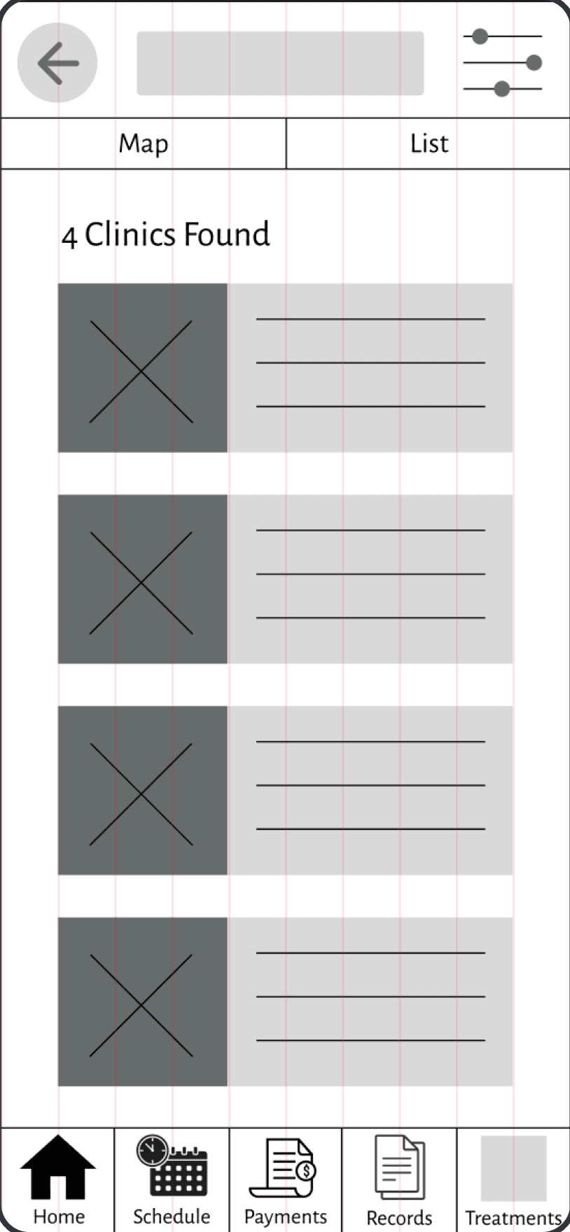
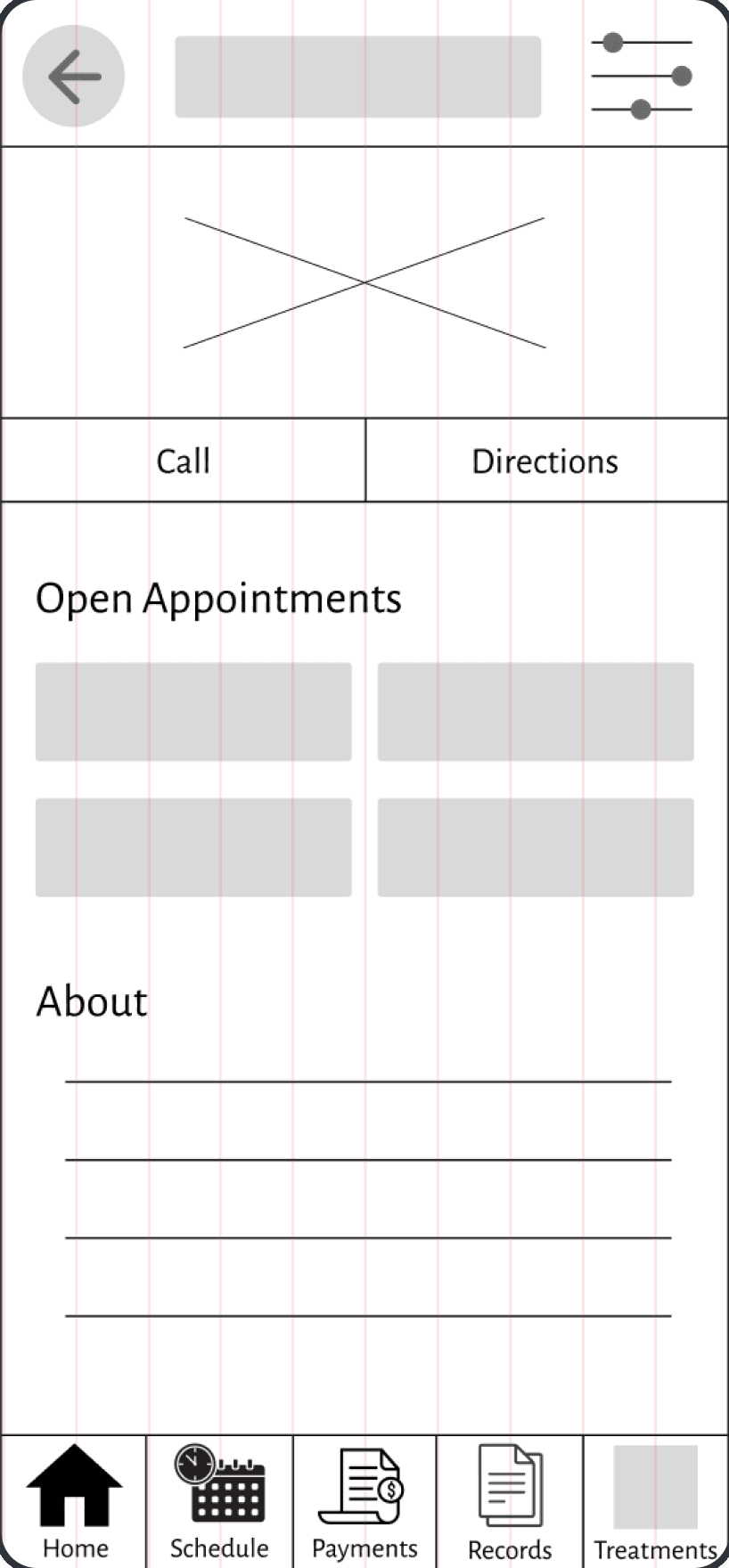
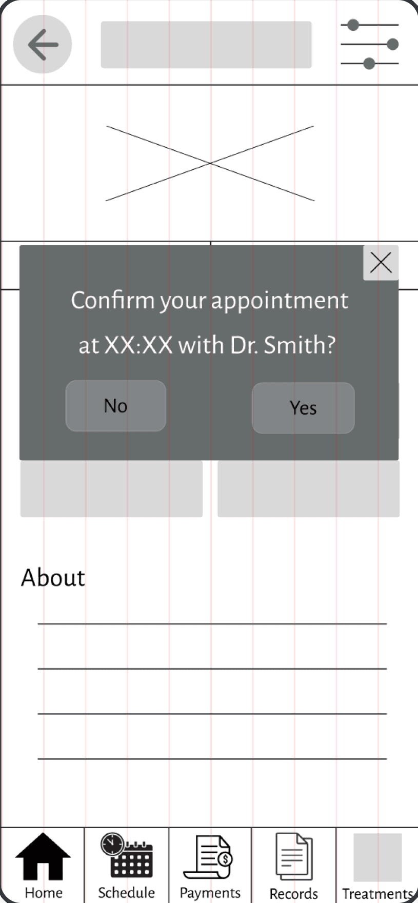
Incorporate a scheduling feature that allows patients to locate clinics and schedule appointments.
Provide a seamless way for patients to manage additional components of their health, including billing, home treatment plans, and resources.
Jump To Final Mockups
User Interviews
1 - 2 Hour Sessions
12 Questions
?
Sample of Questions Asked
How long do you spend on managing health care needs weekly?
How do you currently schedule appointments with your doctors; do you encounter any frustration while trying to complete that task?
How do you manage your health documents like test results, doctor's notes, etc.?
Do you have access to a spouse's or dependents' medical records? If so, how do you manage their needs?
Initial Findings
Overall, patients just want the ability to quickly access all of their medial documents and history
People managing their health care for the first time (mainly children taking responsibility from their parents) feel overwhelmed with the medical nuances and insurance.
Patients are frustrated with having a portal for every doctor's office they go to with no easy way to share data between portals.
There is a lack of resources for managing payments, treatment plans and medications
User Personas
Meet Katherine
Demographics
Occupation: Professor
Education: PHD
Family: Married
Age: 67
Cell Phone
Computer
Social Media
Early Adaptor
Technology Usage
Frustrations
Unintuitive apps
No way to upload previous documents
Medical documentation is distributed over several portals
No way to filter data
Can't keep track of her records
The amount of time it takes to complete tasks
Store all health information in one place
Functional sorting tool
Prescription and supplement tracker
A one page health snapshot including allergies, prescriptions, surgical history blood type, etc.
Goals & Needs
Katherine Jackson is a retired mathematics professor who uses her free time to tutor students at the local library for free. Her greatest challenge at the moment is organizing her ever-growing pile of medical records and receipts in the closet from the additional medical visits she has had over recent years.
Meet Ezekiel
"Everything I do is for Sammy. I want him to have the best life so making sure he is happy and healthy is my top priority."

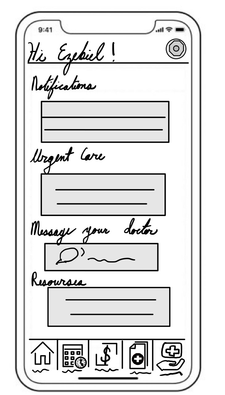
Ezekiel Artzi is a single dad raising his son, Sammy. The two love basketball and are often found shooting hoops after school. A challenge Ezekiel faces constantly is scheduling appointments. Due to his job, Ezekiel can’t always call Sammy’s pediatrician during working hours, so he will try to send an email or leave a message which may go unanswered.
Demographics
Cell Phone
Computer
Social Media
Early Adaptor
Technology Usage
Frustrations
Quickly schedule appointments
Messaging feature to reach Sammy's pediatrician without making a call
A child-friendly interface that Ezekiel can use to show Sammy how to access and manage his health as he grows
Goals & Needs
Competitive Analysis
Now that I understood the patient’s perspective, I investigated available products. I reviewed four health/ health portal applications to determine existing functionality and to see the source of frustration from the patients I interviewed.
Intuitive page layout
Patients are connected with providers immediately
(Once added) Patient records are easily accessible

Weakness
There is a limited amount of care that providers can perform virtually
There is no easy way to incorporate historical data

Opportunities
Provide patients with healthcare beyond virtual limitations
Partner with other healthcare organizations for other visit types

Threats

There are multiple options for Telehealth
Organized health systems have increased their Telehealth capabilities since Covid-19.
Health Tap
Widespread in the US, thus users are familiar with the application
Epic has a long history in The United States healthcare space.
Strengths

Weakness
Unintuitive interface
Patients have to create an account for each health system
Linking accounts is a tedious process

Opportunities
Redesign MyChart to match standard navigation patterns
Remove manual work for the patient when possible

Threats

Other tech companies like Google and Microsoft are threatening to enter the EHR (electric health record) space
MyChart
User Flows
Katherine’s Flow
Because Katherine’s primary goal is to upload and organize her records, this flow demonstrates how that task would be completed.
Ezekiel Flow
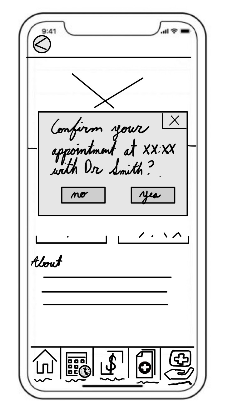
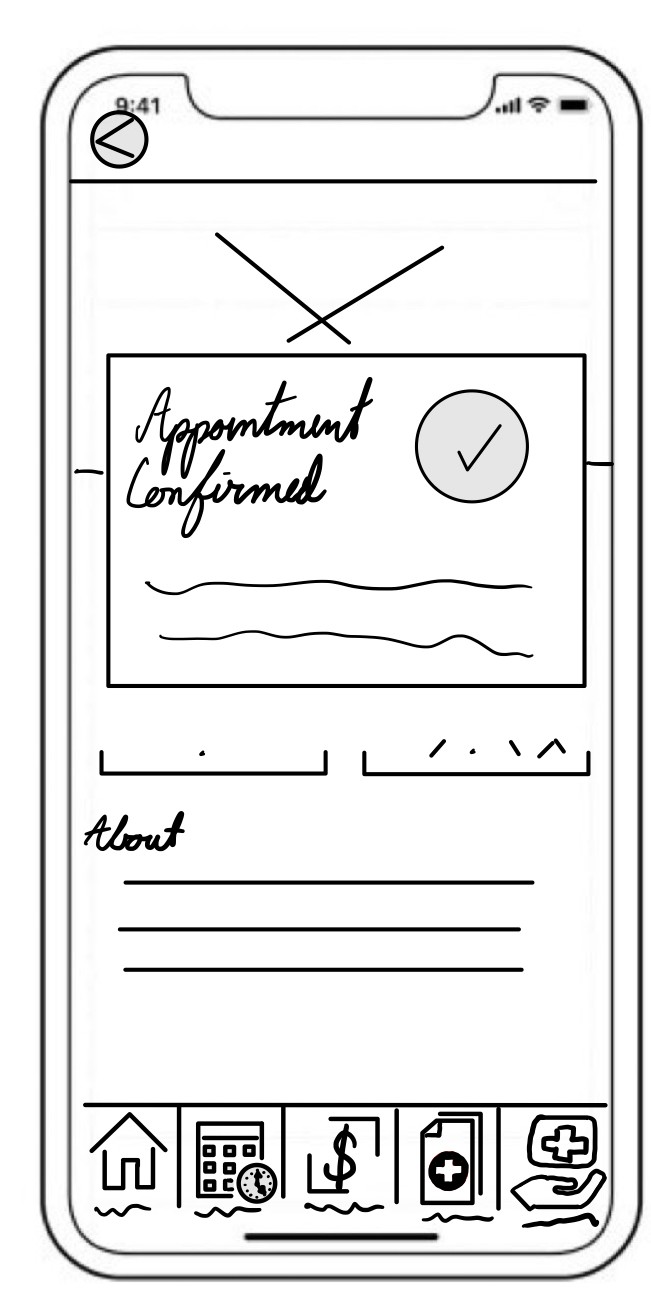
Ezekiel’s flow outlines how to schedule general appointments.
Scheduling for referrals, specialties, or multi visit appointments would follow a different flow.
Information Architecture
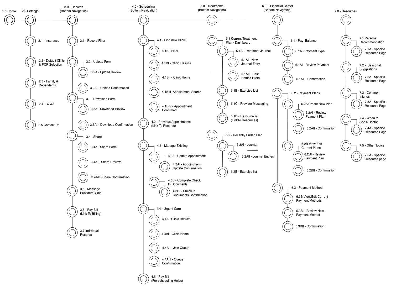
With the goals, needs, and flows defined, my focus shifted to the information structure. Before building the sitemap, I asked 25 participants to complete an open card sort. The objective of this sort was to confirm the grouping of information was logical to users.
With the results of the card sort, I finalized the bottom navigation and built the rest of the site map. Note: While this map is up to date, it can be expanded to include future functionality and refined workflows.
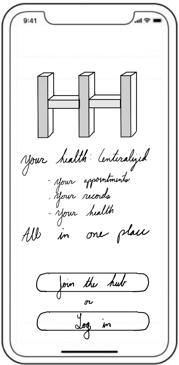
Low Fidelity Wireframes
Upload Records
Home
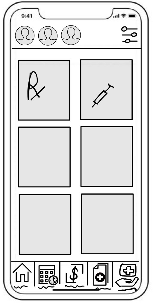
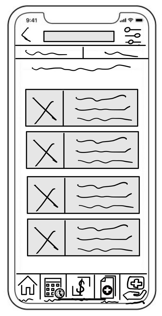
Records
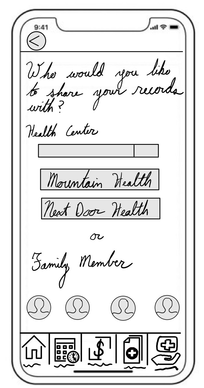
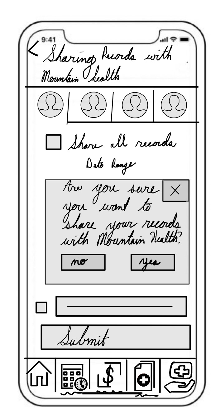
Share With
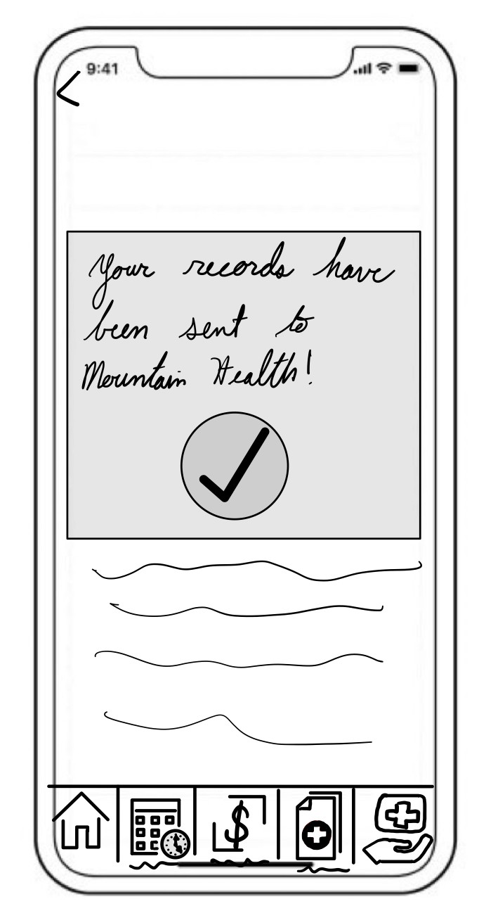
Confirmation
Schedule Appointments
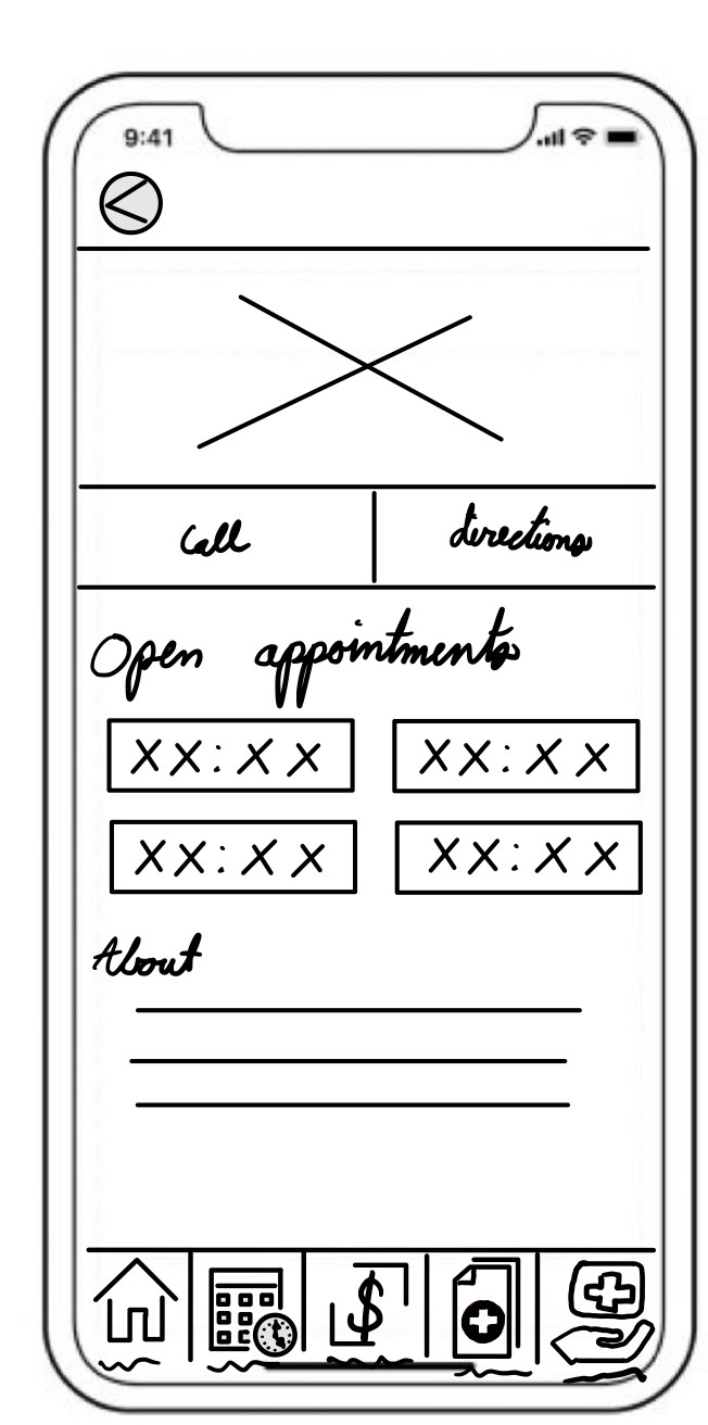
Appointment Options
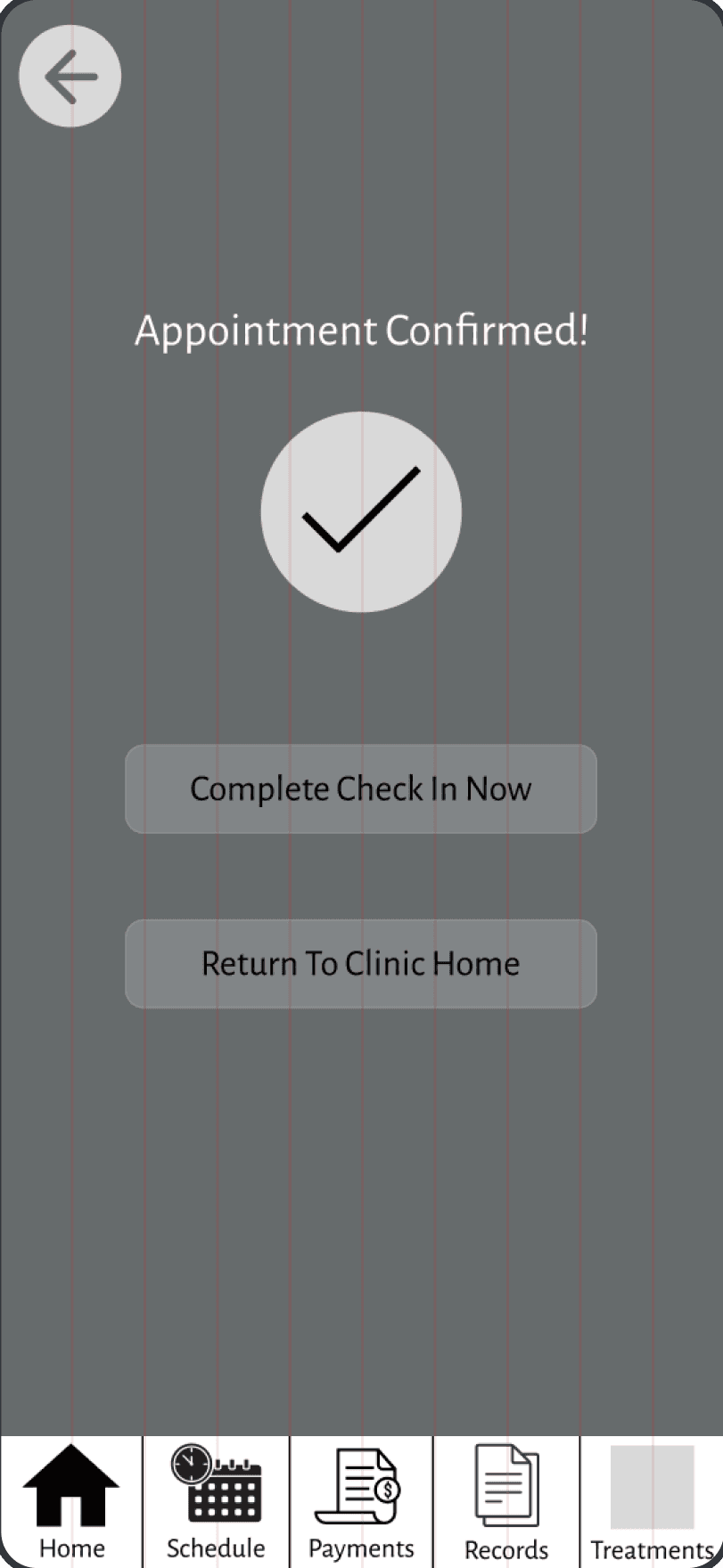
Confirm Appointment
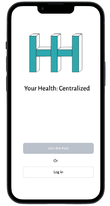
Mid Fidelity Wireframes
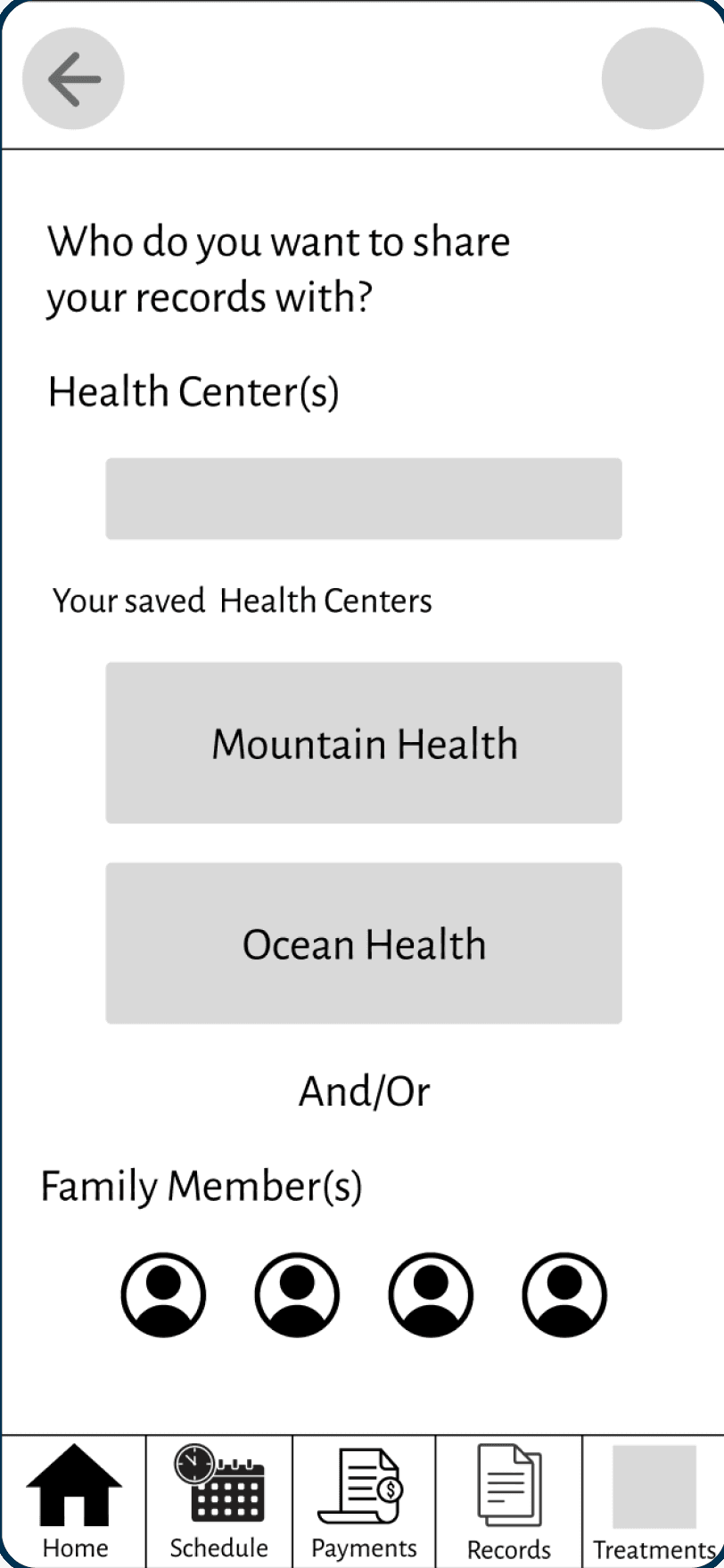
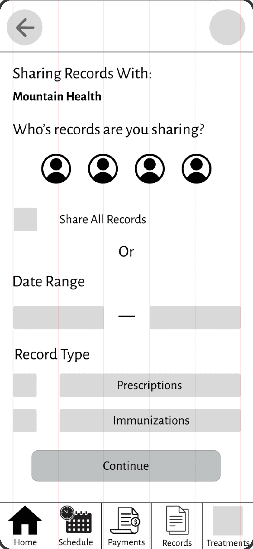
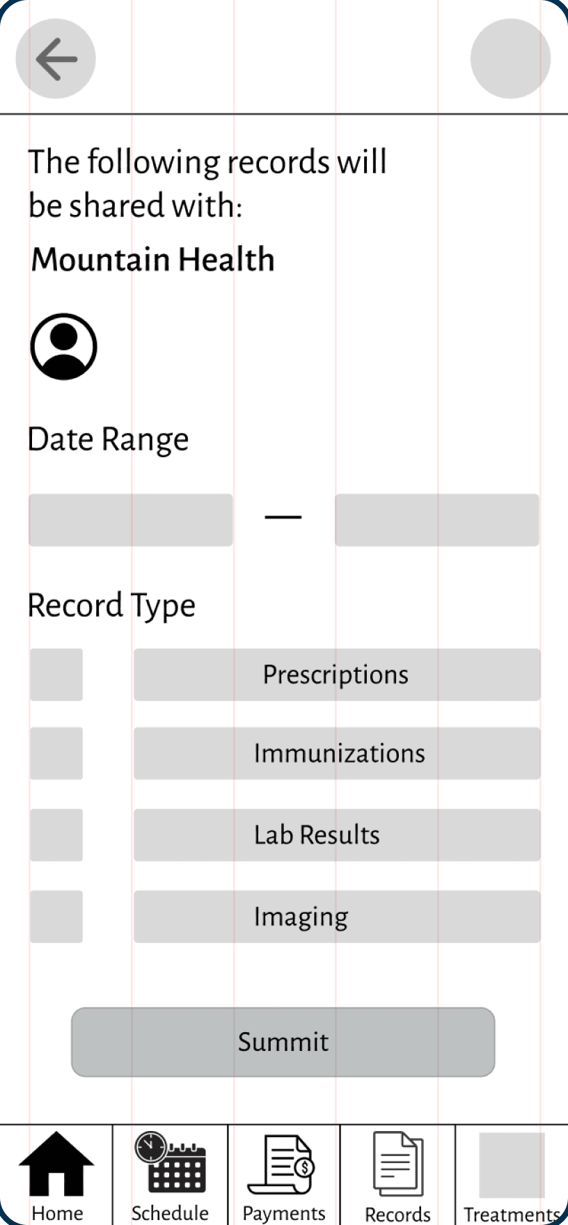
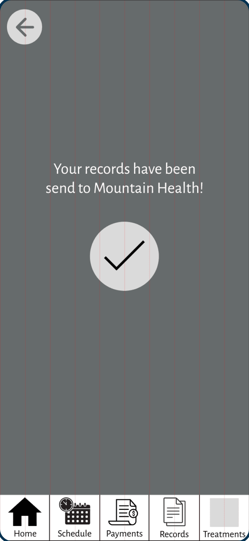
Share Records
Home
Records
Share With
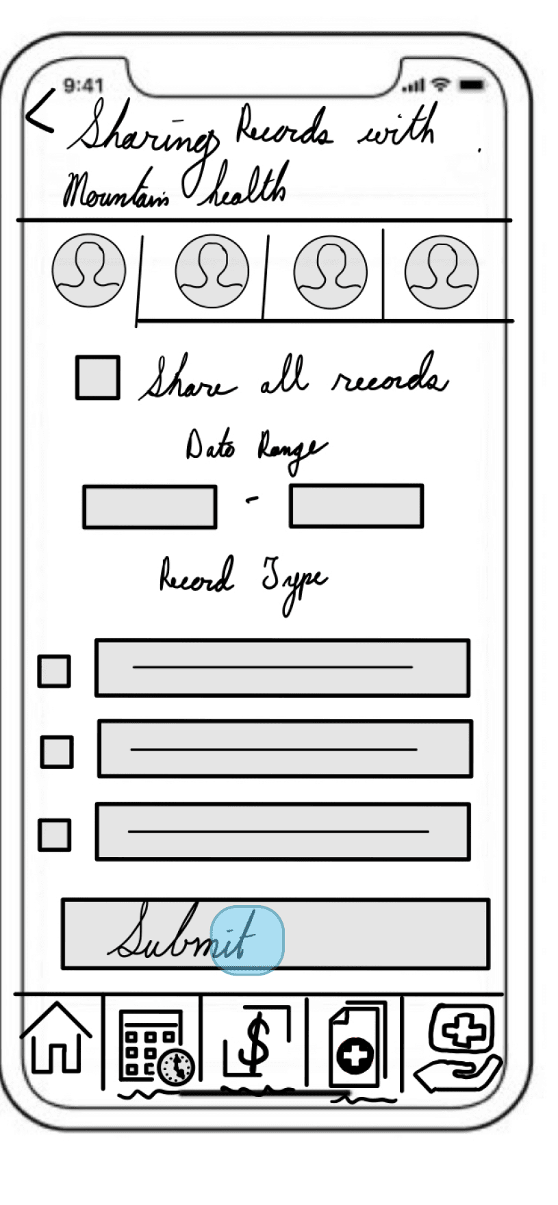
Records to Share
Review
Confirmation
Schedule Appointments
Home
List of Clinics
Confirmation
User Testing
Monitored Sessions
5 Tasks
Tasks
Schedule an appointment
Pay a bill
Send records to a clinic
Complete a home treatment journal entry
Update their visual preferences
Patients felt frustrated when they couldn’t schedule an appointment in less than two minutes.
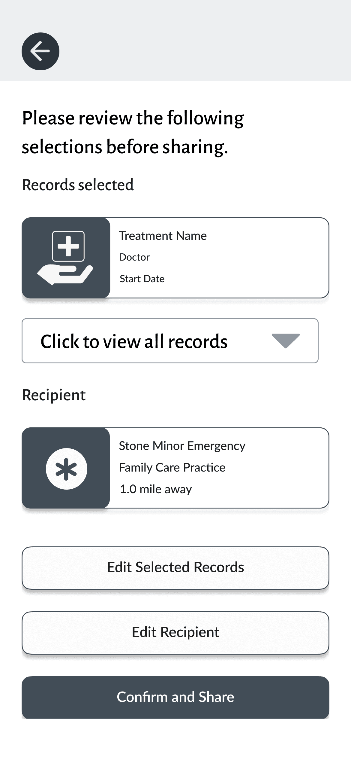
Patients were unable to share records without some guidance, so this workflow was reworked prior to the creation of high-fidelity wireframes.
In general, participants expressed enthusiasm with the available functionality but just wanted a few updates to improve ease of use.

Observation

Positive Quotes

Negative Quotes

Errors
Once I completed the Affinity Map, I took those findings and recorded them into a spreadsheet. I then assigned each one of my participants a color and noted the similarities between the tests within the four categories listed in the affinity map. This is where the term “rainbow spreadsheet” comes from, if you want to view the complete document you can do so here.
Using the spreadsheet as a guide, I was able to quickly identify commonalities between participants, records possible next steps, and devise a plan to implement adjustments. Two primary areas of focus were scheduling appointments and sharing records.
Updates From User Testing
Scheduling Appointments
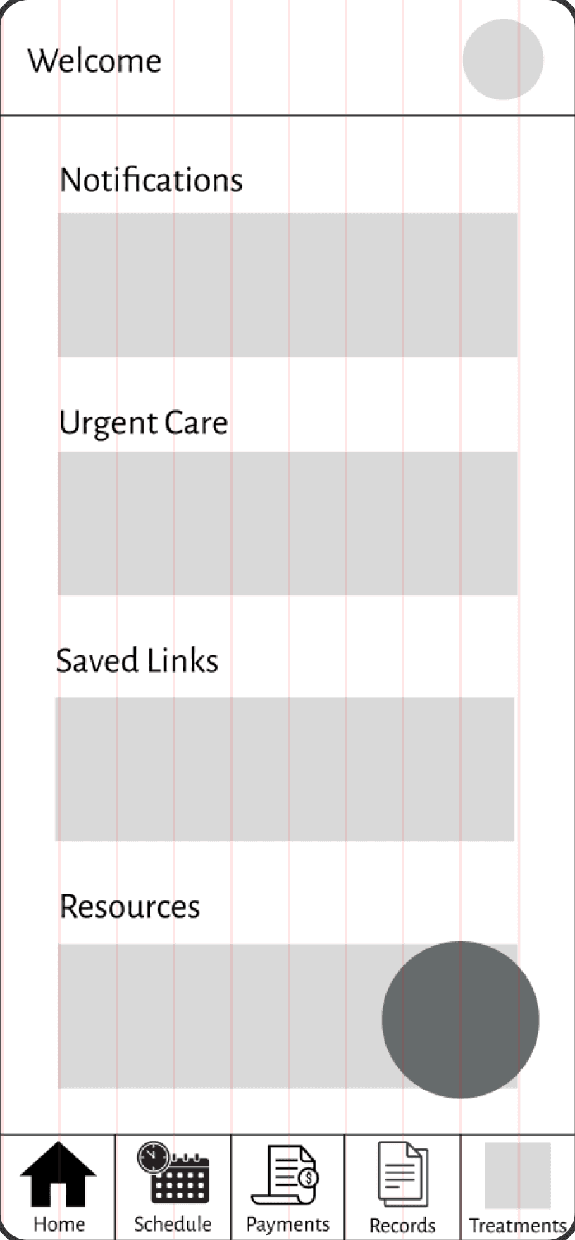
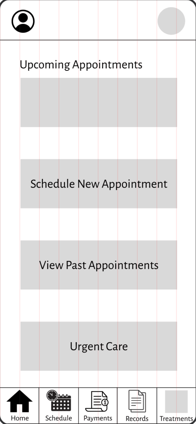
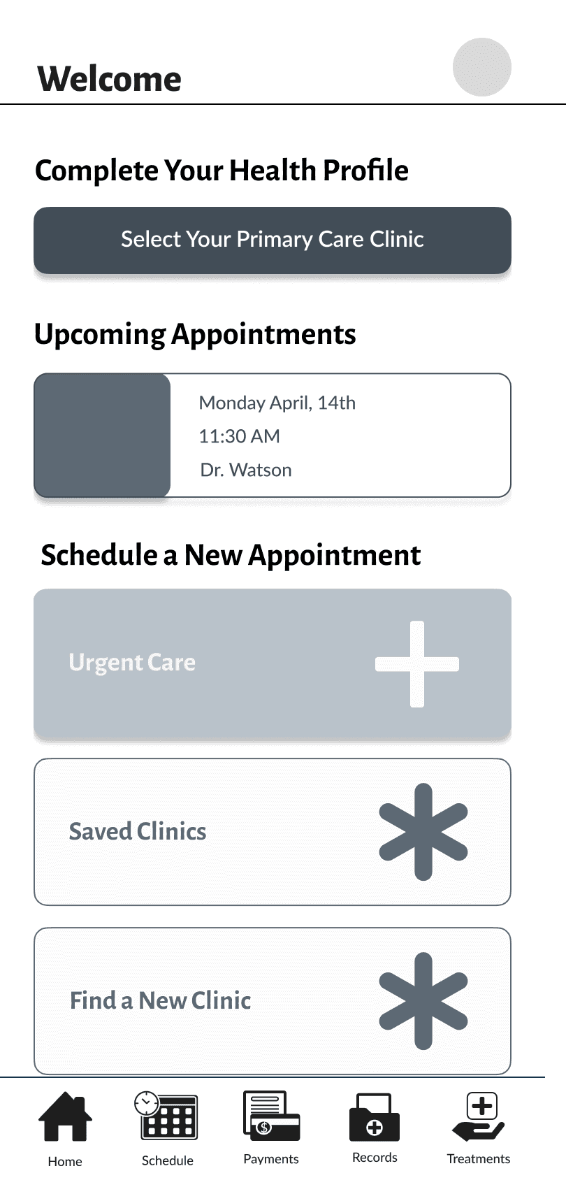
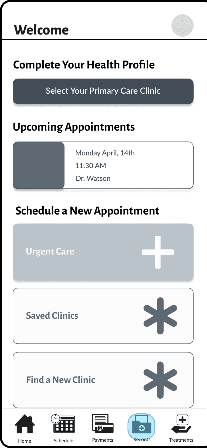
Most participants felt that it took too many clicks to make an appointment. So I added a scheduling section directly to the home screen which broke up the scheduling into three possibilities: schedule at a saved clinic, find a new clinic, and find urgent care.
This eliminated a click for the user and helped them to navigate to what they needed quickly. The original and revised workflow are shown below.
Original
Revised
Sharing Records
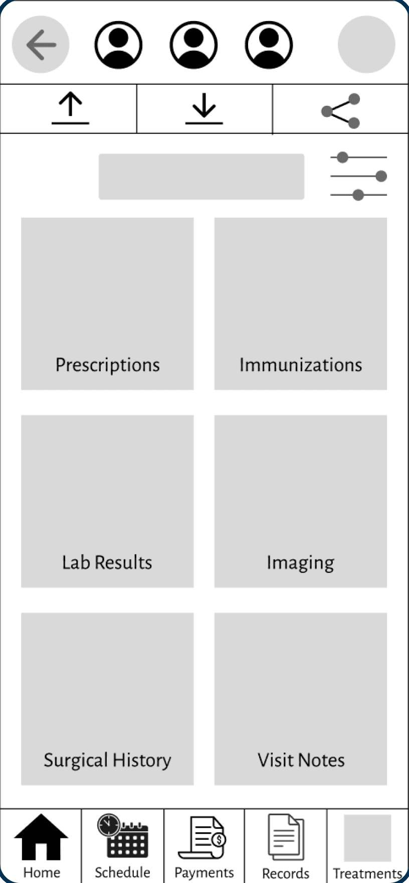
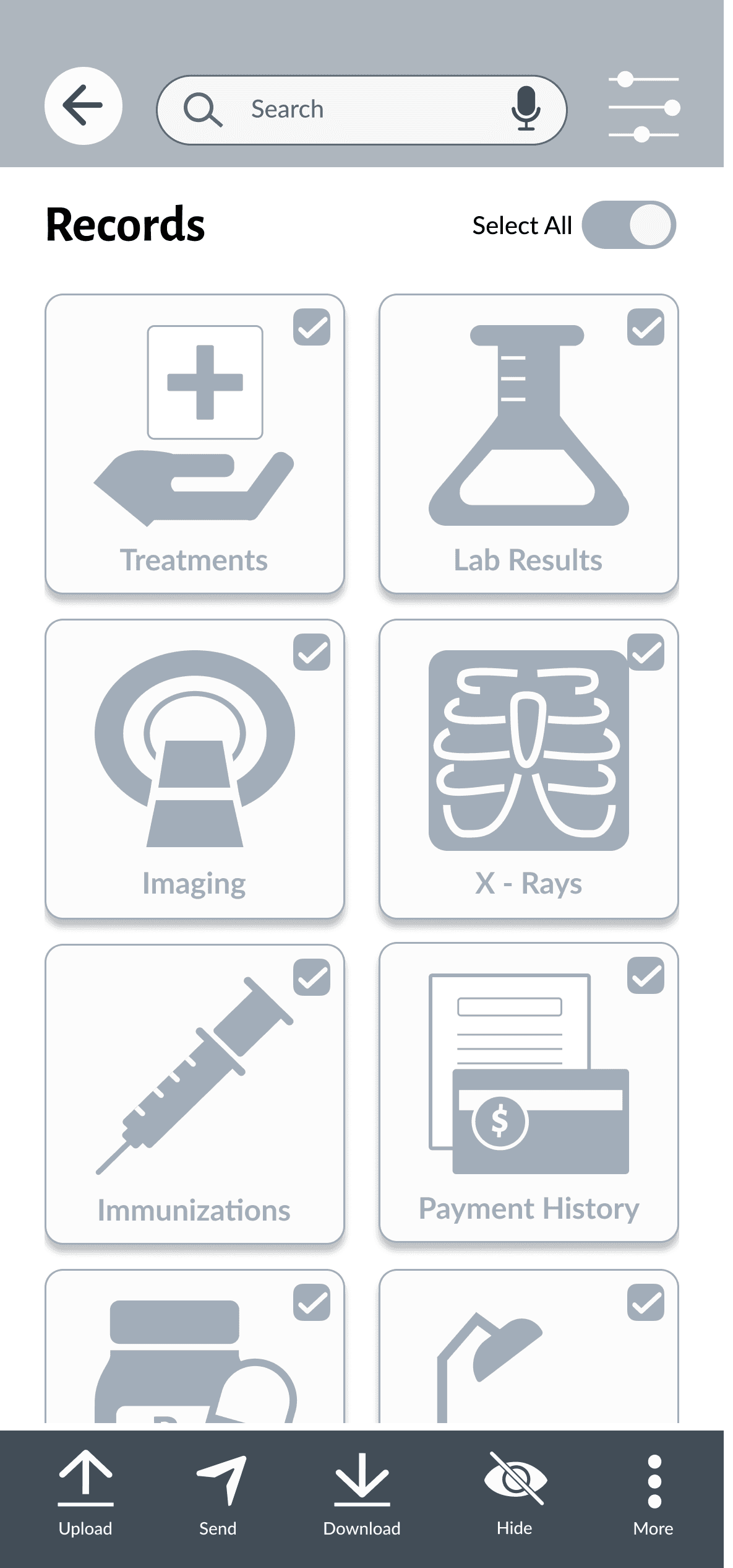
This workflow underwent the largest change. Originally, I used a secondary top navigation that allowed user to share, upload, and download records. During the testing sessions, users felt this navigation was unclear, and took up too much space.
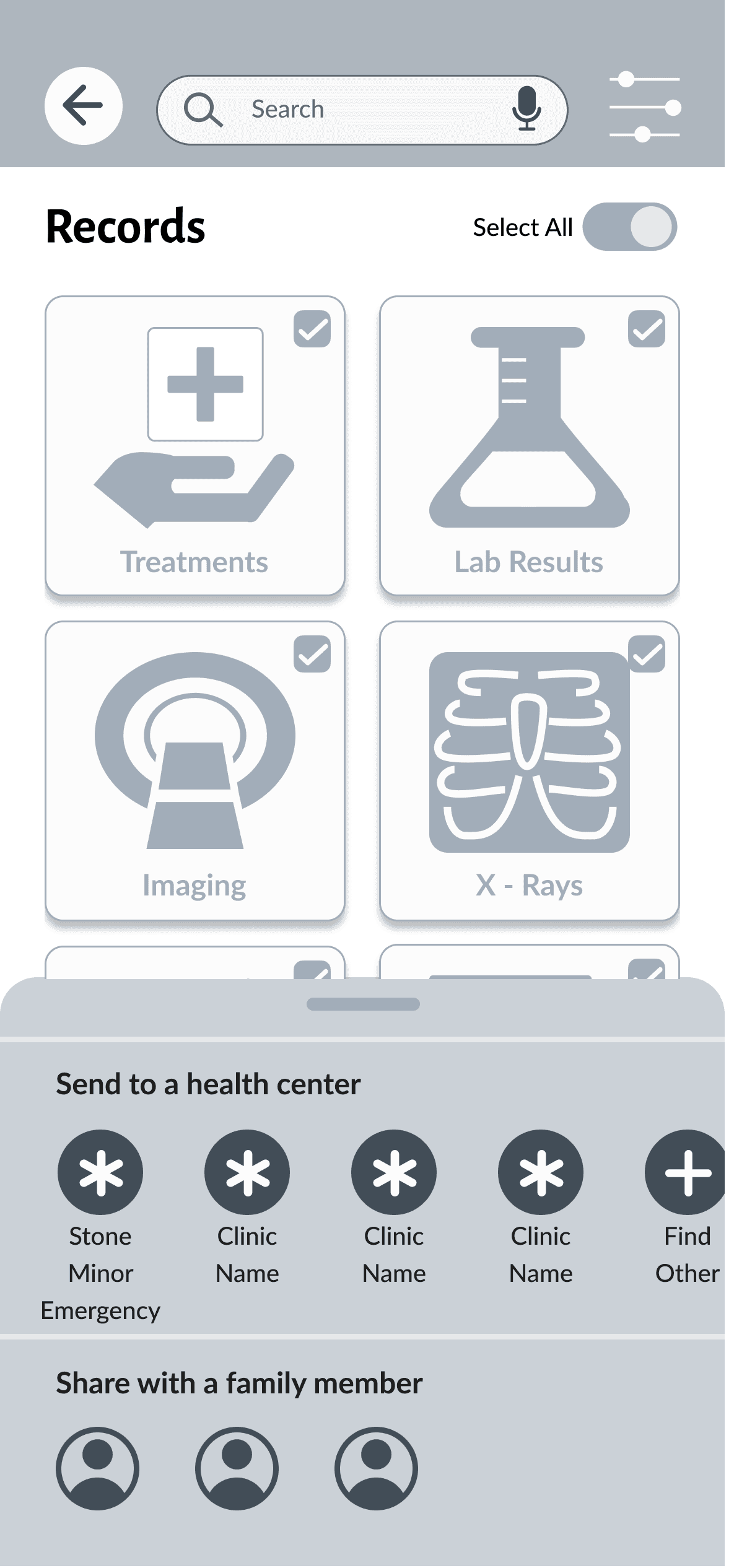
I knew I needed to revise the workflow, but I wasn’t sure how. While sending a picture to my dad, an idea popped into my head. In the revised workflow, I decided to include a bottom sheet to indicate addition actions.
Original
Confirmation
Revised
In the revised workflow, once a record, record type, or multiple (in the case of the example) is selected, the secondary bottom navigation appears. Patients now have more options that they can take with their records including, uploading, downloading, sending, hiding, or adding notes.
Patients can take the same actions with individual records when they click into the record type cards. Each option is paired with a unique bottom sheet that allows for further actions.
UI
With the adjustments complete, I began to develop the design system. I choose blue as the primary color because of its calming quality, while red, the secondary color, indicates any risk to the patient or urgent care.
Due to the specialization of the application, all but two icons were custom made for this project.
Typography
01
Aa
Headers
Paragraph
Colors
02
OO7DA3
Primary
B90E13
Secondary
FCFCFC
Surface
1E1E1E
Text
Icons
03









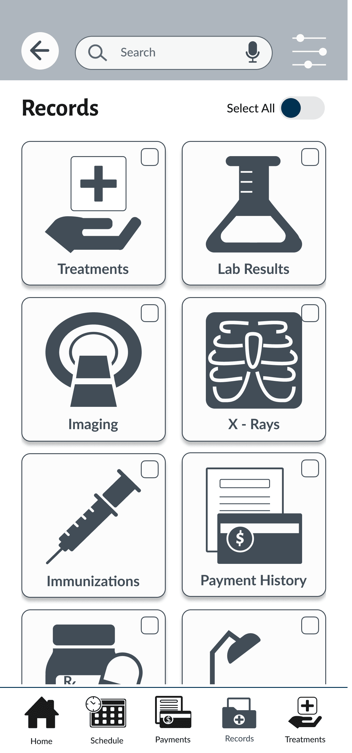
Record Icons
Application Logo


Record Actions

Bottom Navigation






Treatment Icons
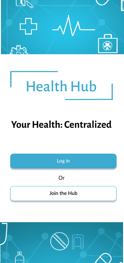
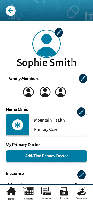
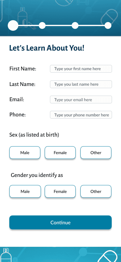
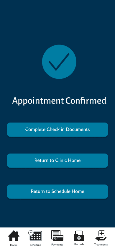
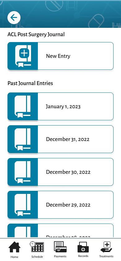
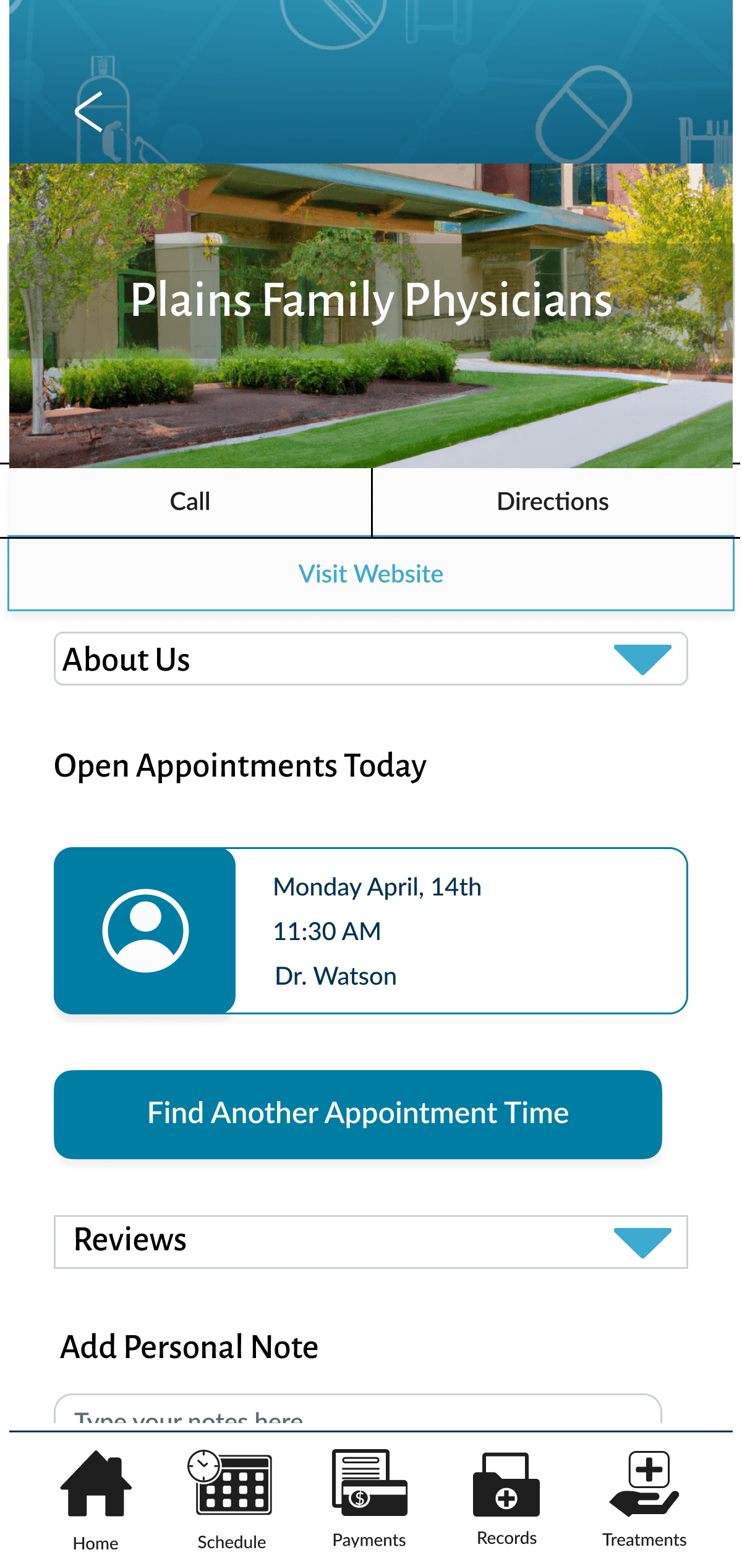
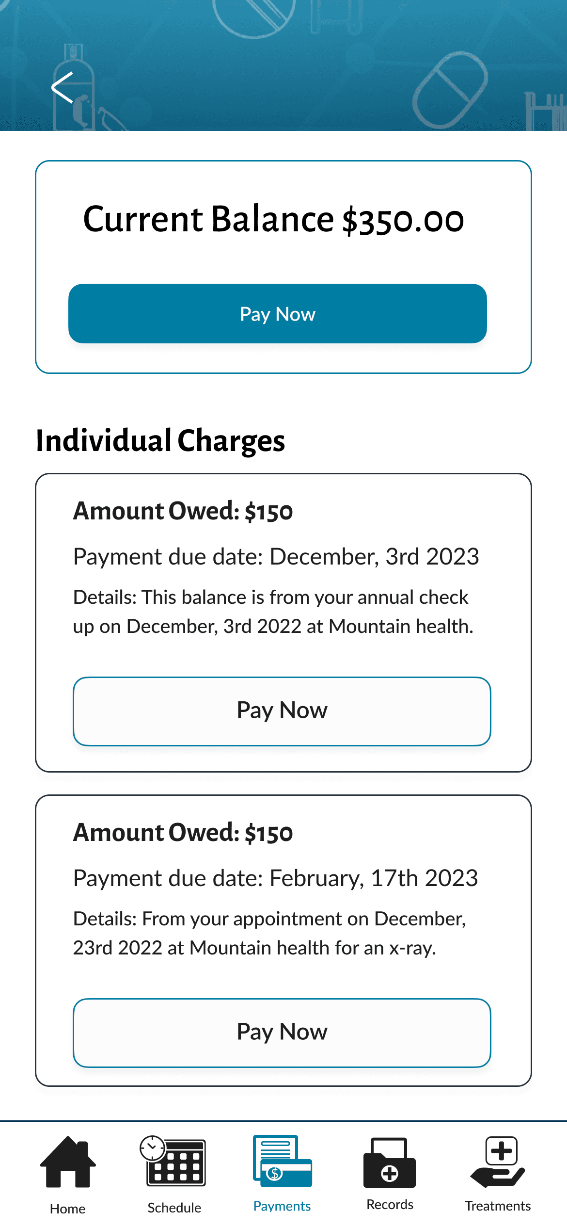
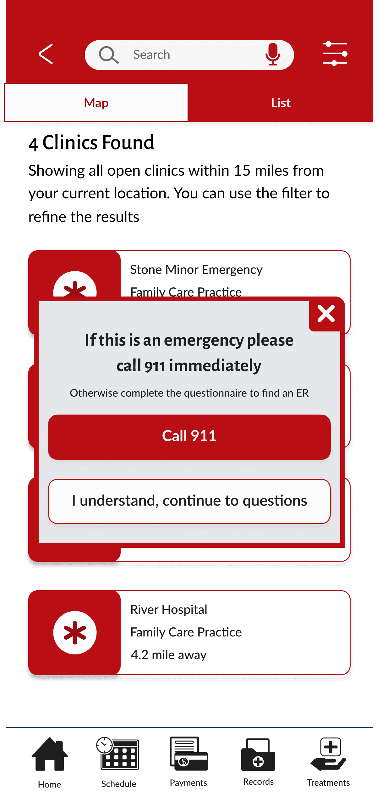
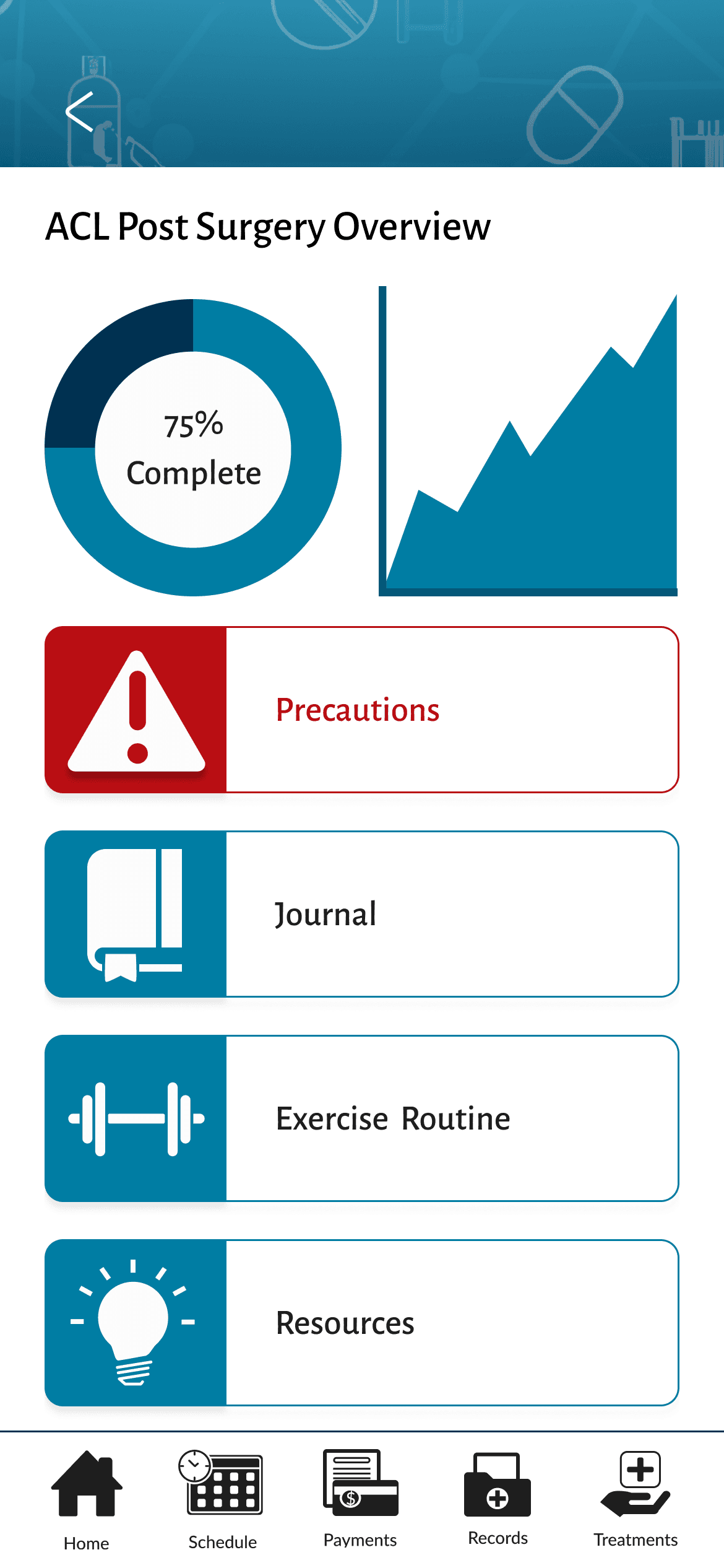
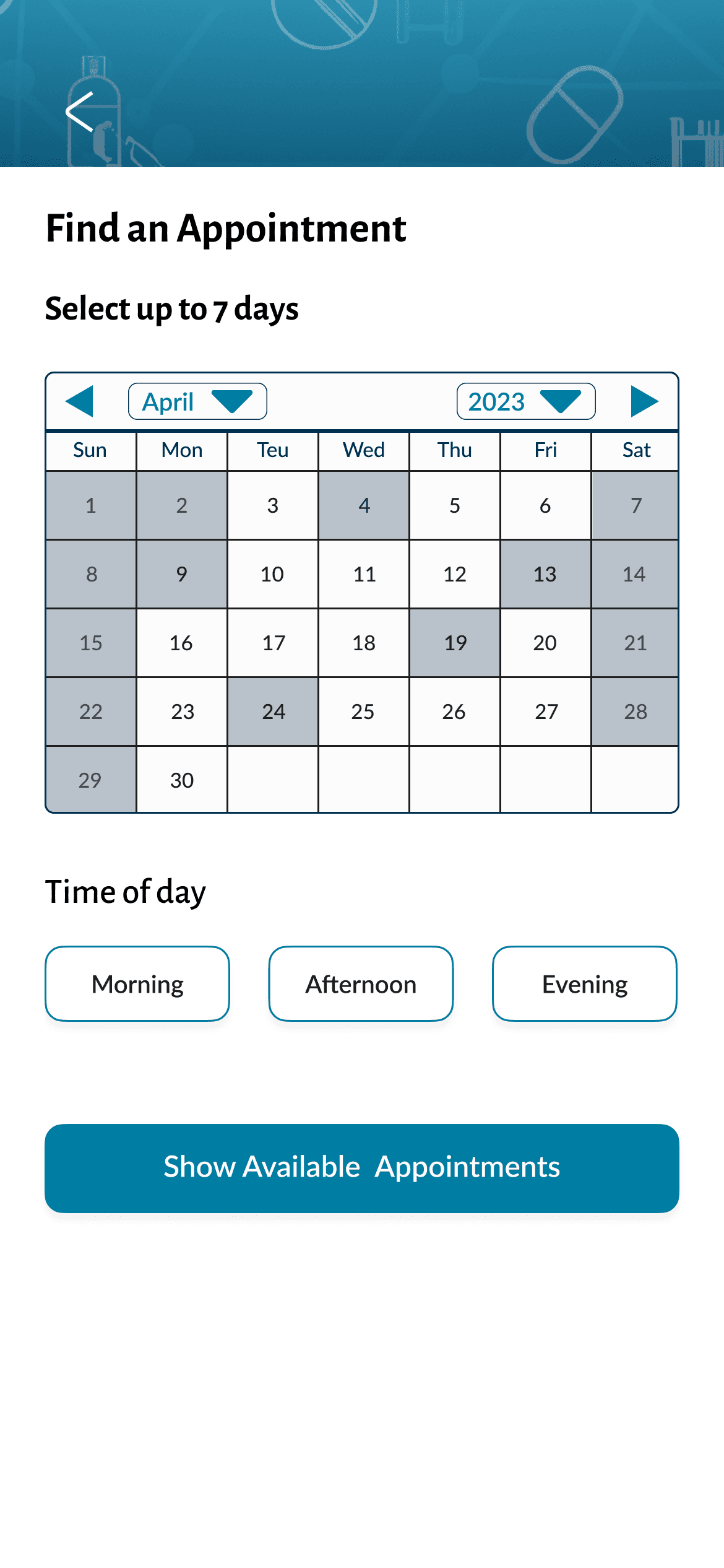
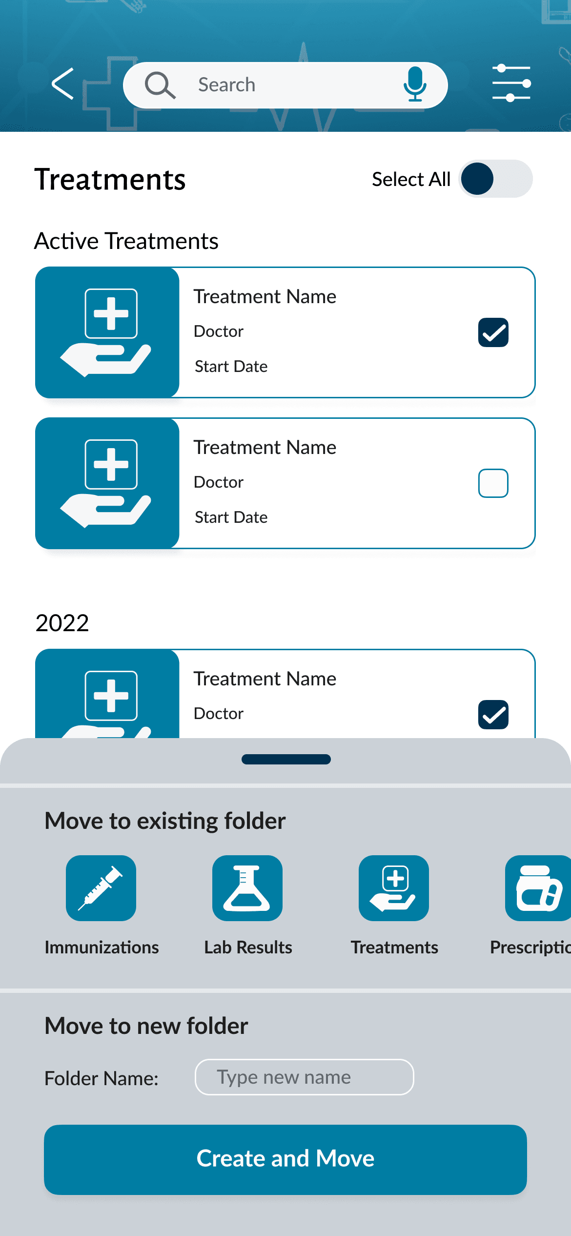
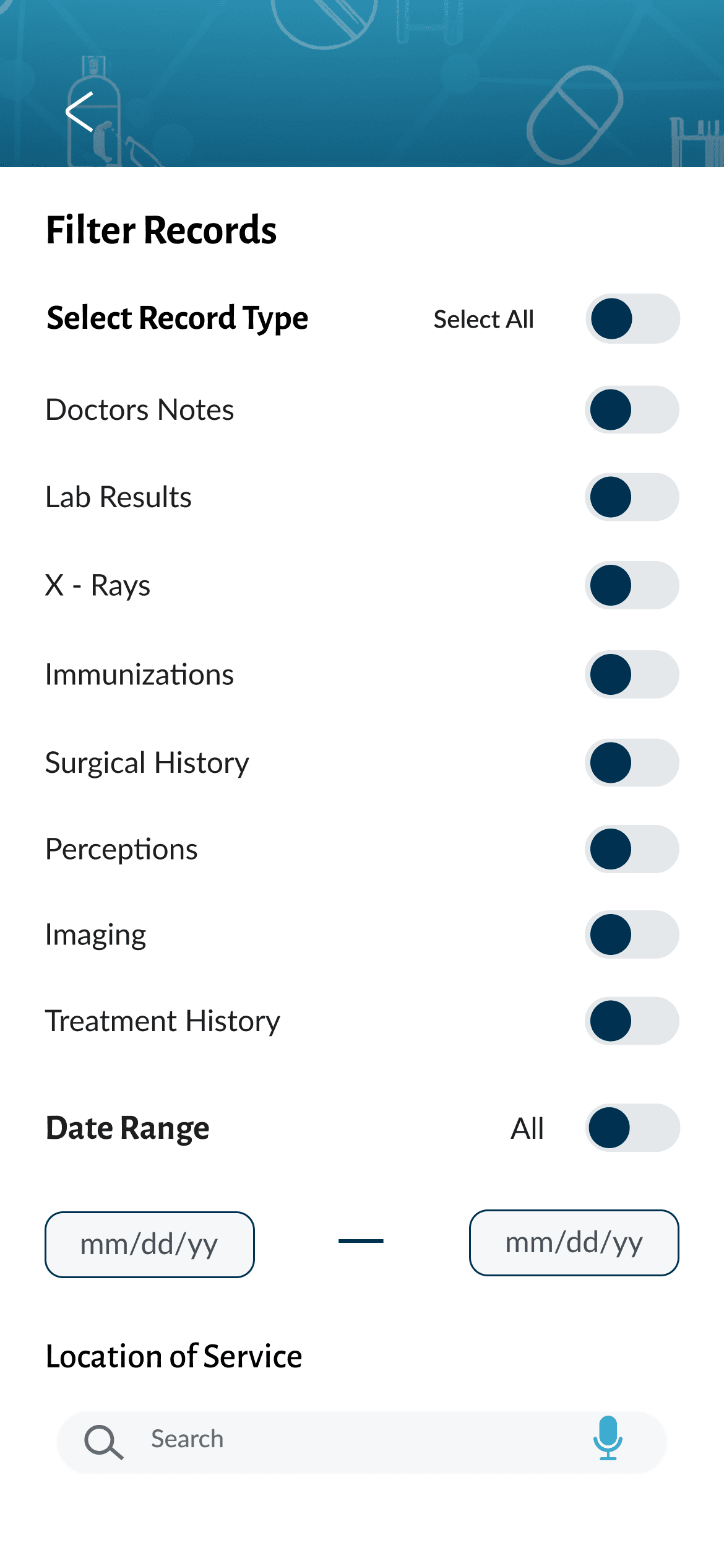
High-Fidelity Wireframes
The final part of this project was applying the design system to the existing mid-fidelity wireframes and prototype.

Learnings & Next Steps
This project was complex not only in subject matter, but also in the technicality of the workflows. Even though I have experience working in the health space as a project manager, I still relied heavily on professional contacts for information and validation.
In many ways, this is why this project was interesting for me to work on because it allowed me to look at patient care through a new lens. While interviewing patients, I learned about the wide breadth of their daily struggles and experiences as they interact with the United States healthcare system and how the lack of access to their medical history impacts them.
I find it interesting how this is a problem that everyone has to face and yet there is not a widely used universal solution. Consolidating medical history and being about to send it to a desired place of service or doctor's office should not be a difficult or time-consuming task, but to many, it is. Why is there not a more streamlined solution available? The answer changes depending on who you ask.
Regardless, I hope this project brings inspiration to those actively driving the health technology industry forward.
While not in the scope who this project, here is a list of items which could be expanded on.
Treatments: Currently, there is only one type of treatment plan mapped, but the design will need adjustment to account for other medical treatments including, but not limited to, cancer, viral infections, surgical/procedure prep, and prenatal. Building these templates will require expert consultation so patients have the correct information.
Payments: Currently, patients can make payments and add payment methods, but this workflow lacks the ability to make payment plans or request itemized bills. These features are nearly impossible to build without help as different organizations have different opinions on both topics. Plus, insurance companies are also needed if patients want to see what part of the bill their insurer paid compared to their portion.
Scheduling: The app currently allows patients to find places of service and make appointments, but it fails to account for treatments that require multiple visits (chemo or prenatal), referrals (for specialty visits), or special requests (a patient may need an interpreter, sensitive to bright light or noise, prefers to be called a different name than what is on their birth certificate, etc.)
Additional functionality: I want to build a messaging center, a resource hub, and an age-appropriate version for kids.
UI: While the UI was not the main focus, slight adjustments to the cards and animations would improve gamification and enjoyment of use.

