

Arrow
Project
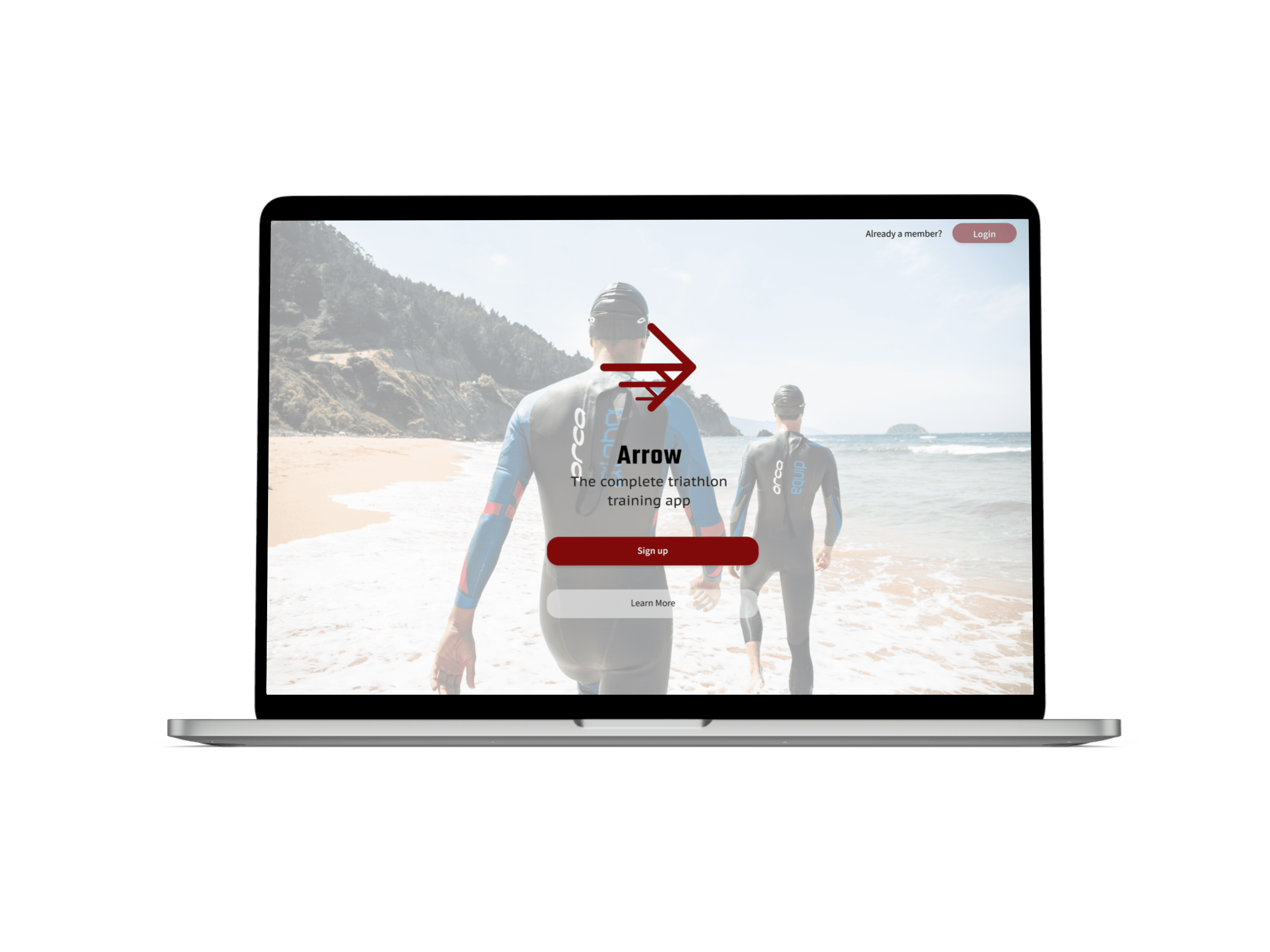
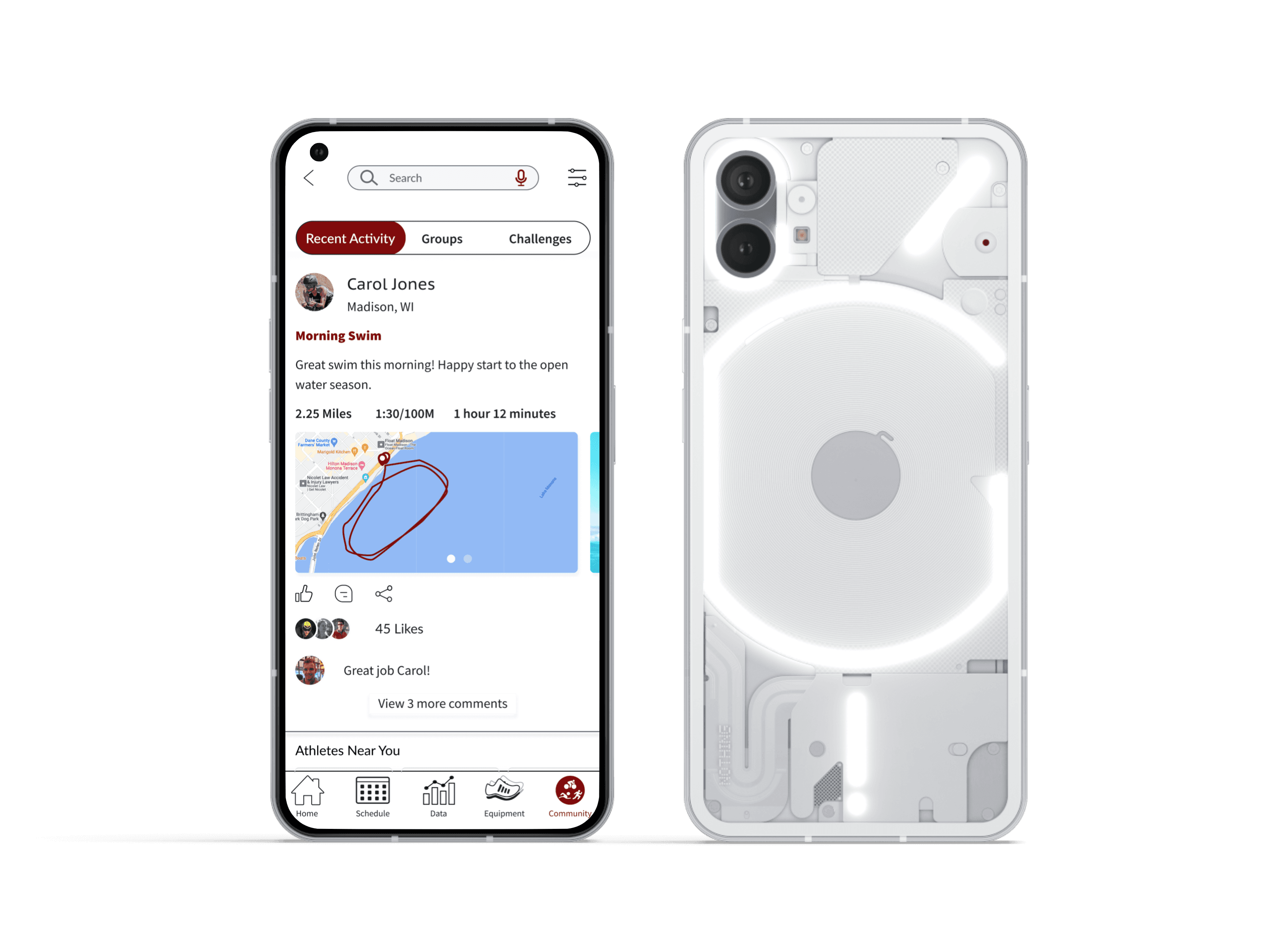
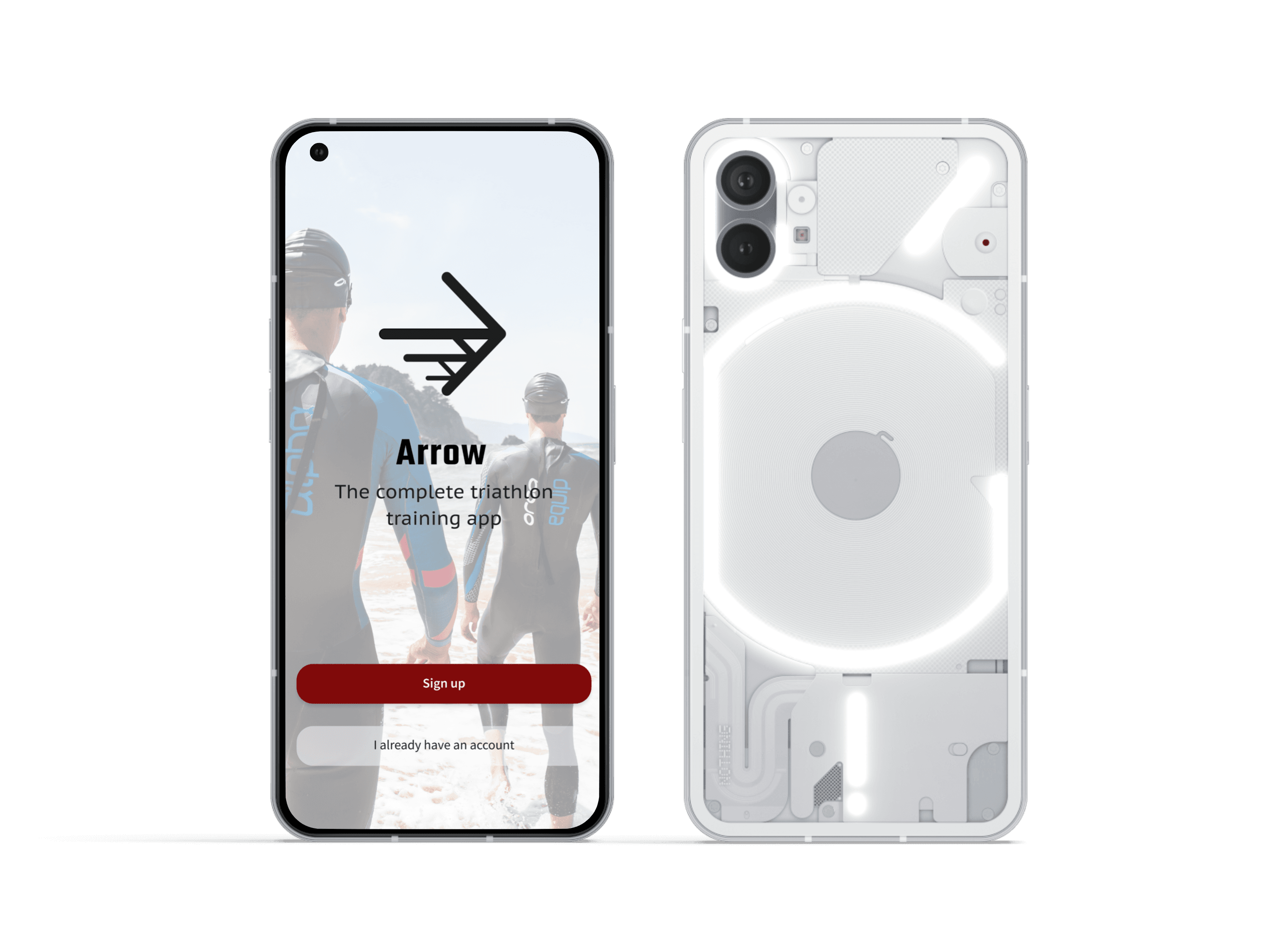
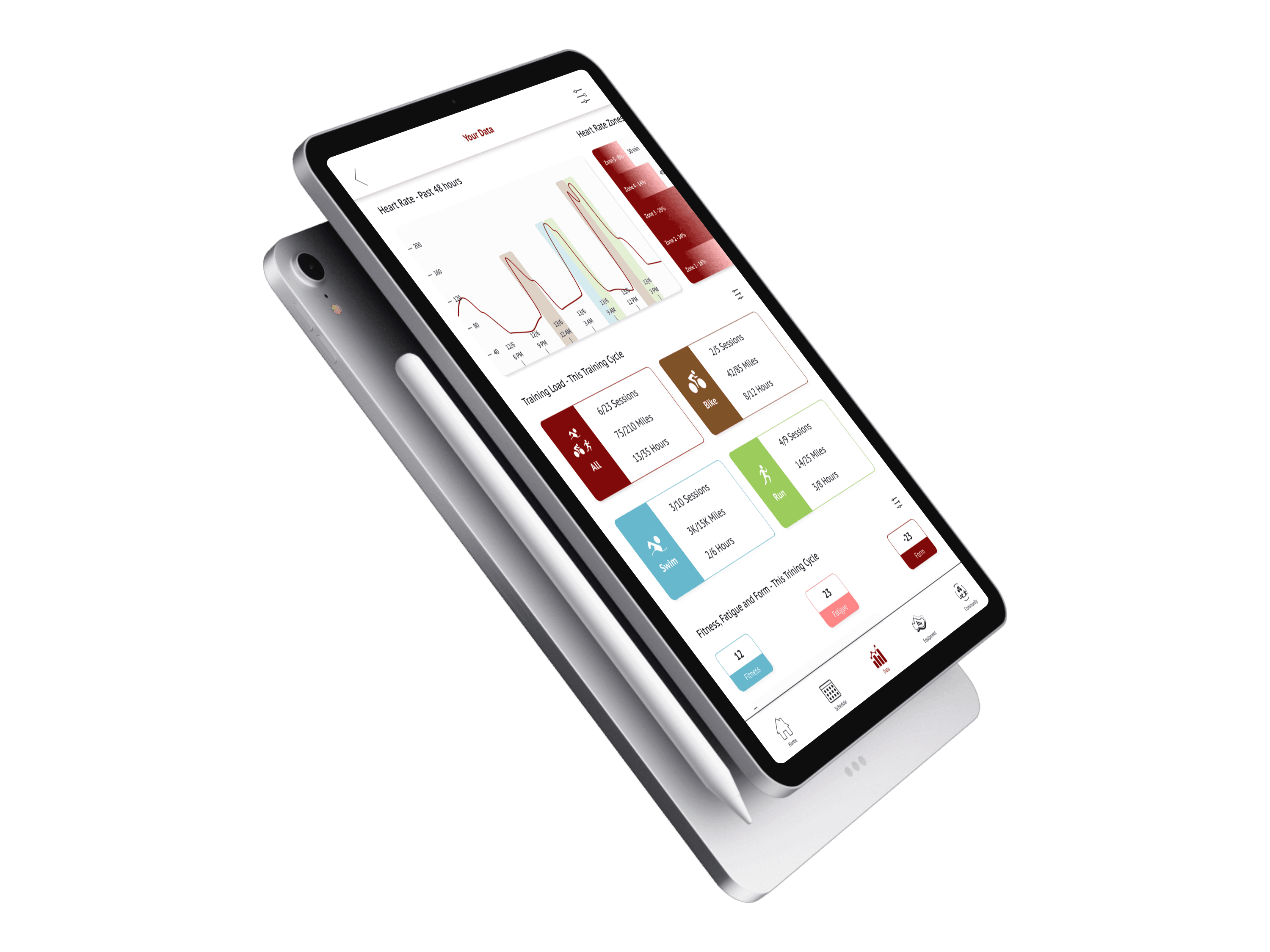
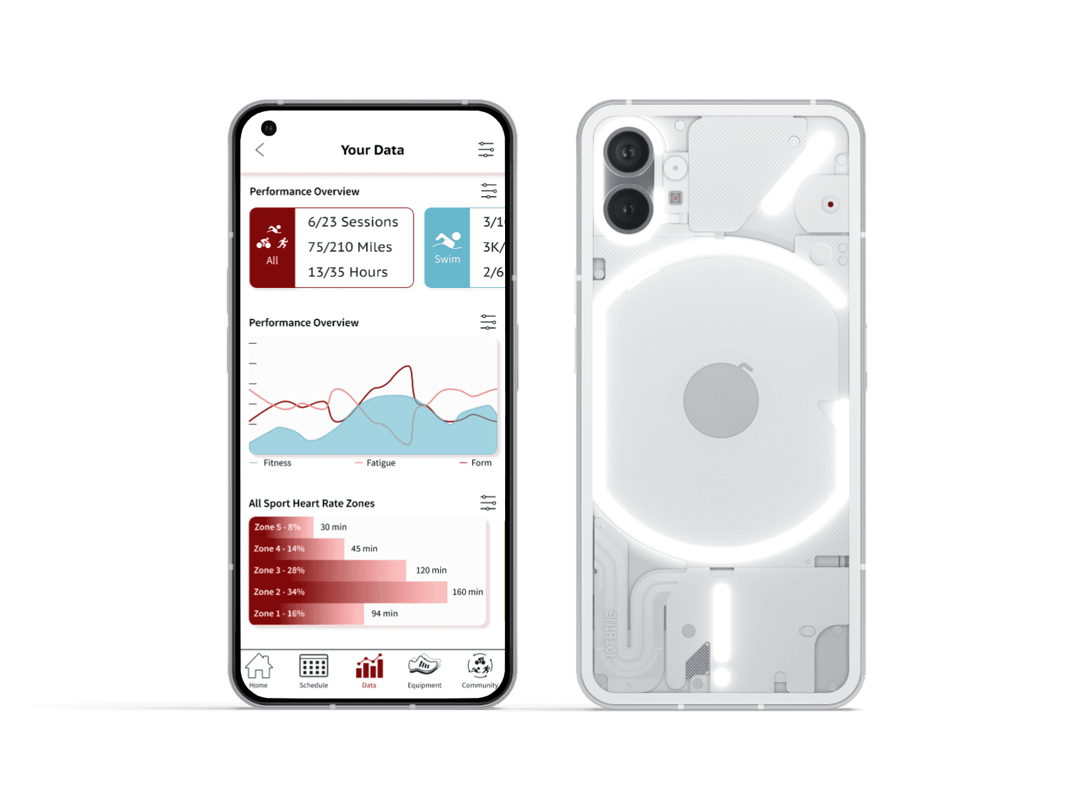
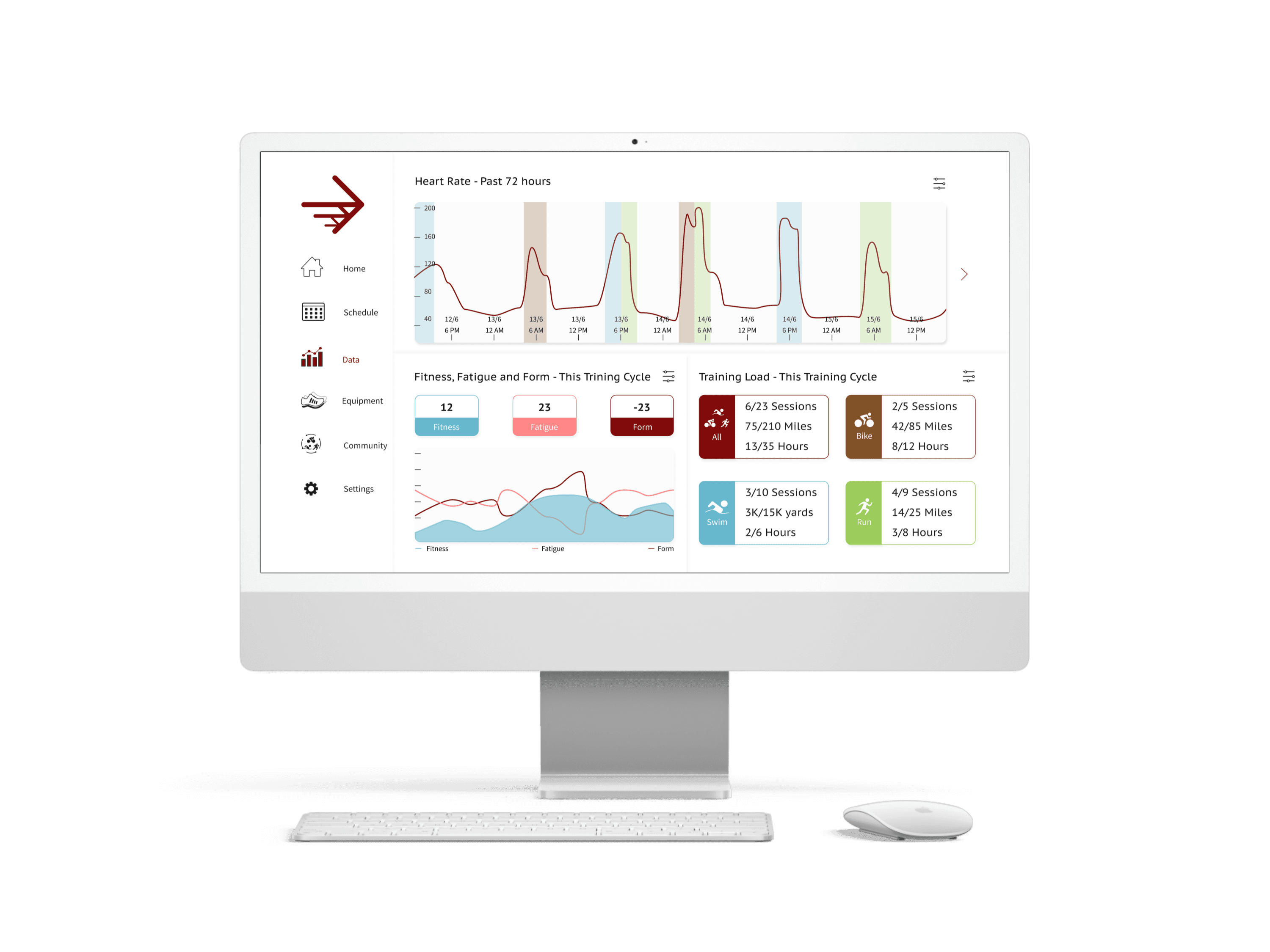
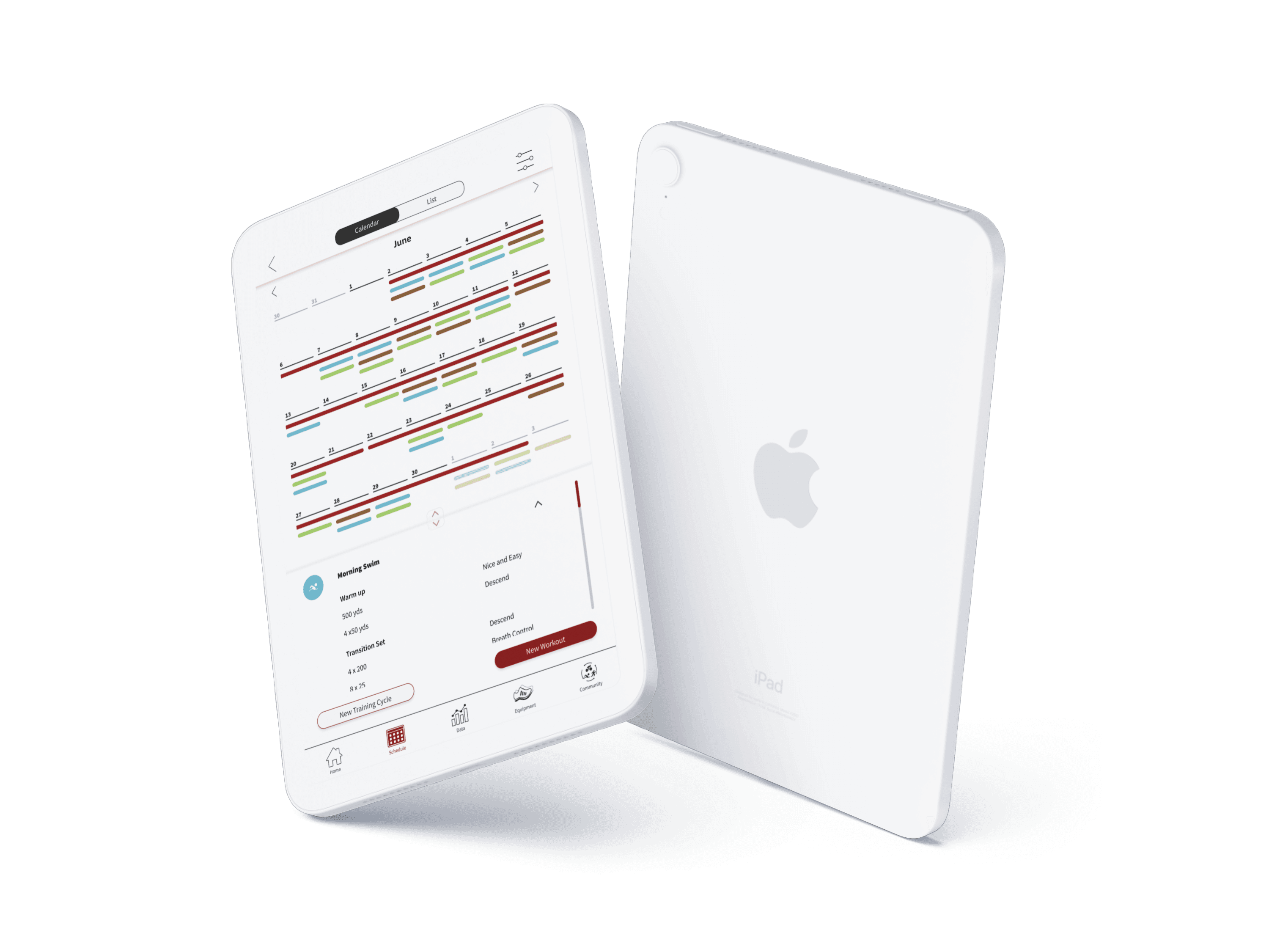
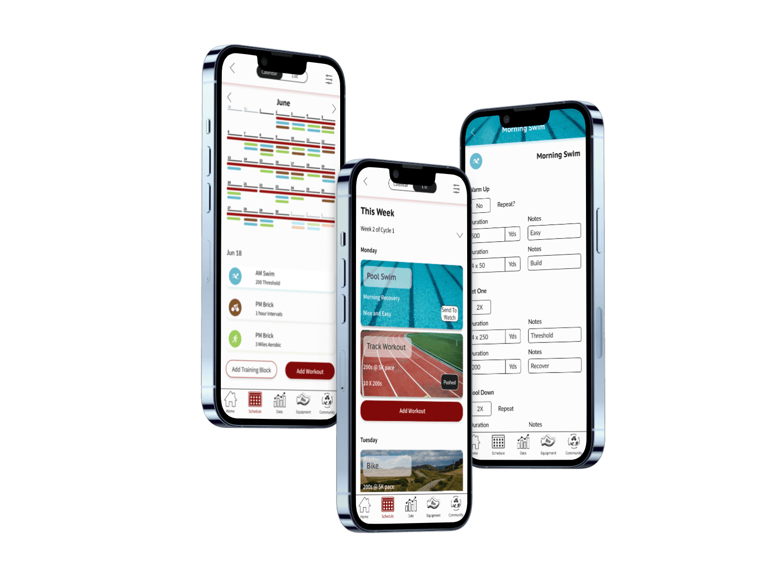
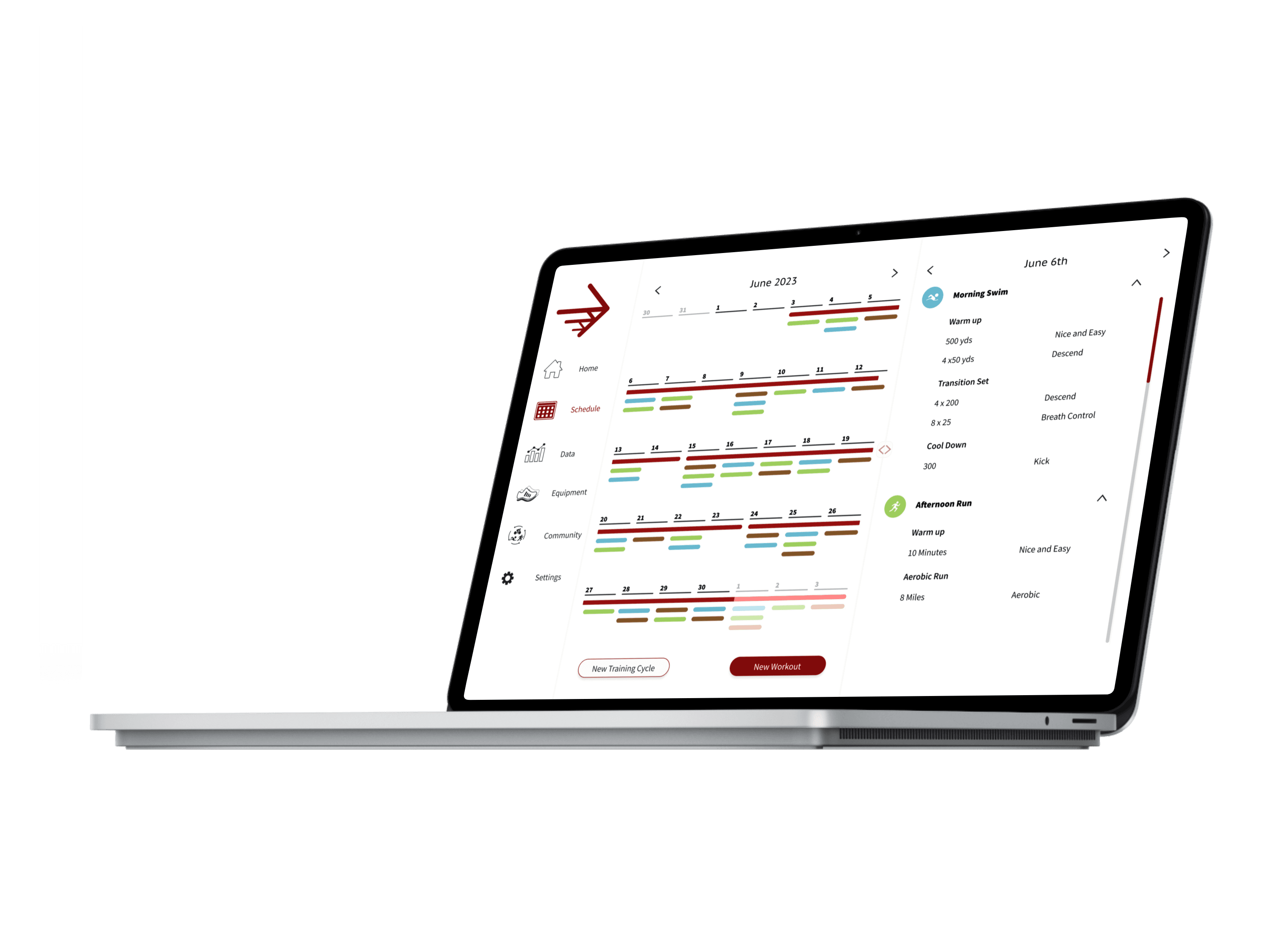
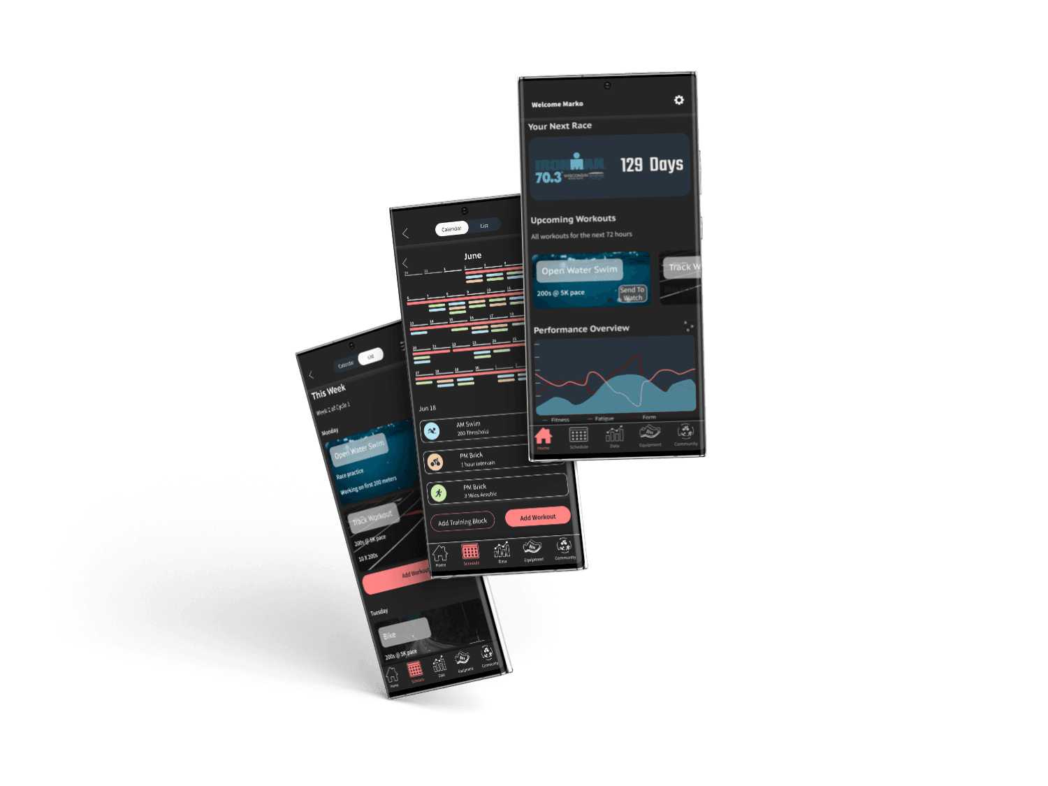
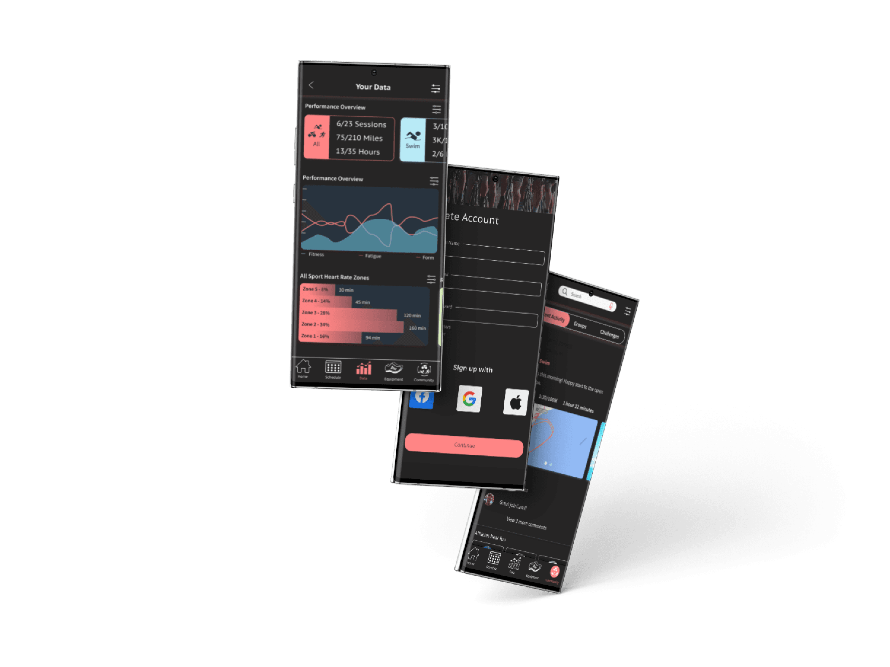
Arrow is a web-based application that provides a streamlined training experience for triathletes competing at all levels. Athletes can create training cycles and workouts, track equipment usage and training data, and interact with athletes in the community.
Challenge
After watching my boyfriend and mutual friends struggle to streamline their training, I decided to formulate a new solution. Many triathletes toggle between multiple applications, each with a specific use (workout management, social interaction, data analysis, etc.). While each application works well in its own space, athletes often jump between apps to view desired information. A platform that consolidates their information would add tremendous value to these athletes because it would allow them to spend more time on their training and less on management.
Jump To Final Mockups
Timeline
User Interviews
3 participants
1 Hour Sessions
7 Questions
?
Sample of Questions Asked
Initial Findings
Athletes use 4+ applications on average.
Must be compatible with Garmin technology because athletes use a combination of a watch, bike computer, and heart rate monitor to gather their training data.
All accept that using multiple applications is not ideal, however, they tolerate this current solution because an app for all of their needs does not exist.
User Personas
Pro Triathlete
Married
35
Needs
Ability to sync with other training equipment such as watches, heart rate monitors, pedals, and her bike computer.
View her data over custom time periods.
Track equipment usage.
Upload workouts to her watch or computer.
Frustrations
Using multiple apps to manage her training.
Not being able to transform the data the way she wants.
How difficult and time consuming it is to edit workouts and push them to her watch.
Delaying her training because her technology is not working.
Motivations
Placing top 3 at IronMan World Championships.
Compete in at least 5 races in the pro circuit and place top 5 in at least 3.
Brands

Age Group Triathlete
Single
21
Hunter Wicks
A platform he can track his progress.
Ability to keep up with his club teams training.
The ability for his coach to write workouts for him and allow him to edit them if needed.
Put races on the calendar.
Needs
Motivations
Continue to improve.
Compete in the same races as his teammates.
Build his connections in the community.
How expensive the sport is.
How some of his technology doesn't sync easily.
Wasting time trying to customize workflows that fit his training style.
Frustrations
Brands


User Flows
Signup and Onboarding
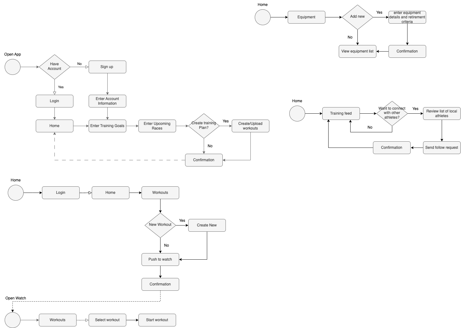
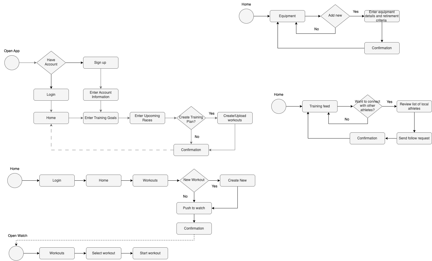
Most athletes plan their season around their 2 - 4 primary races. Having the ability for athletes to enter their racing during the onboarding process will allow them to build their training plans accordingly.
Athlete Connection
The triathlon community is an important part of the sport for many athletes. This flow outlines how athletes would connect with friends, teammates, or other local athletes.
Track Equipment Usage
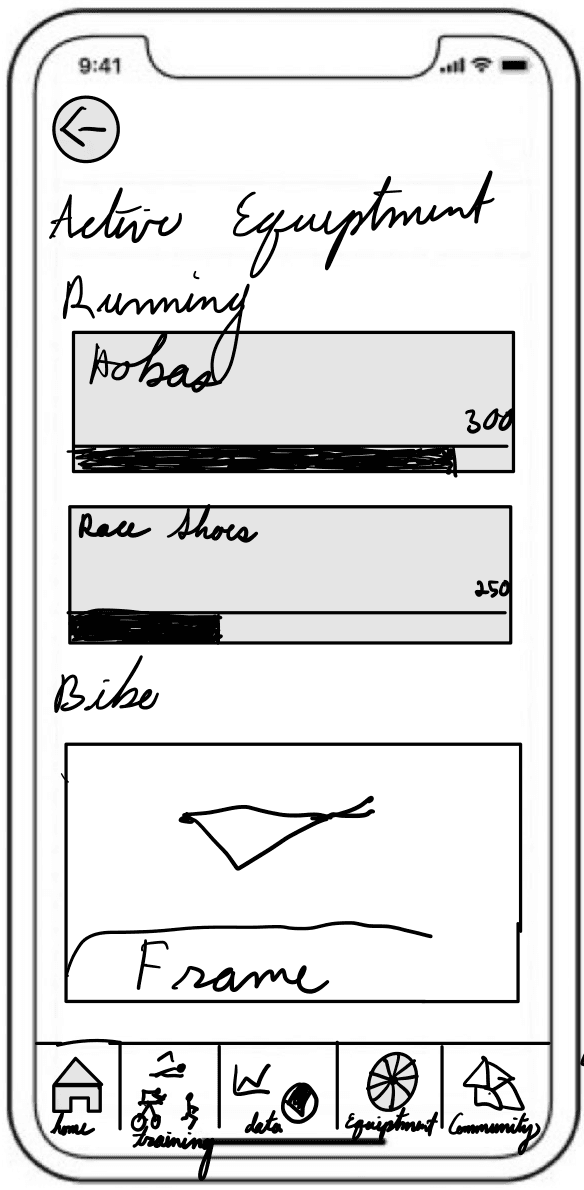
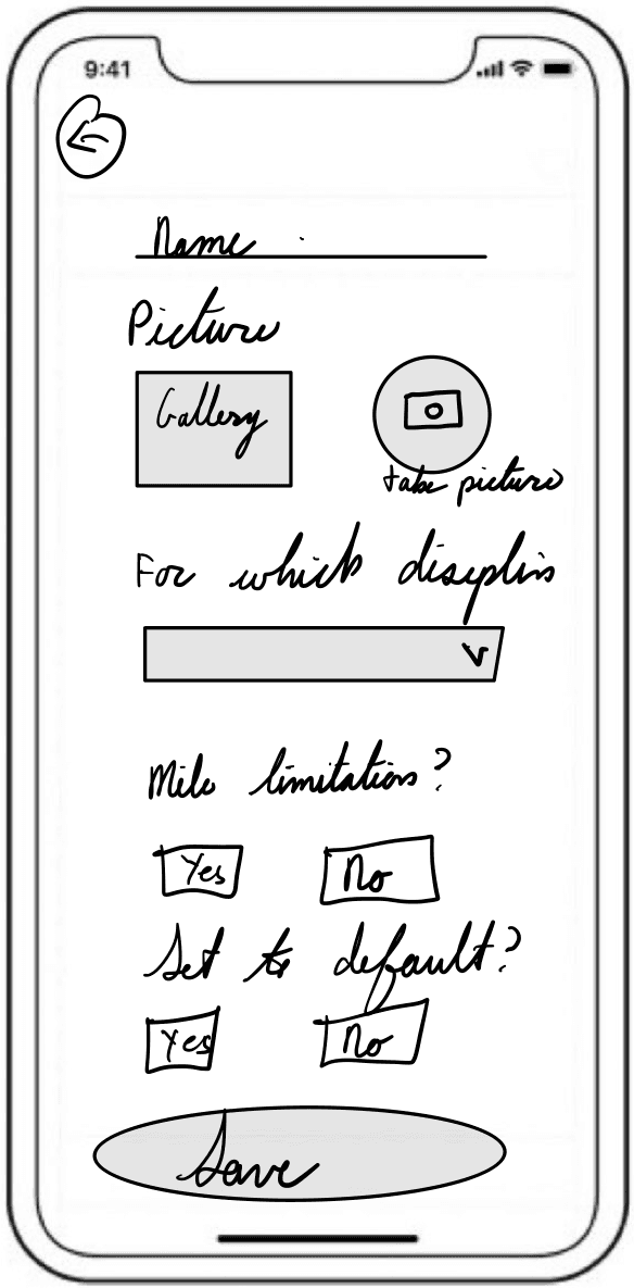
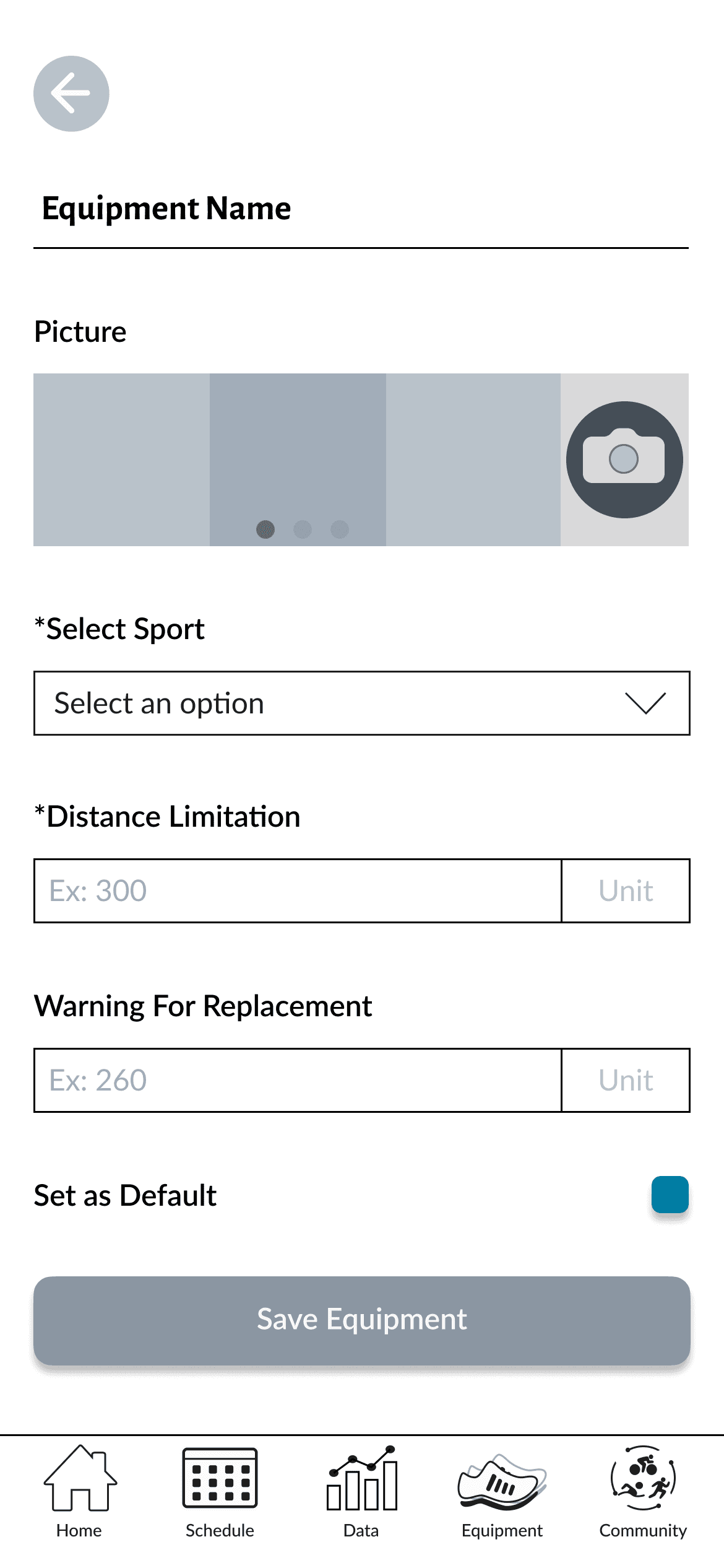
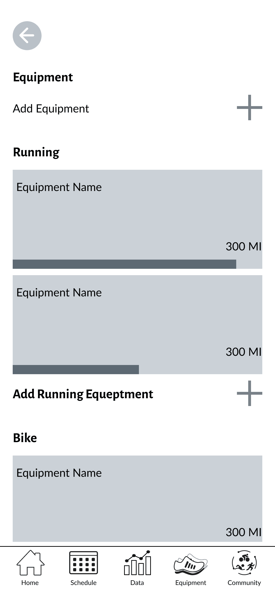
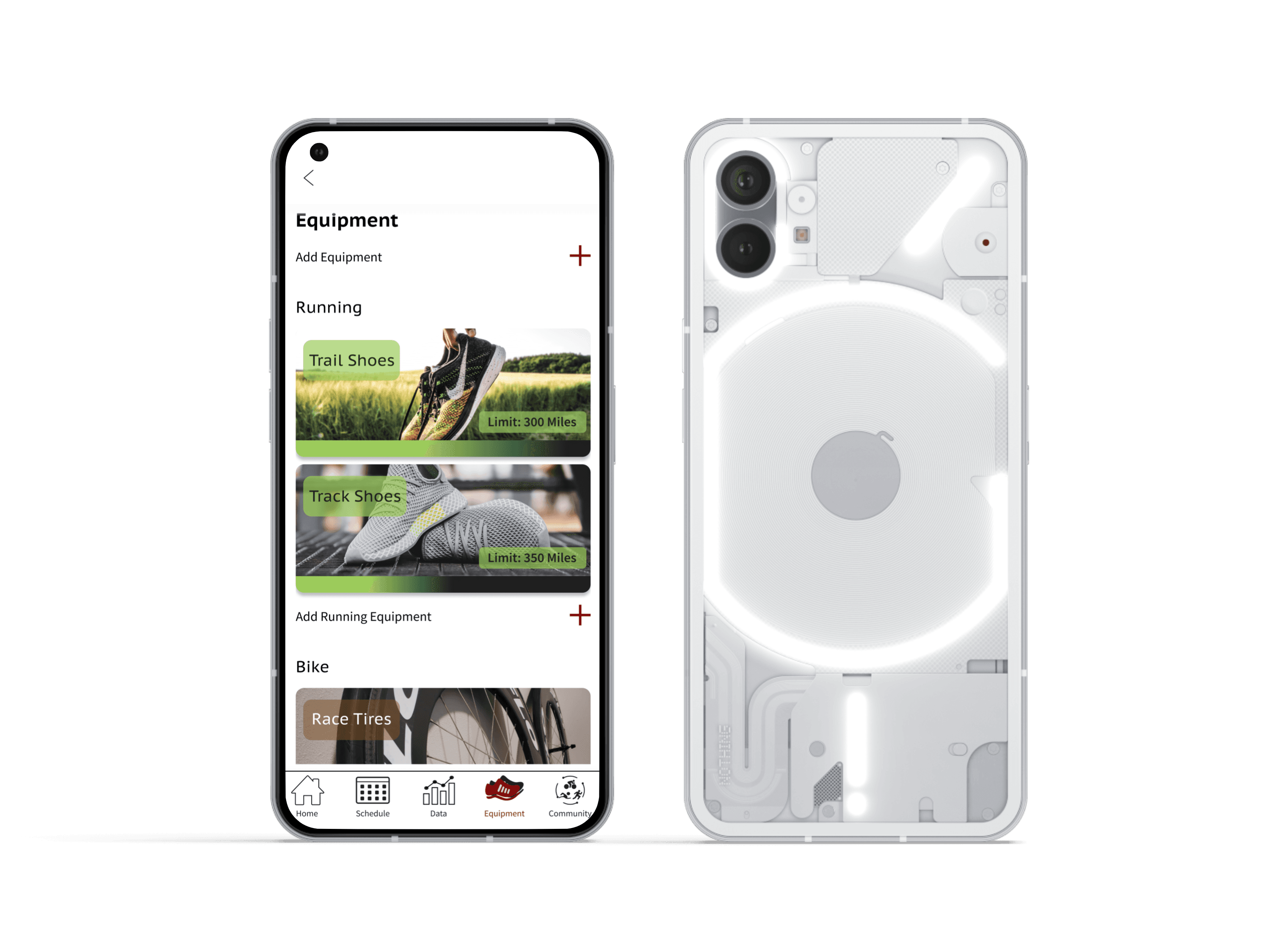
Many pieces of equipment that triathletes use have limited use (for example, running shoes have a limit of 300-400 miles). Thus the ability to easily track these limits is valuable for the athletes and their coaches.
Low Fidelity Wireframes
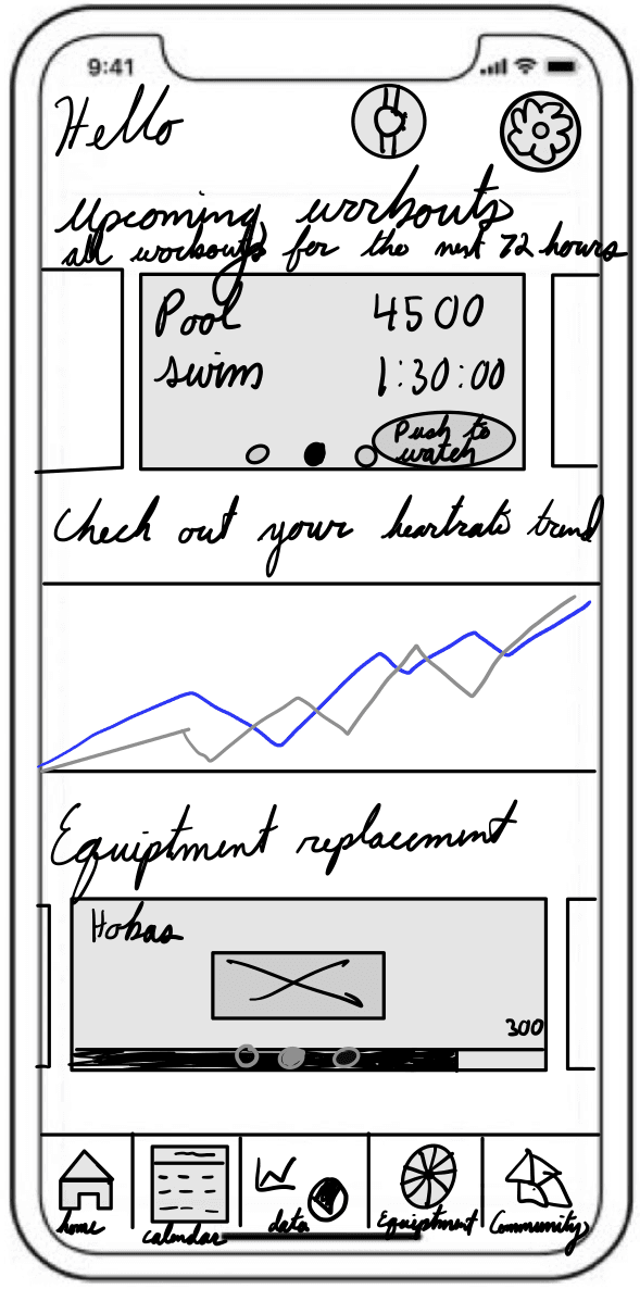
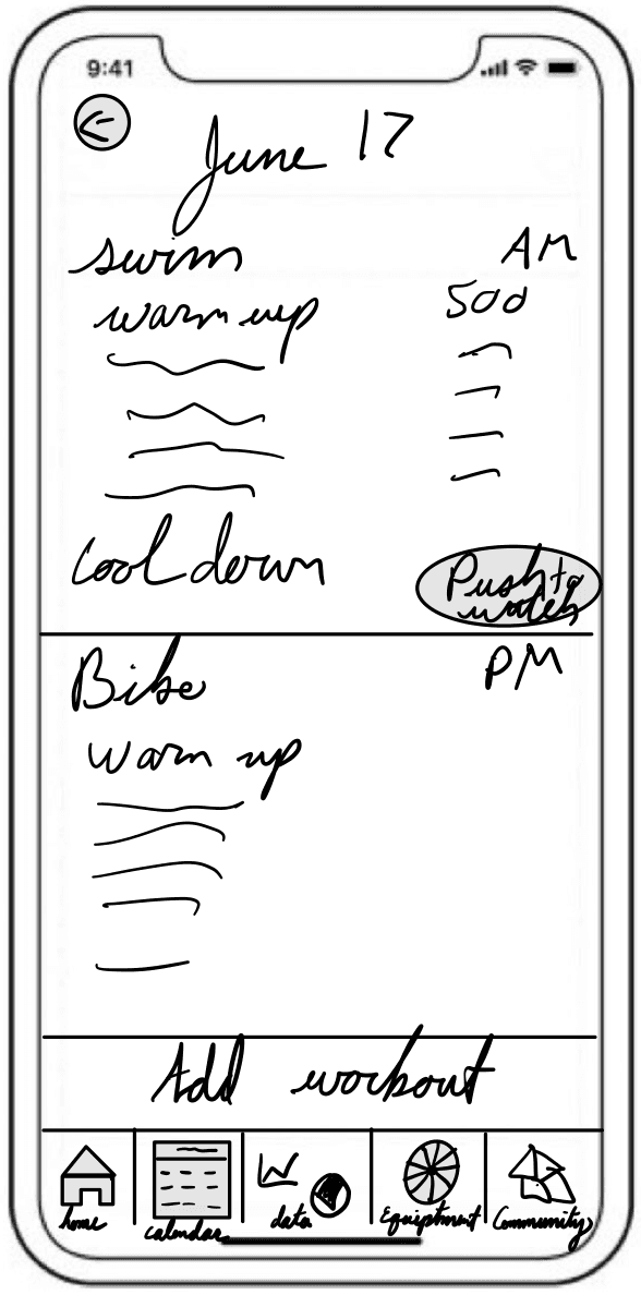
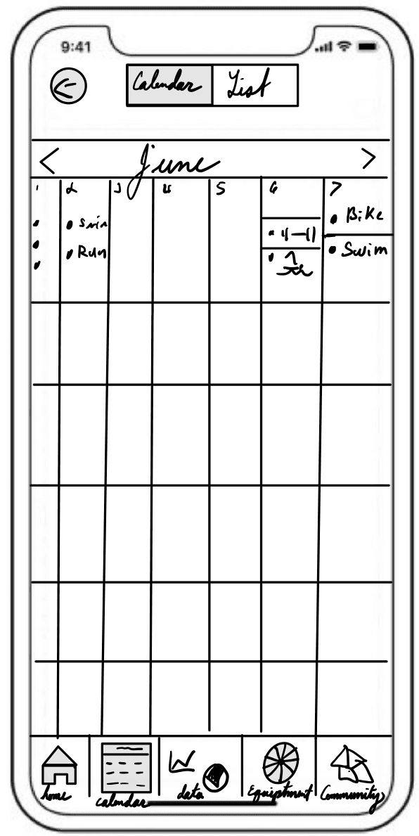
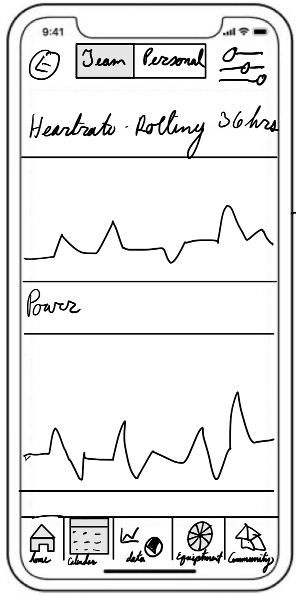
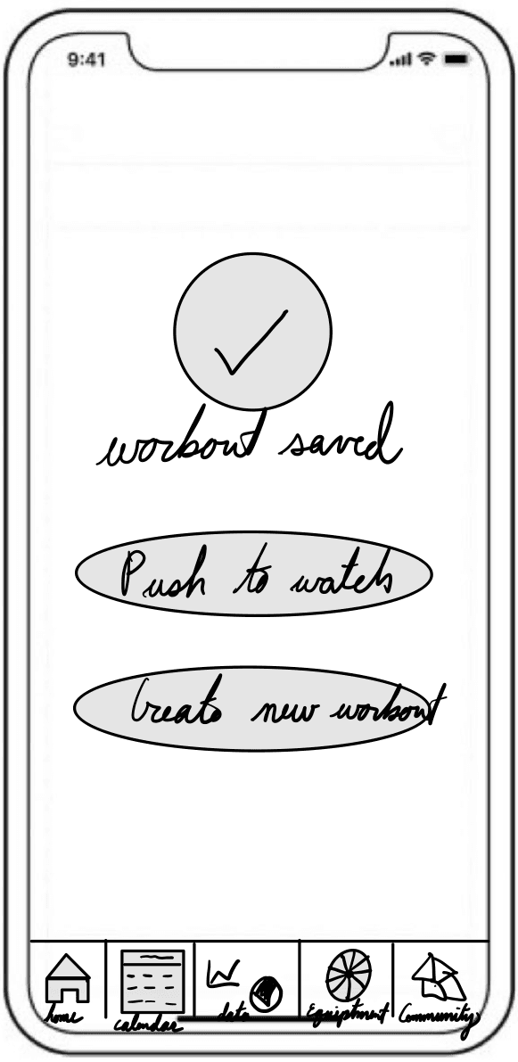
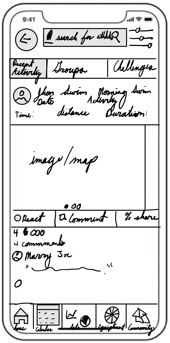
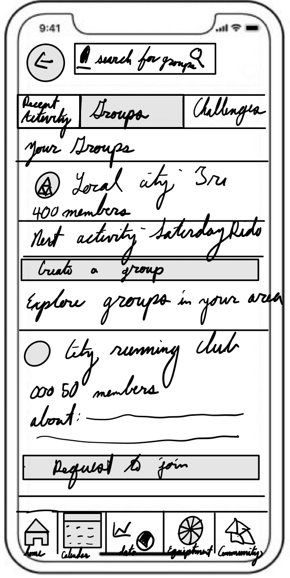
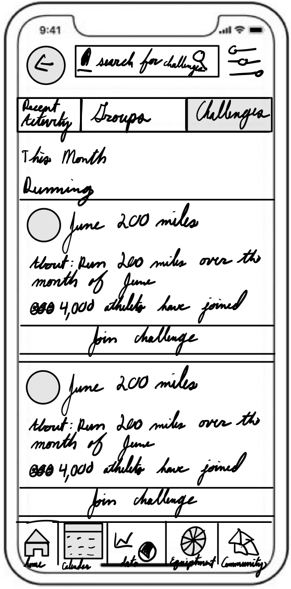
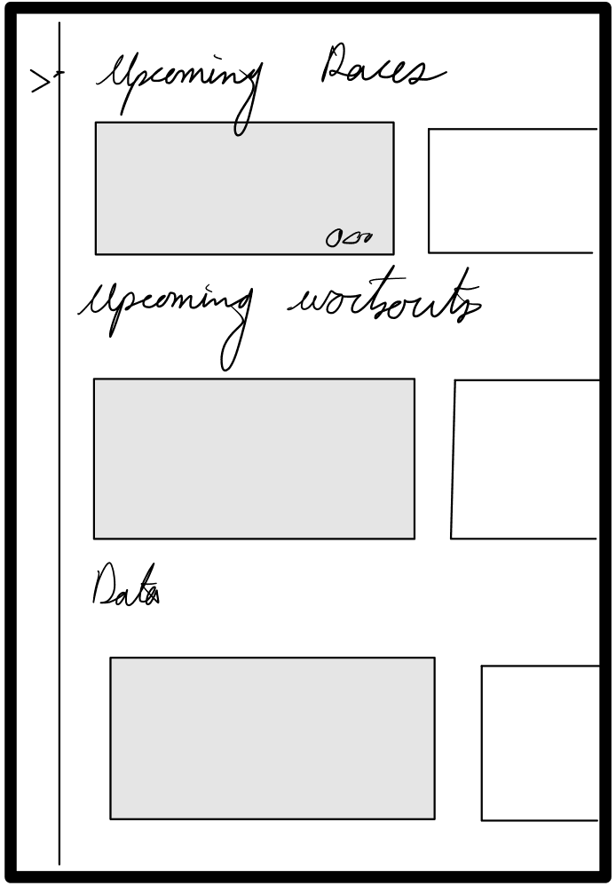
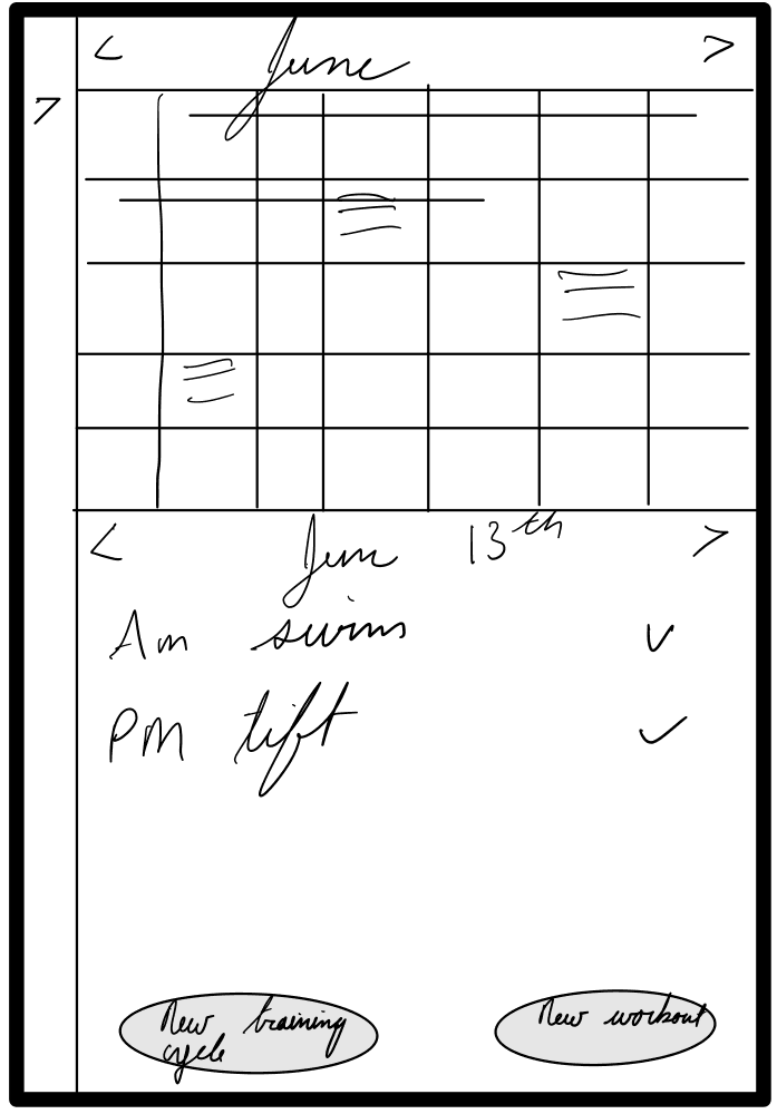
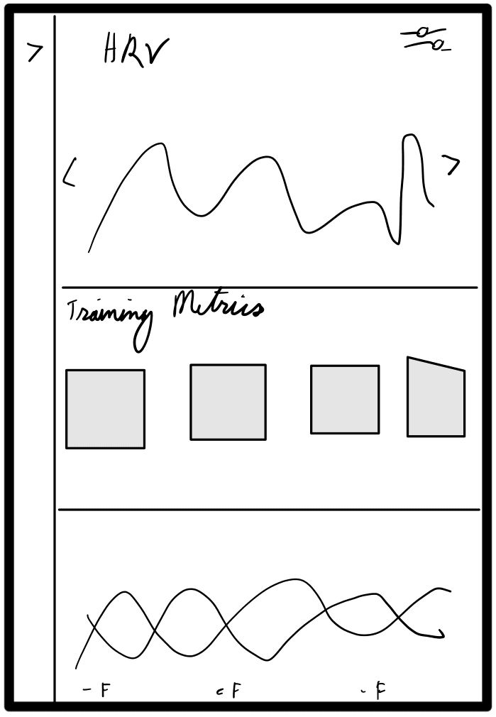
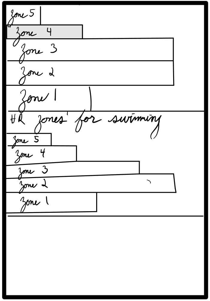
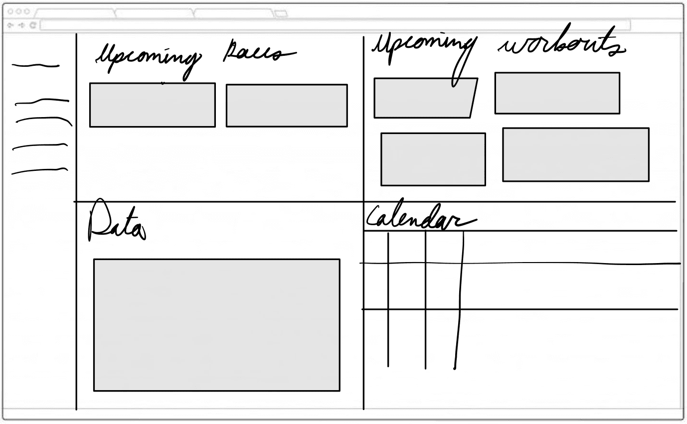
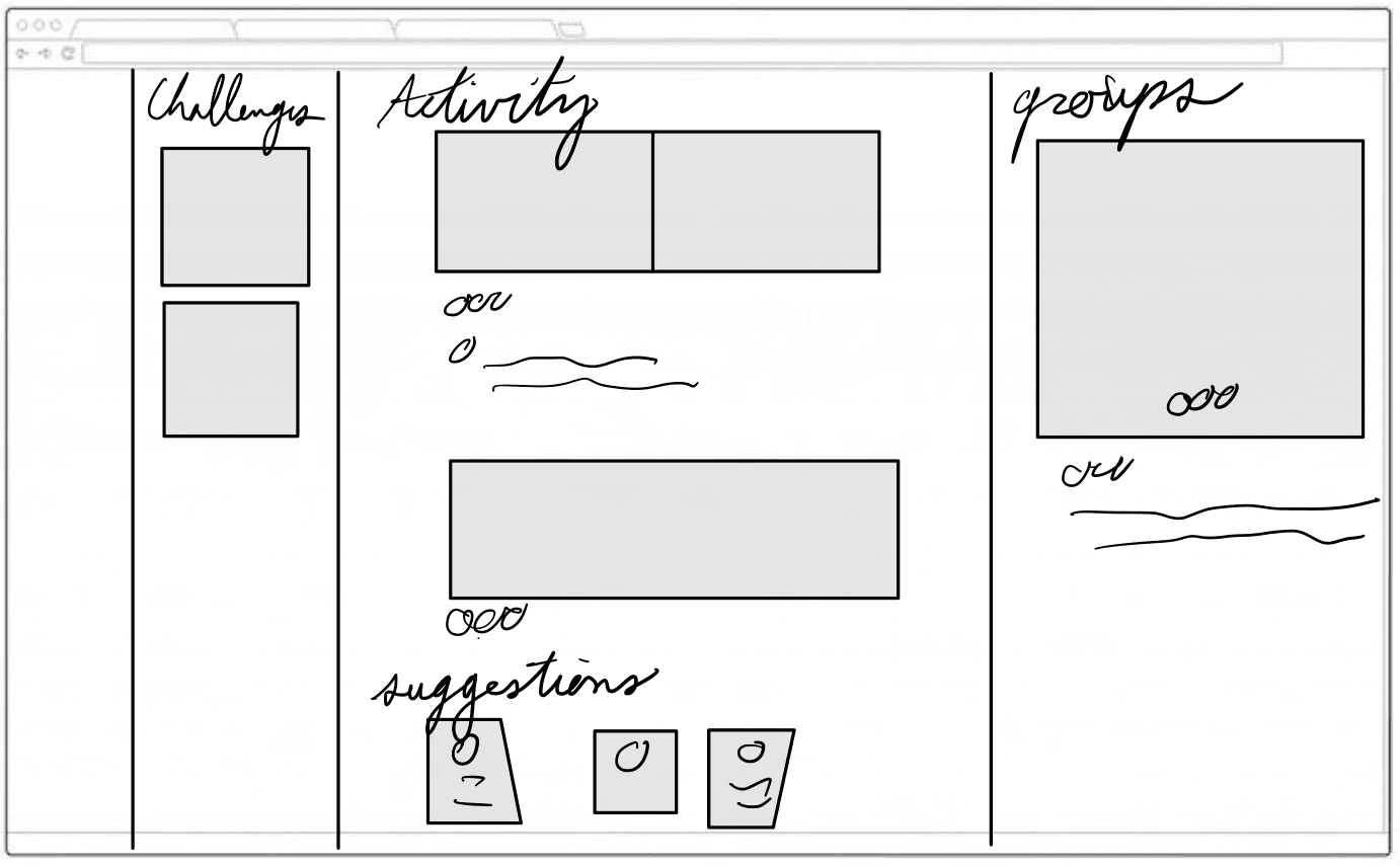
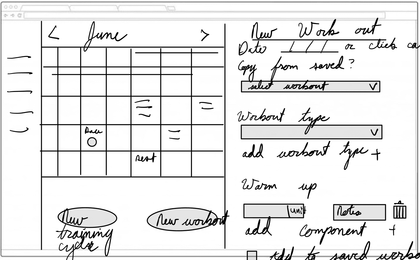
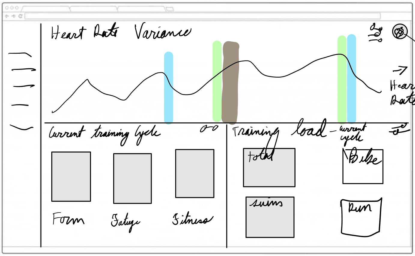
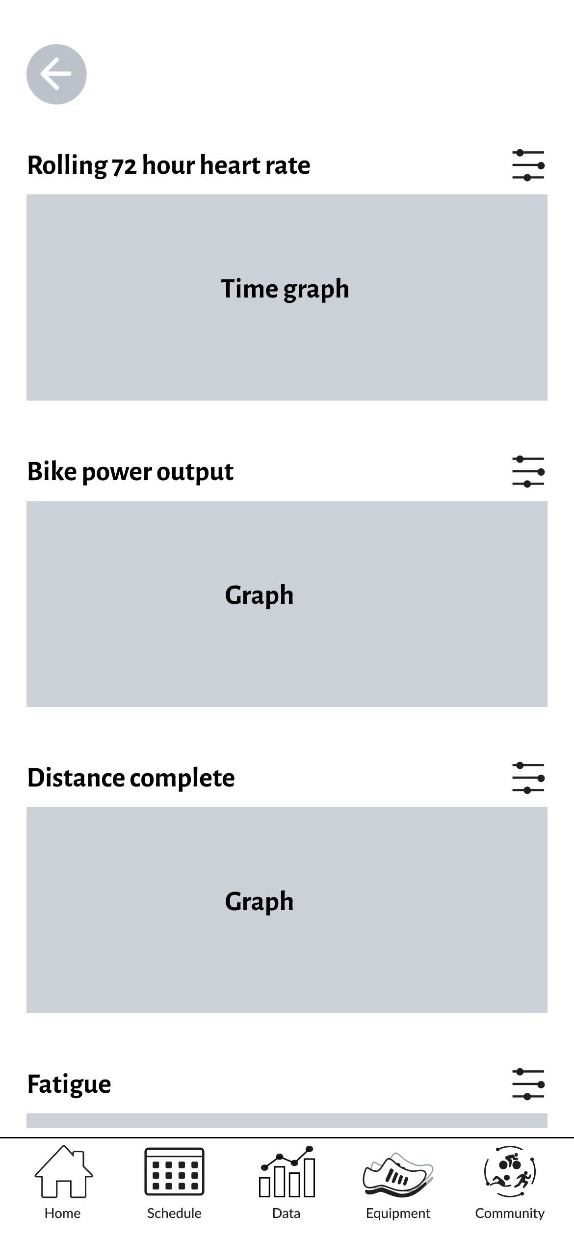
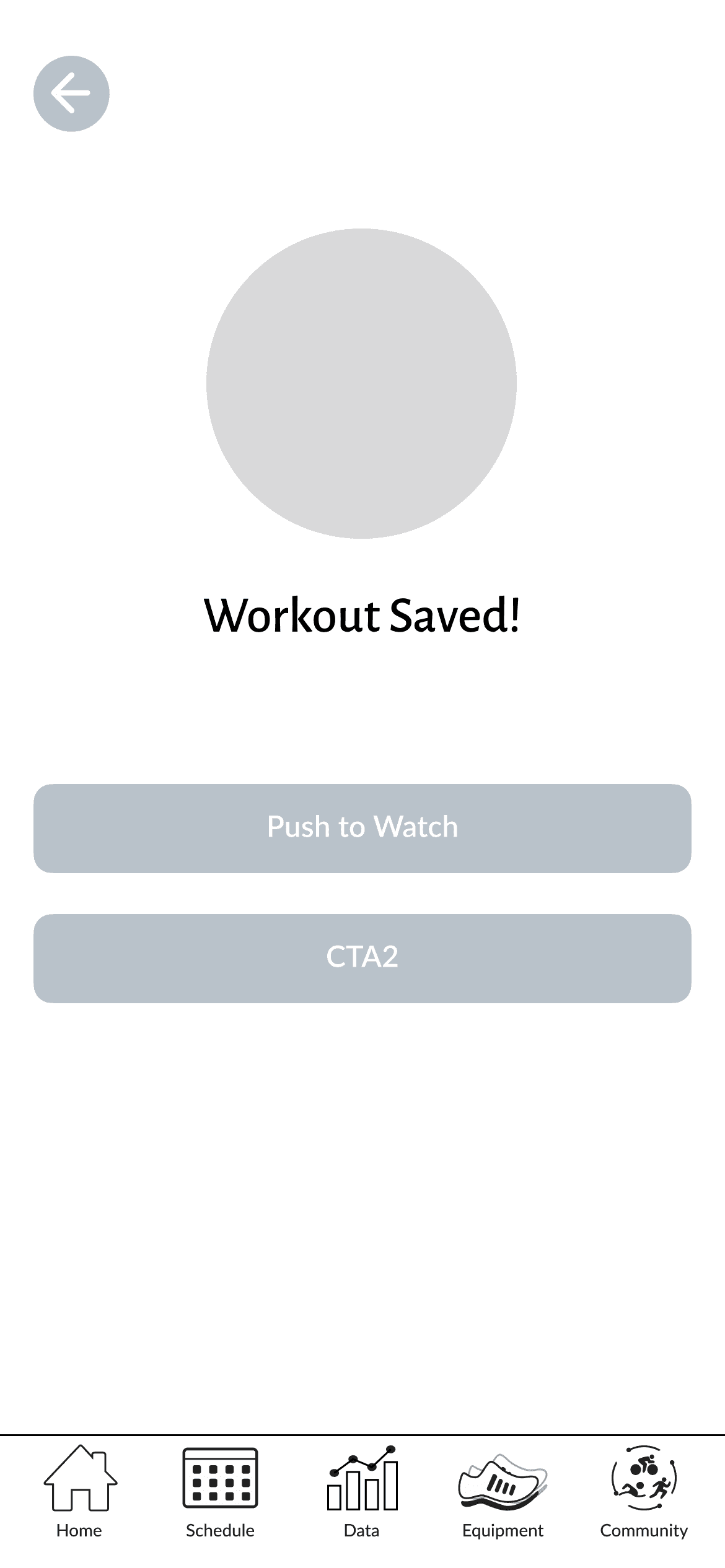
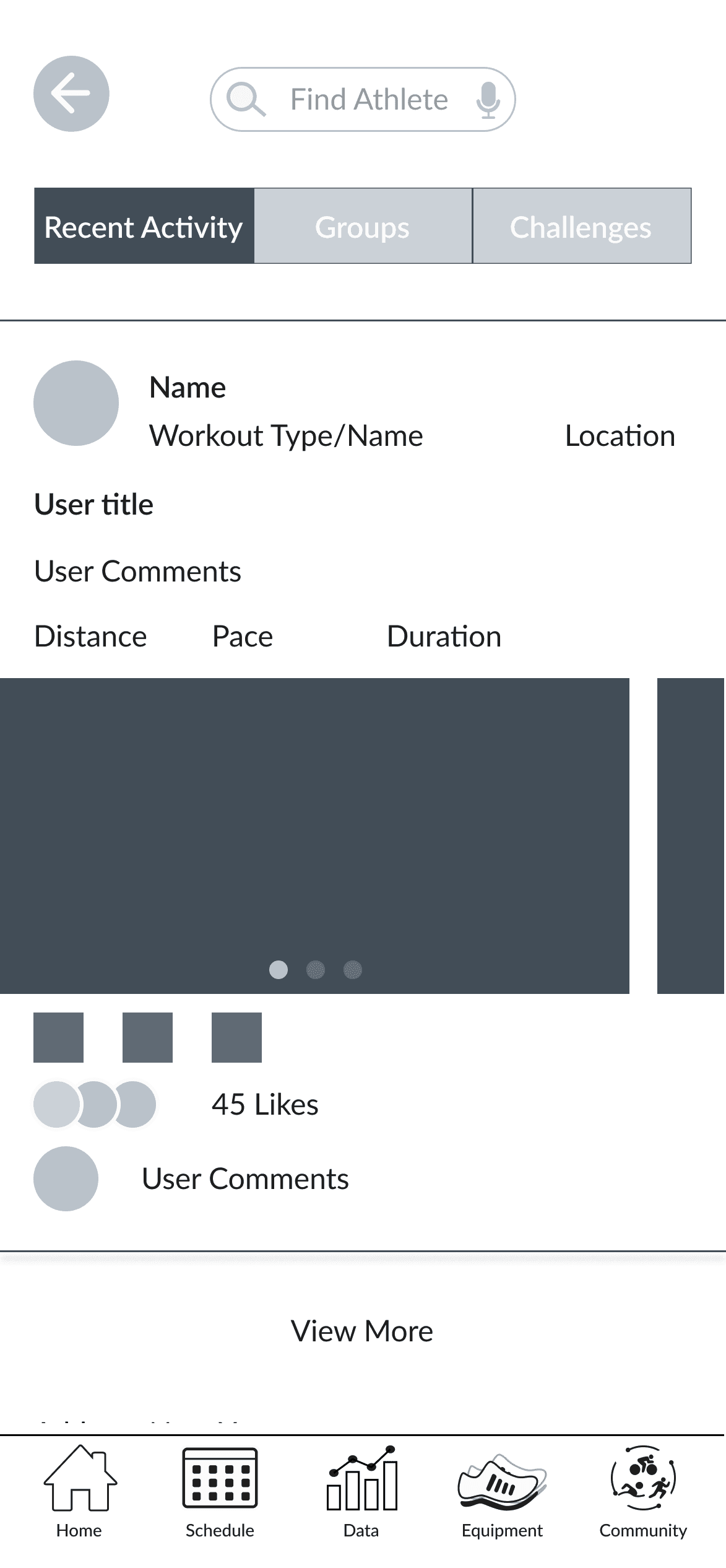
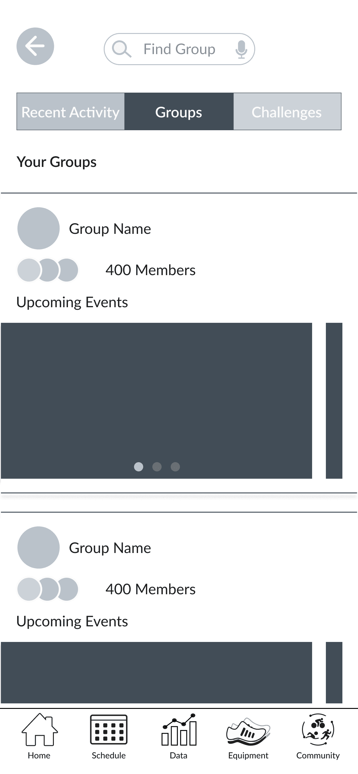
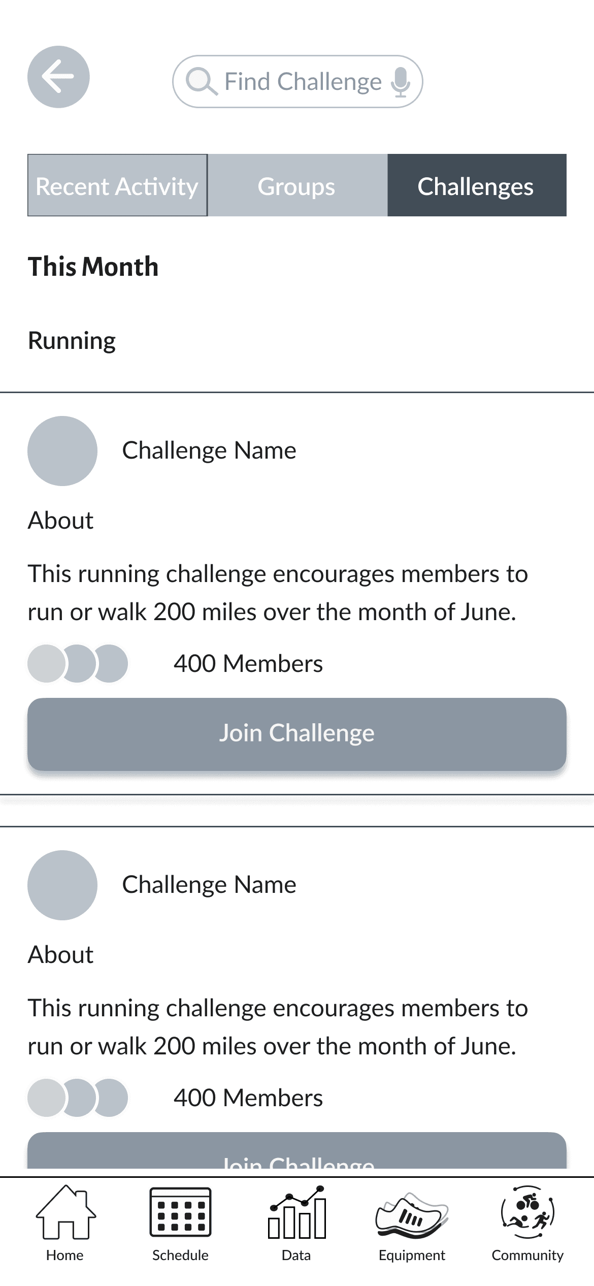
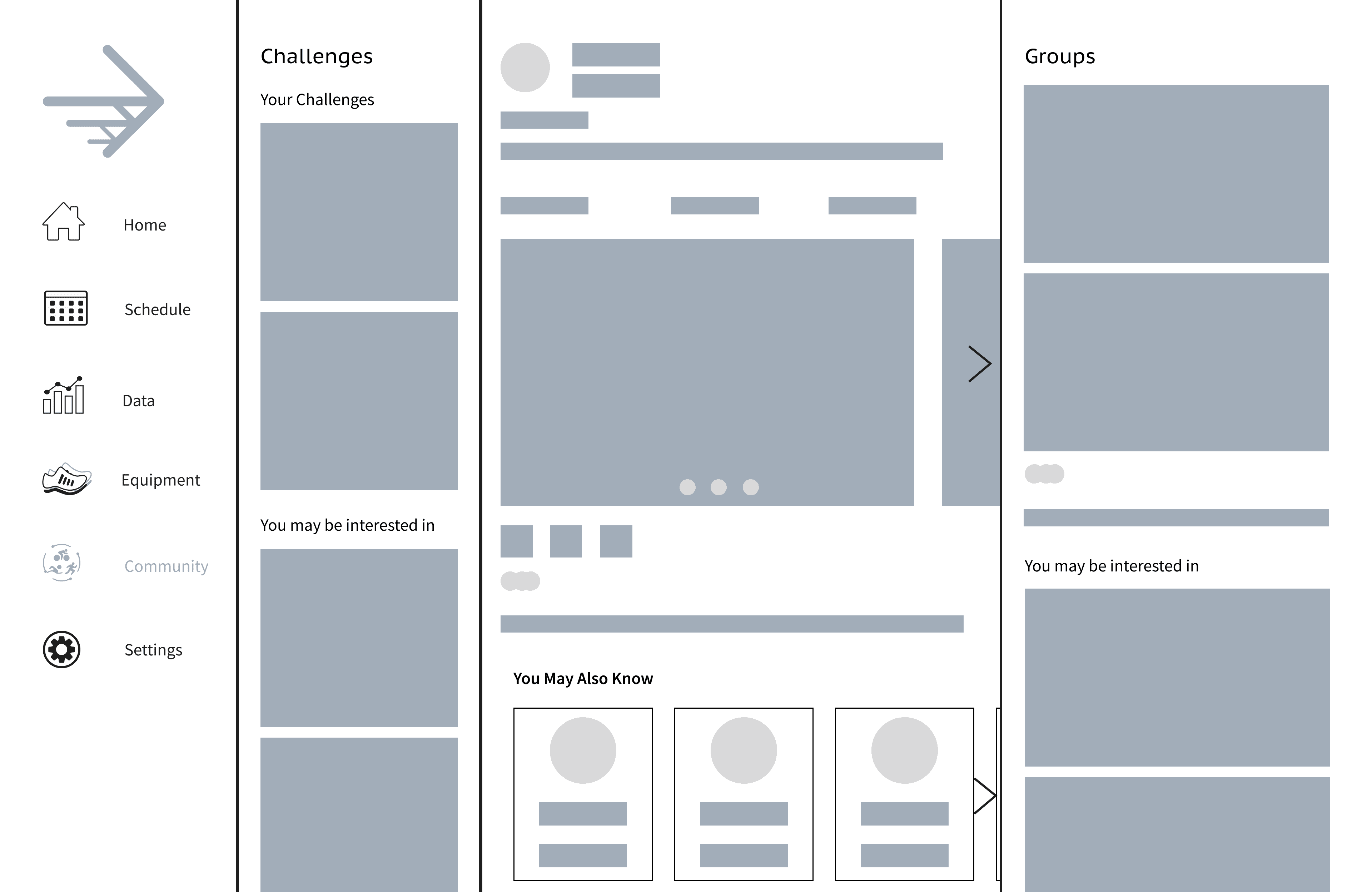
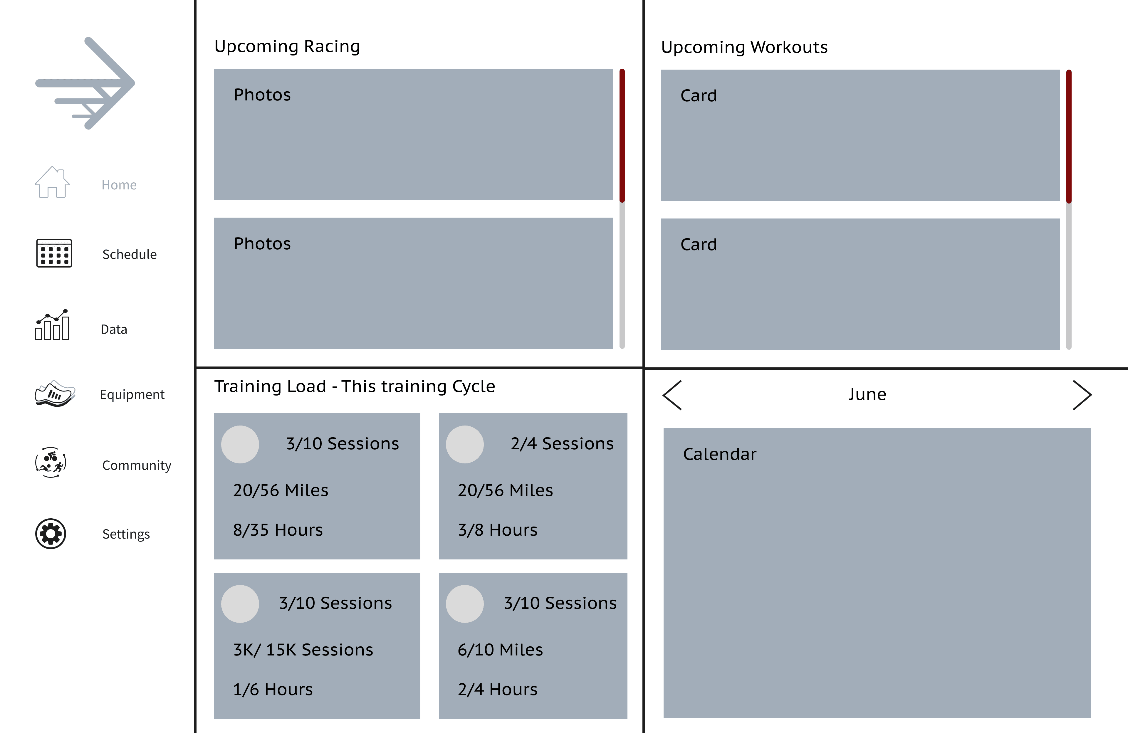
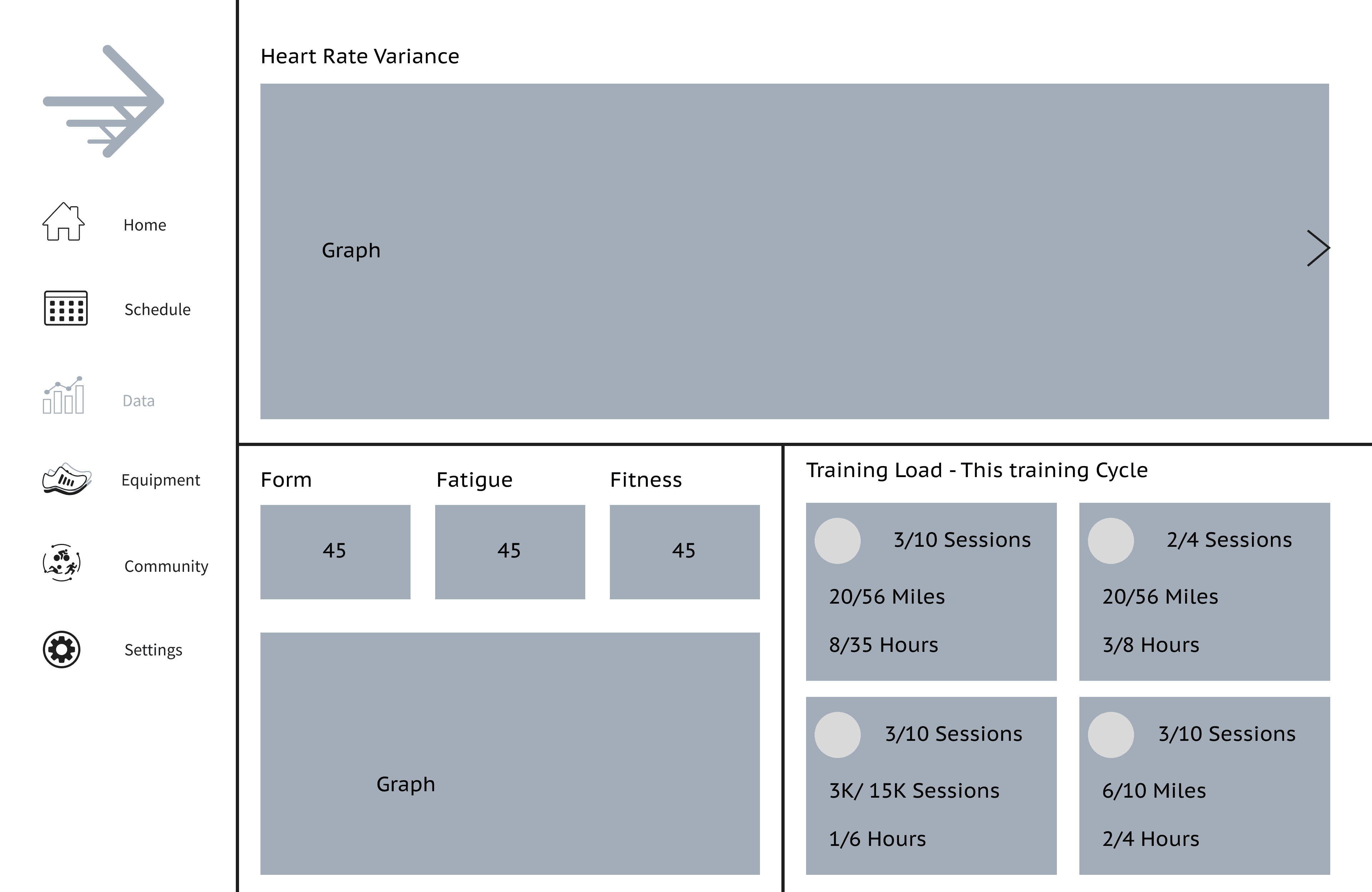
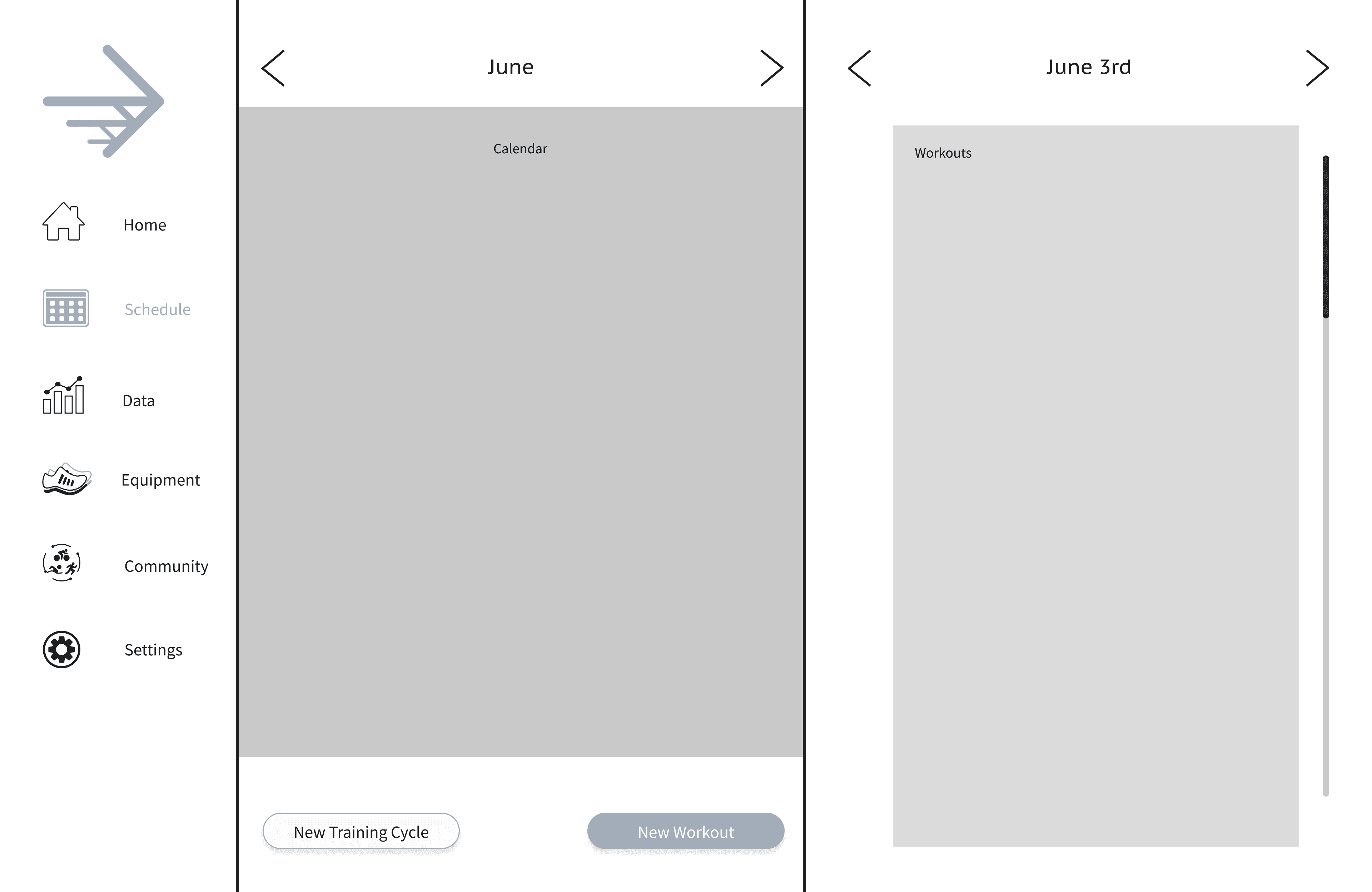
Using the user flow and personas as guides, I began drafting the low-fidelity wireframes. While the primary focus was the mobile application, I included some tablet and desktop wireframes to visualize the responsive design.
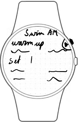
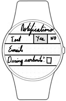
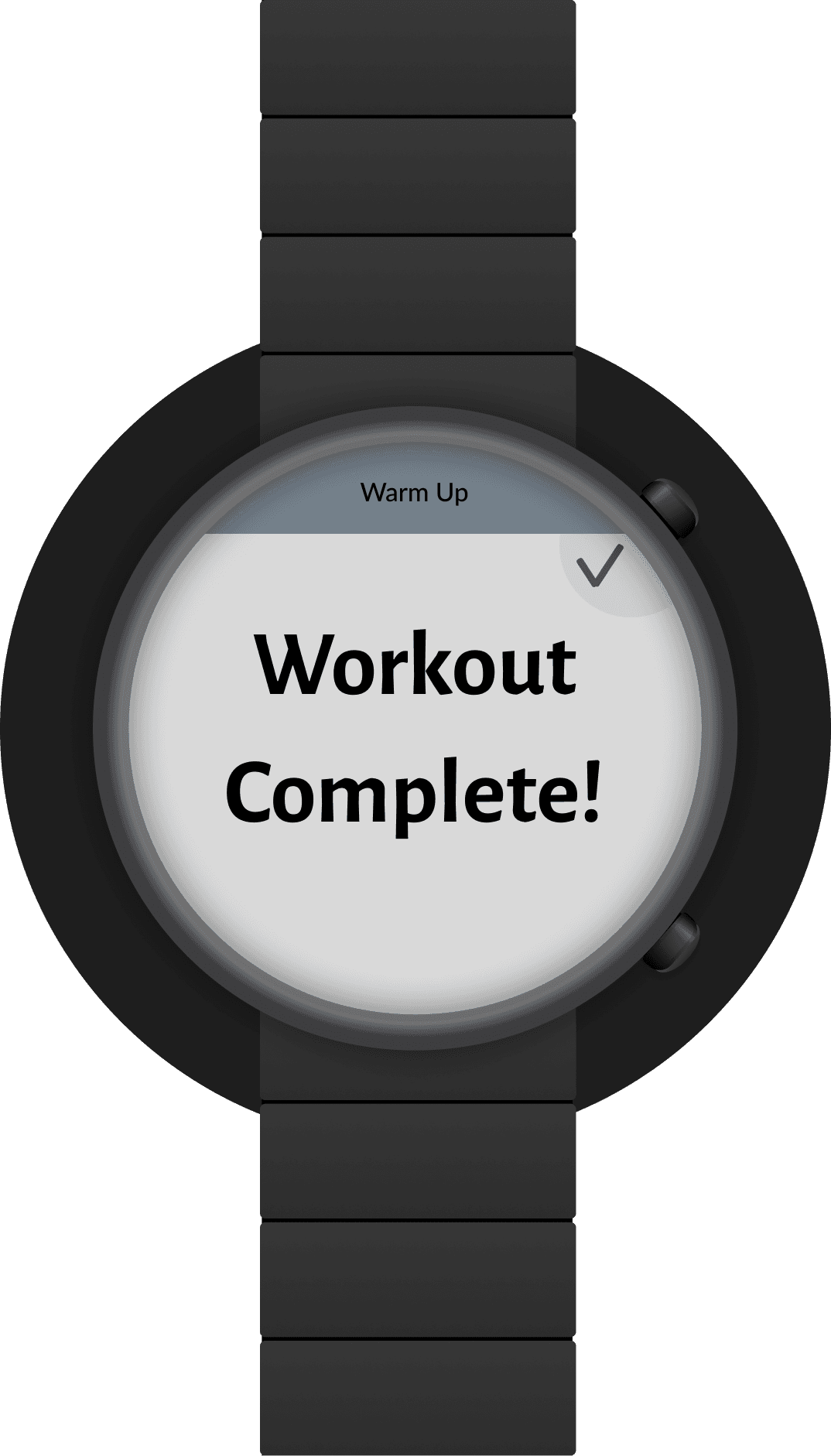
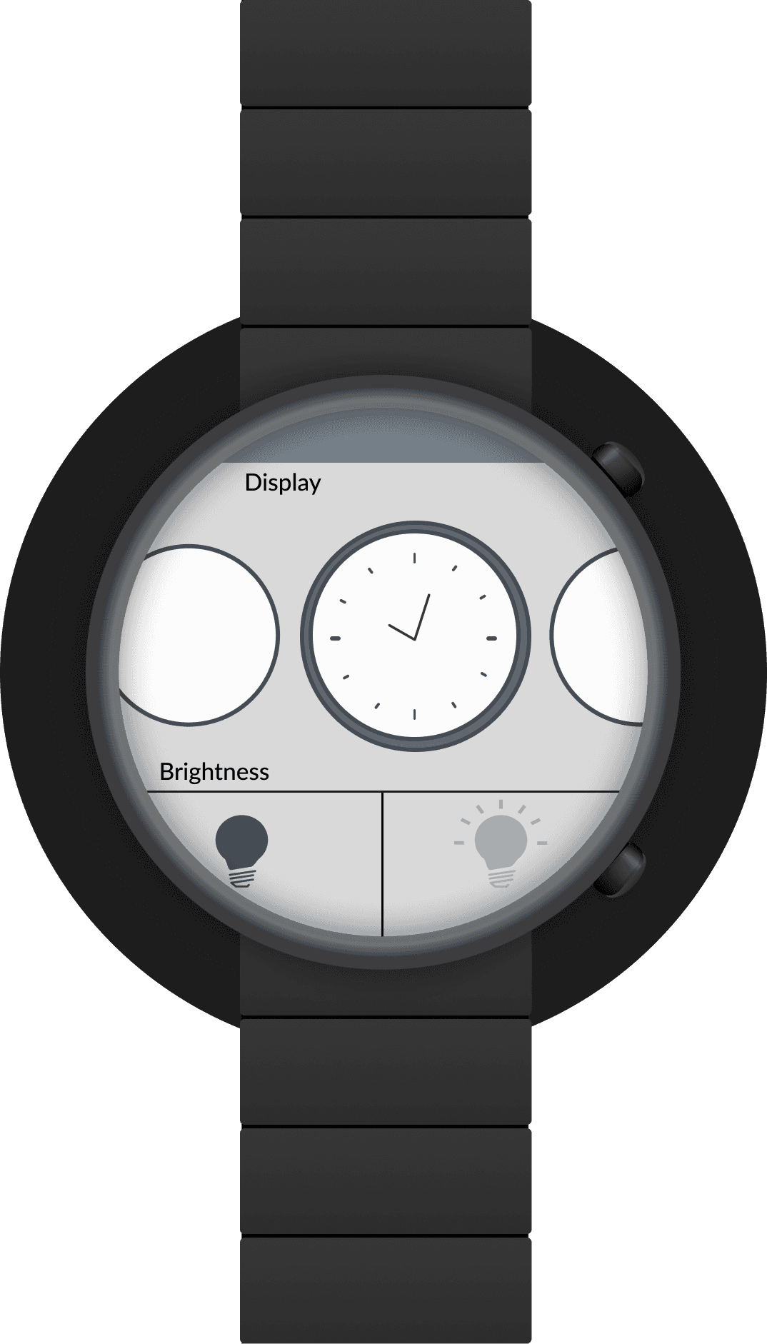
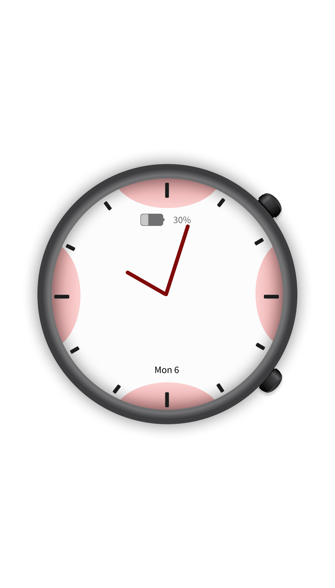
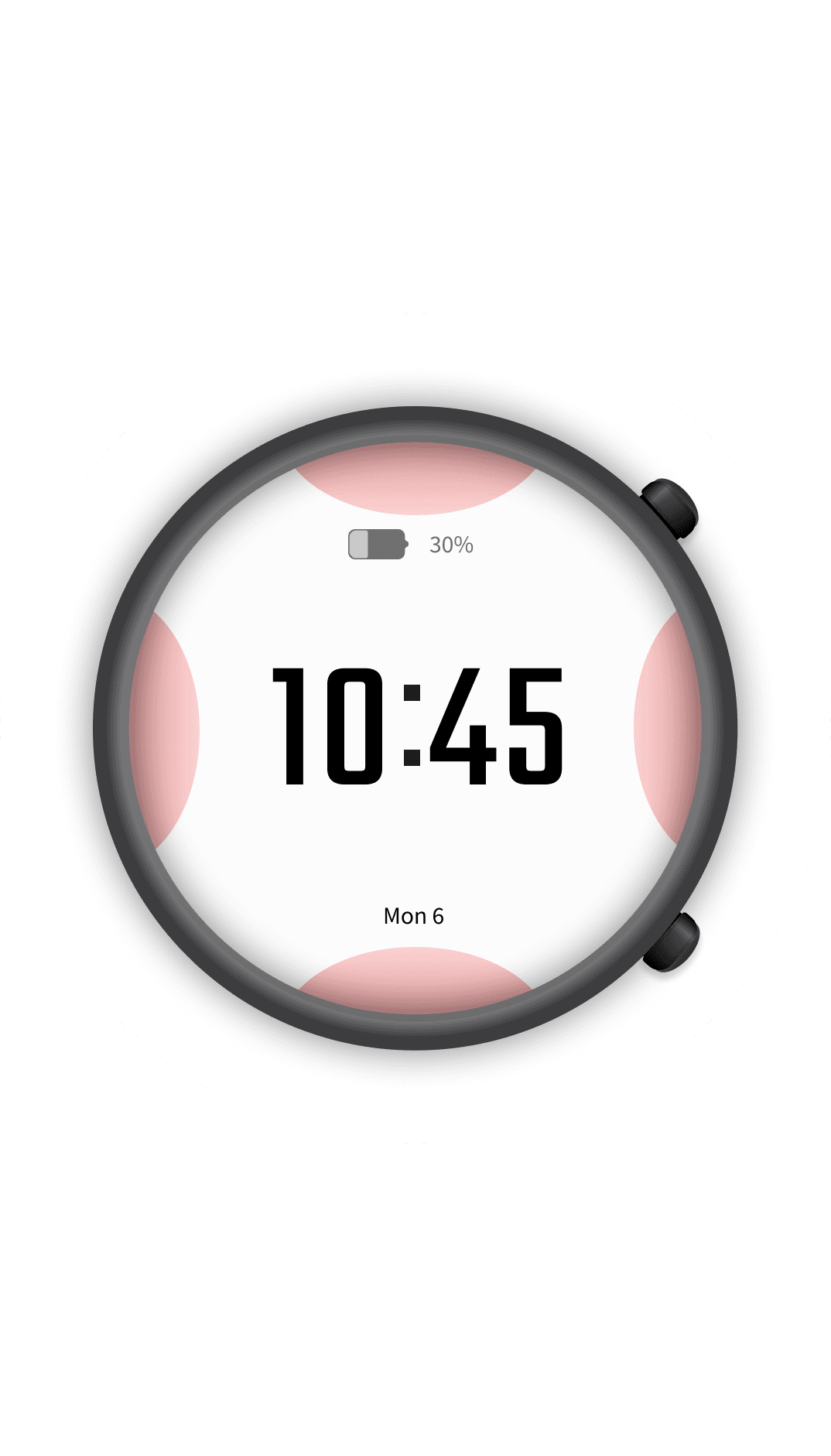
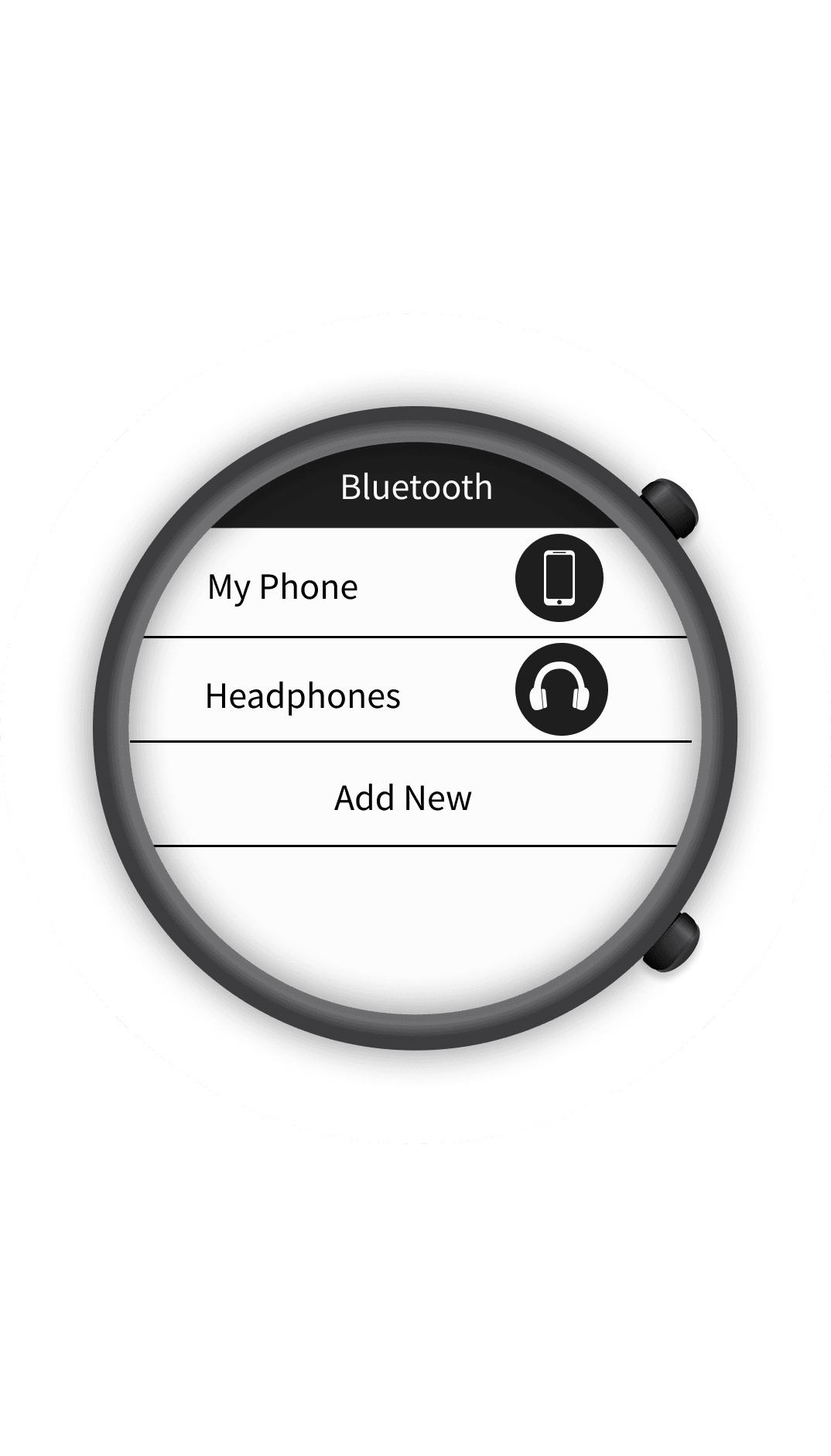
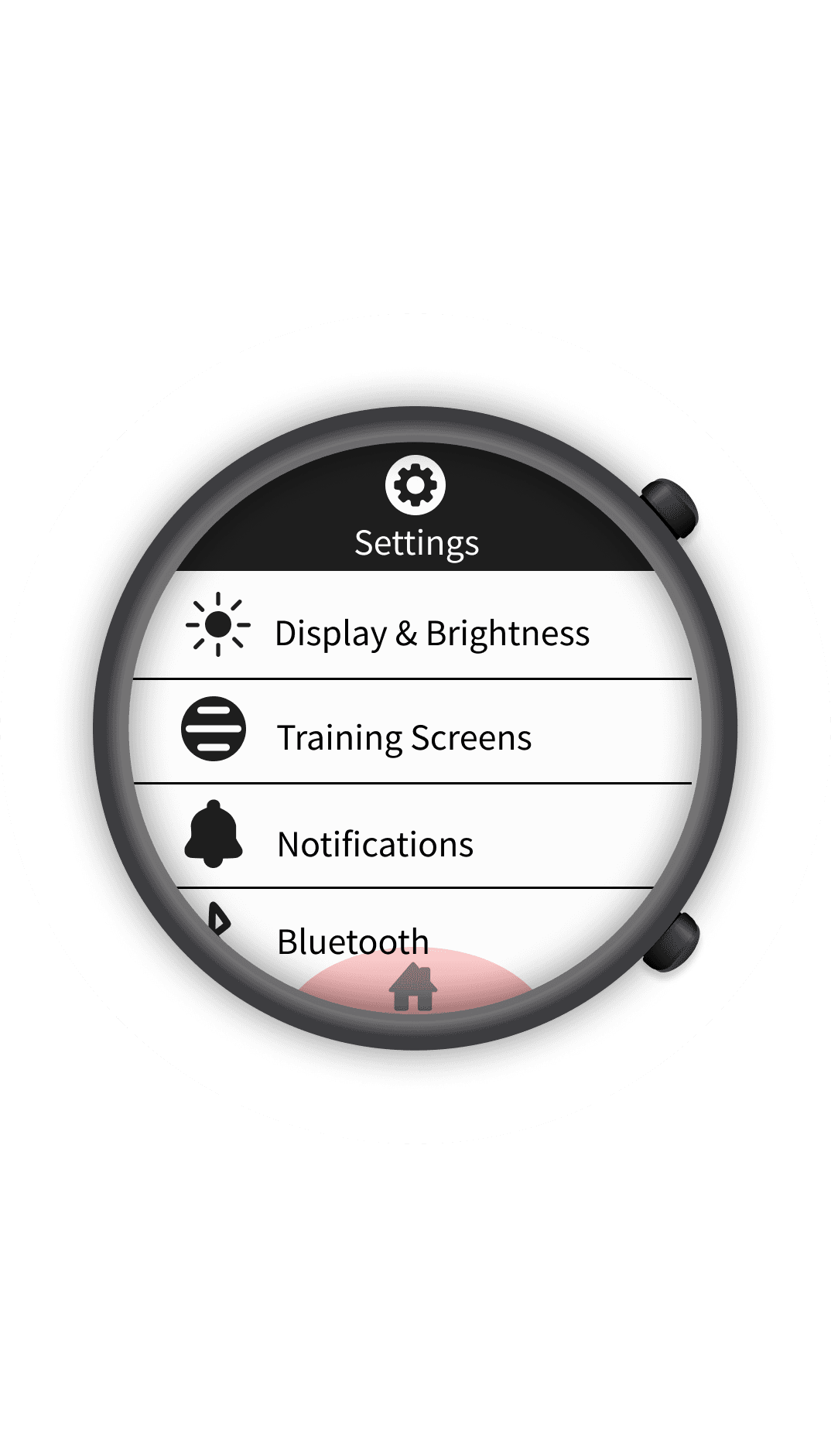
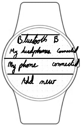
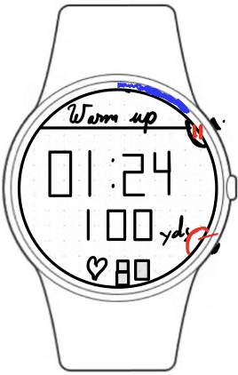
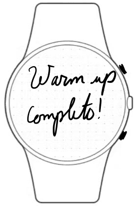
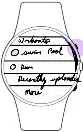
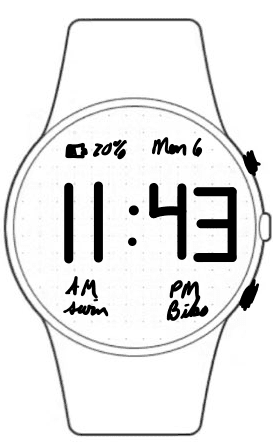
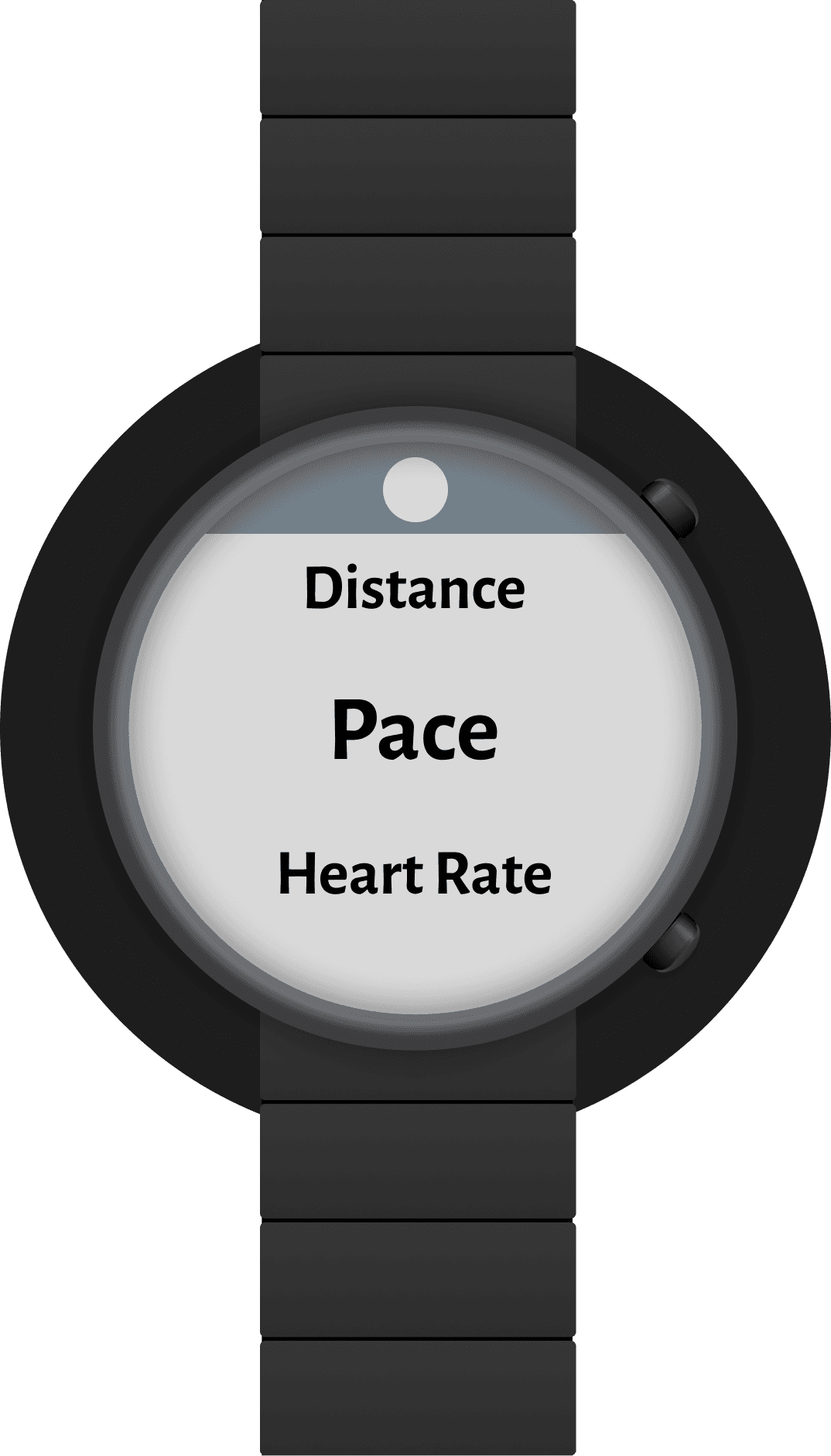
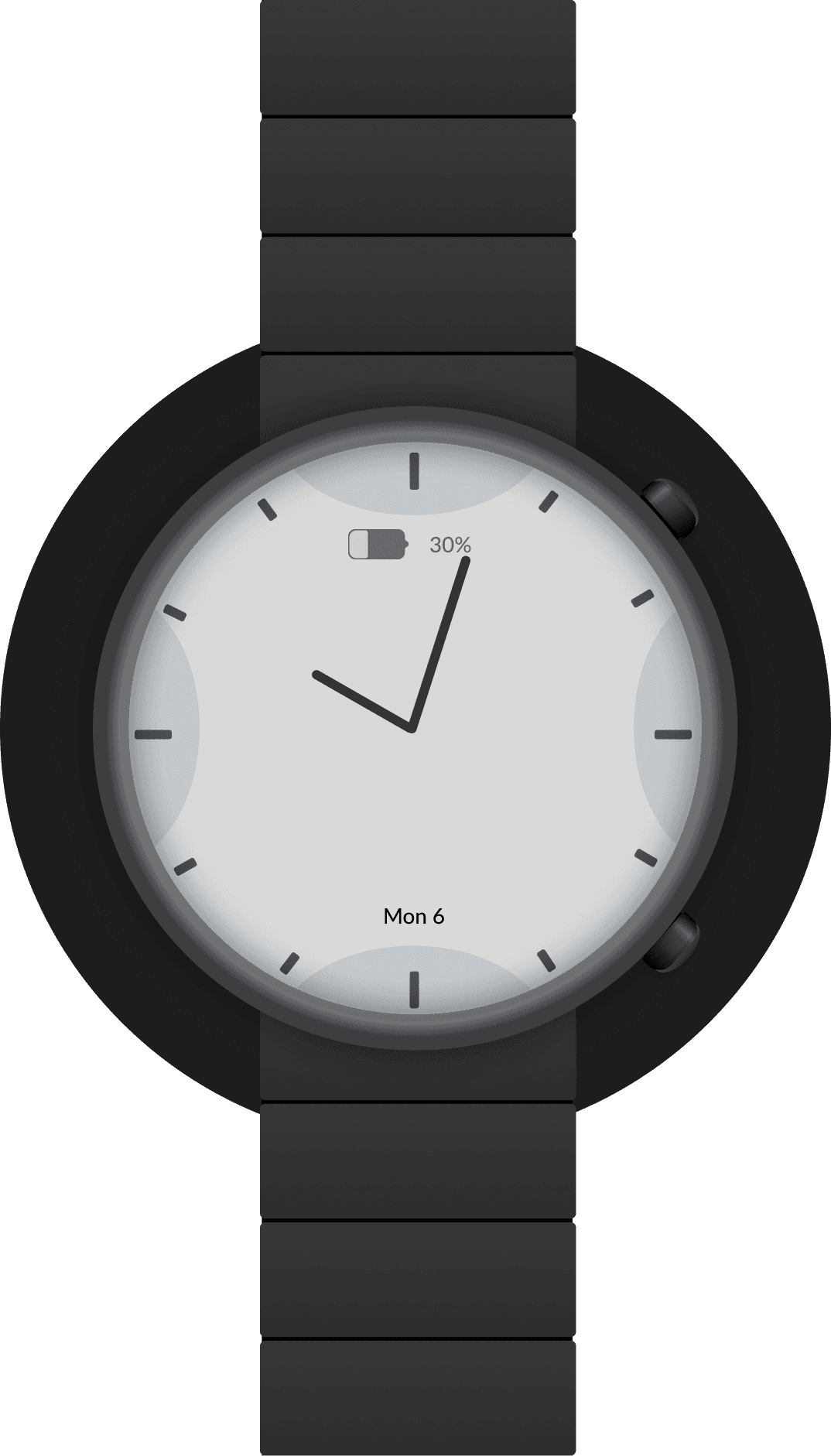
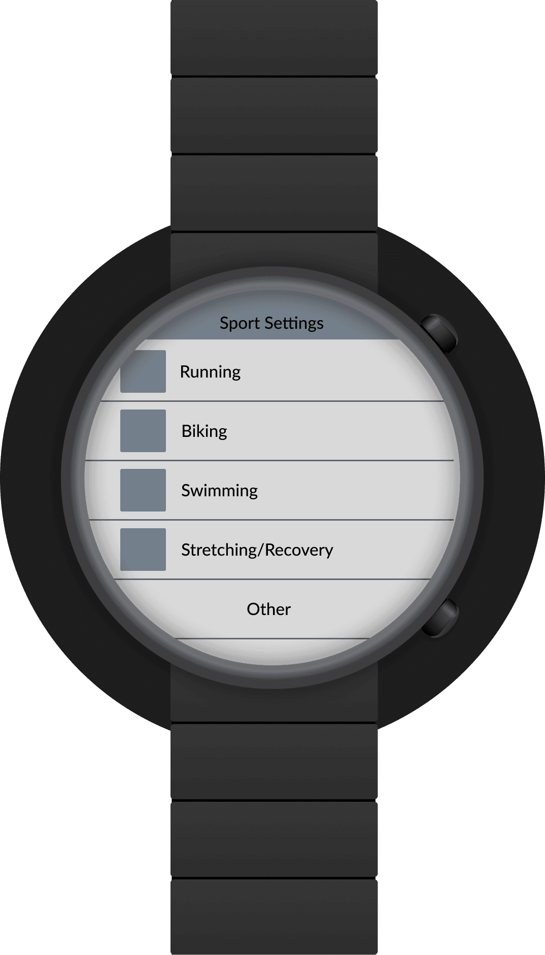
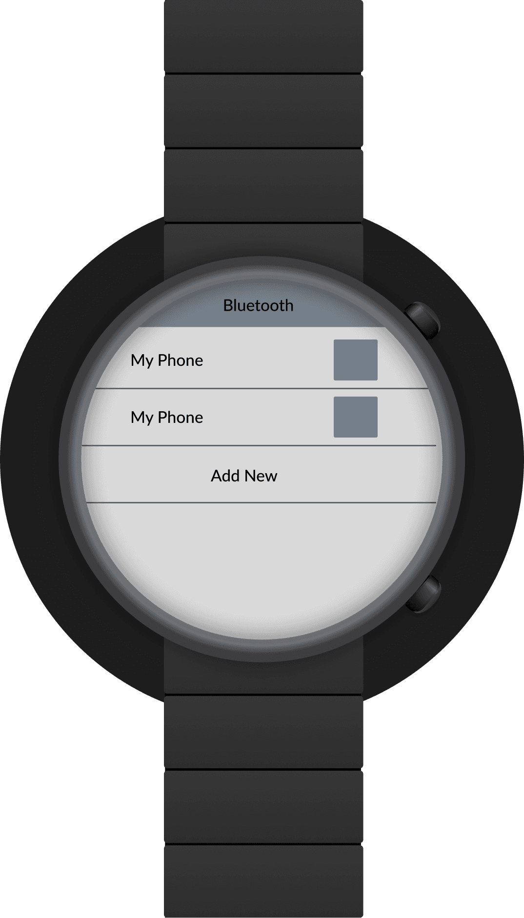
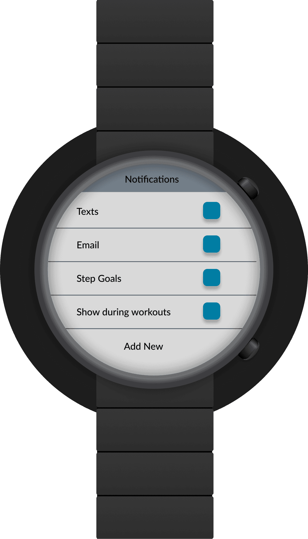
As mentioned in the user flows, athletes rely heavily on a watch when they train. For this reason, I wanted to include a few watch screens; however, this is just a starting point. I plan to return to the watch in a future project and expand the specific sport use cases.
Mobile
Home
Workout List
Workout Calendar
Data
Equipment
New Equipment
Community Activity
Community Groups
Tablet
Home
Schedule
Data
Data2
Desktop
Home
Community
Schedule
Data
Watch
Bluetooth
Workout Screen 1
Workout Screen 2
Sport List
Home Traditional
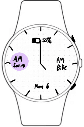
Home Analog
Settings
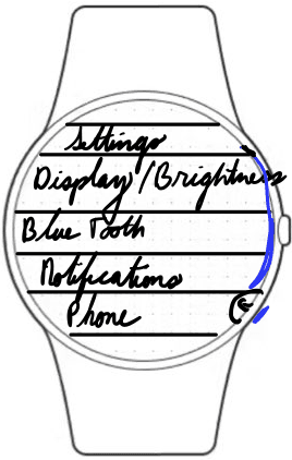
Brightness/Display
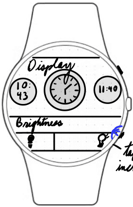
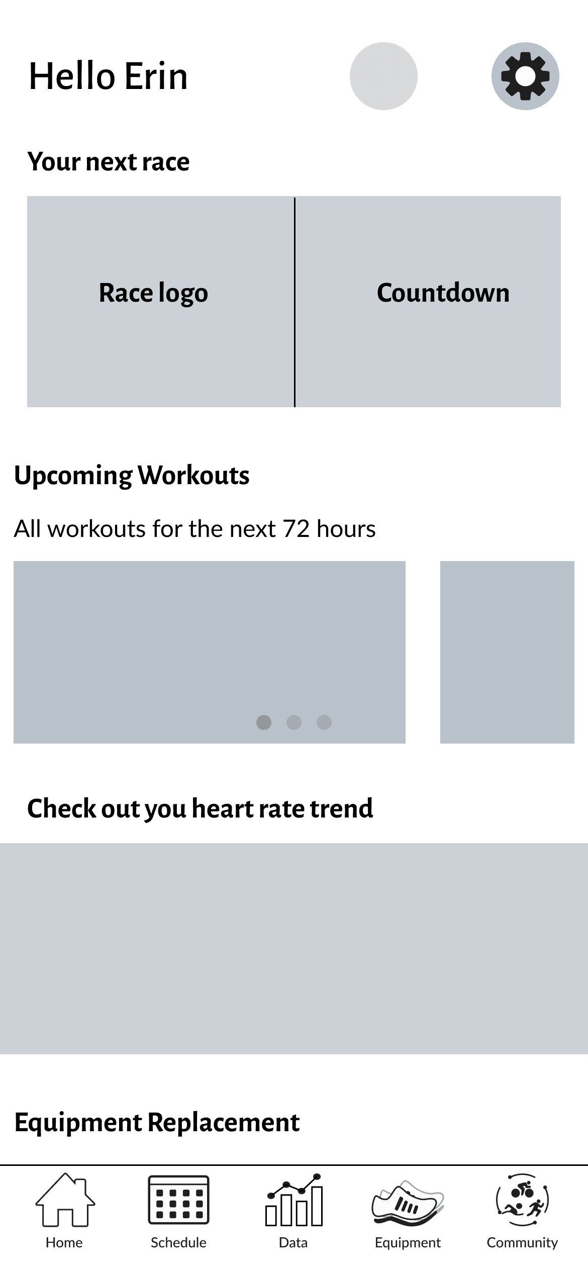
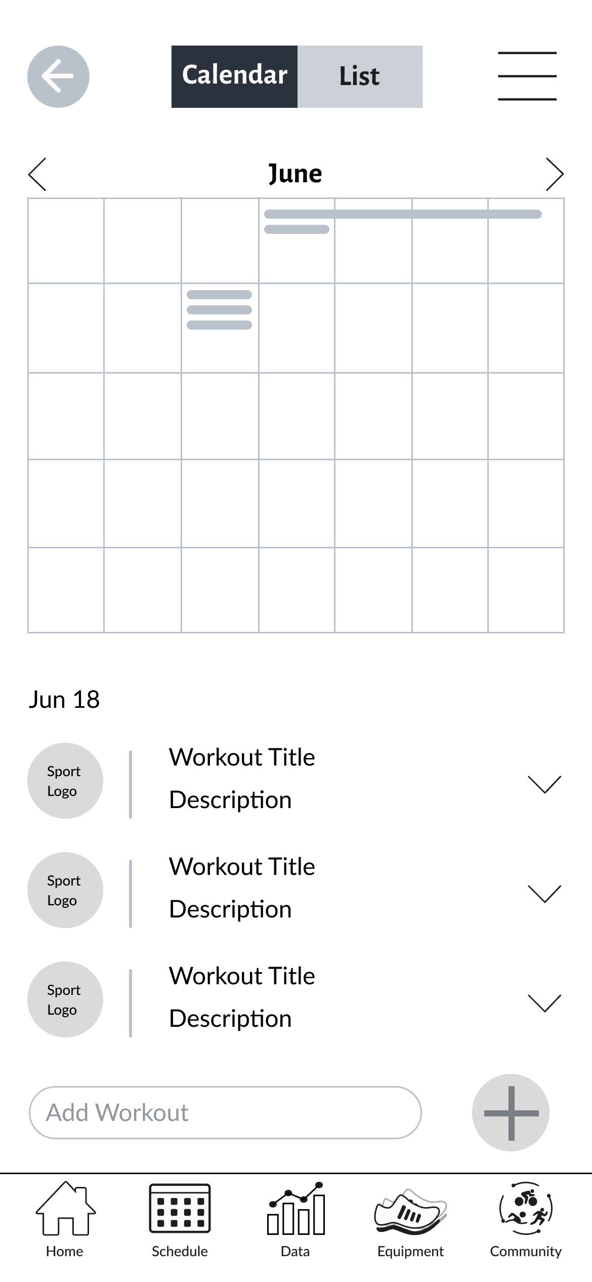
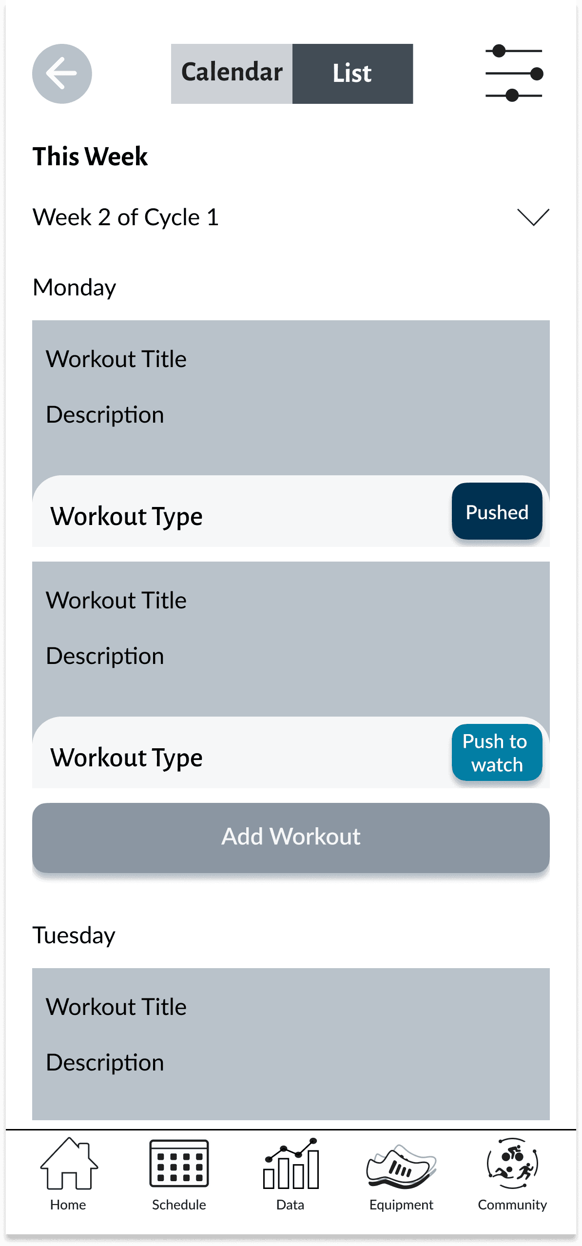
With the drawings complete I then opened Figma and converted them to mid fidelity.
Mid Fidelity Wireframes
Mobile
Home
Workout Schedule
Workout List
Data
Community Activity
Equipment
New Equipment
Community Groups
Tablet
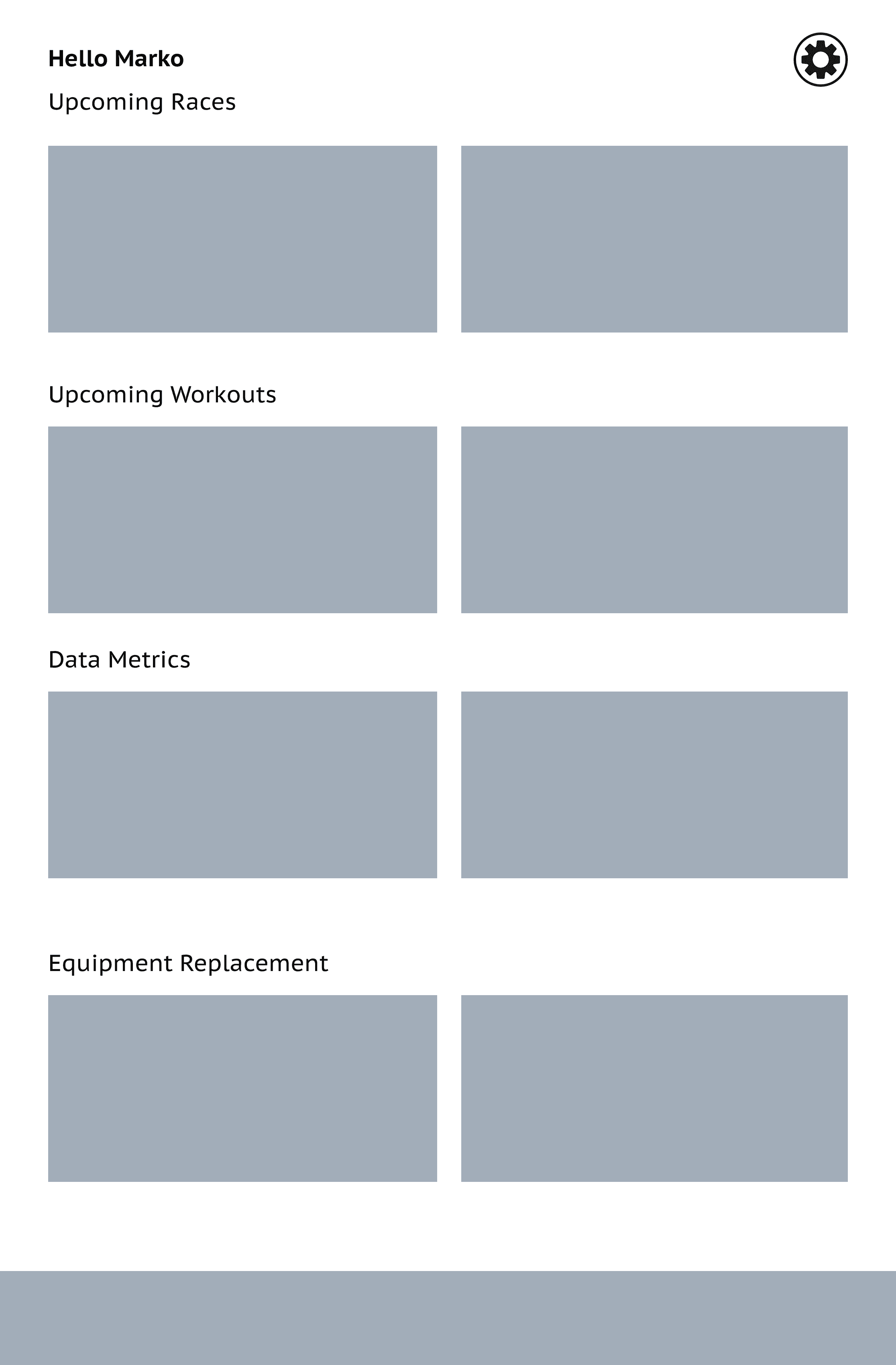
Home
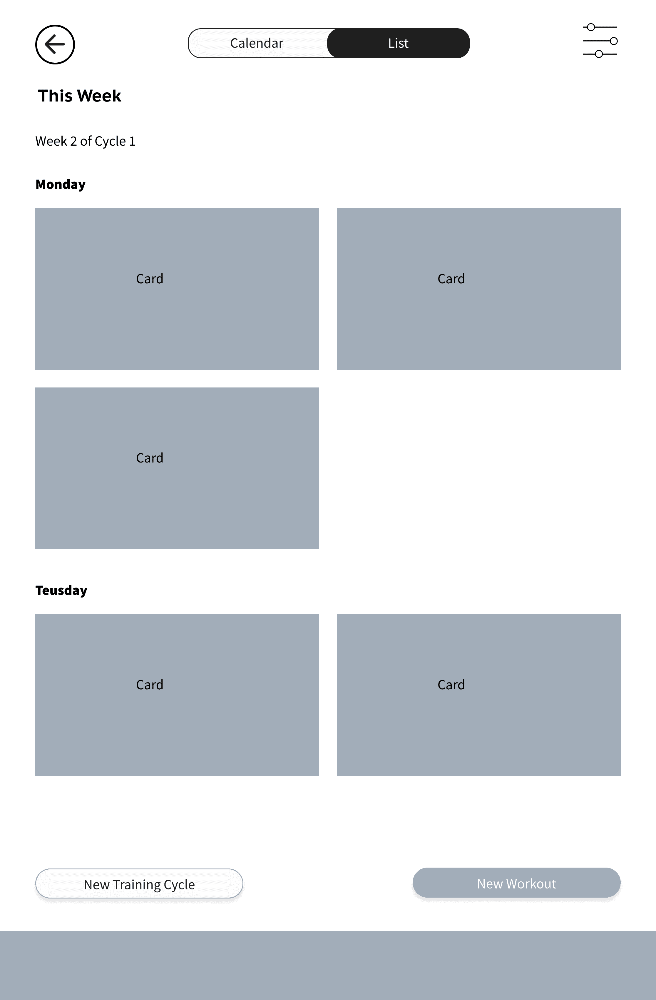
Schedule List
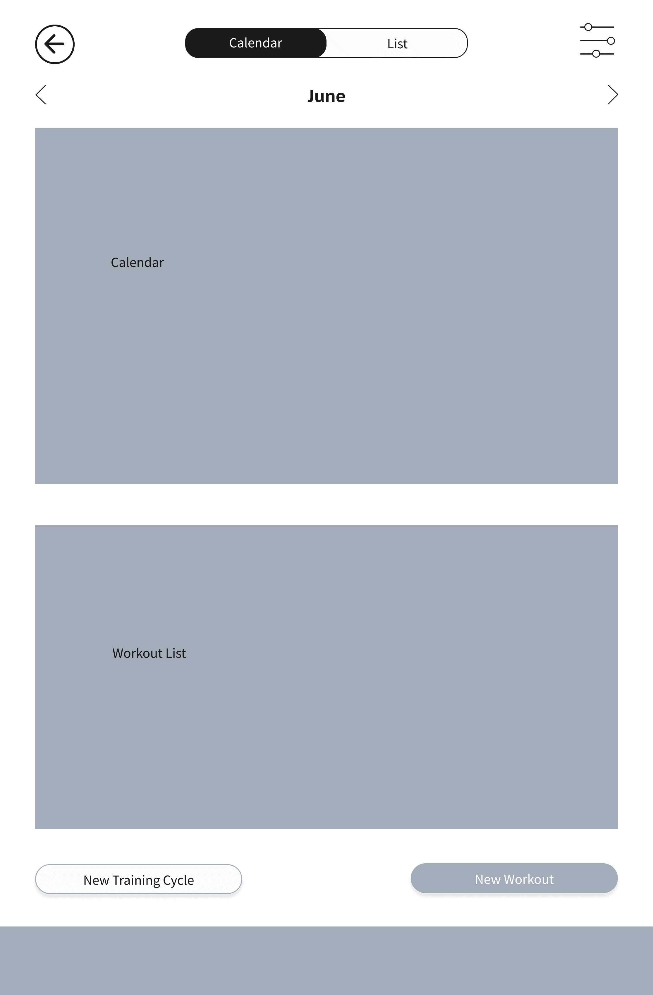
Schedule Calendar
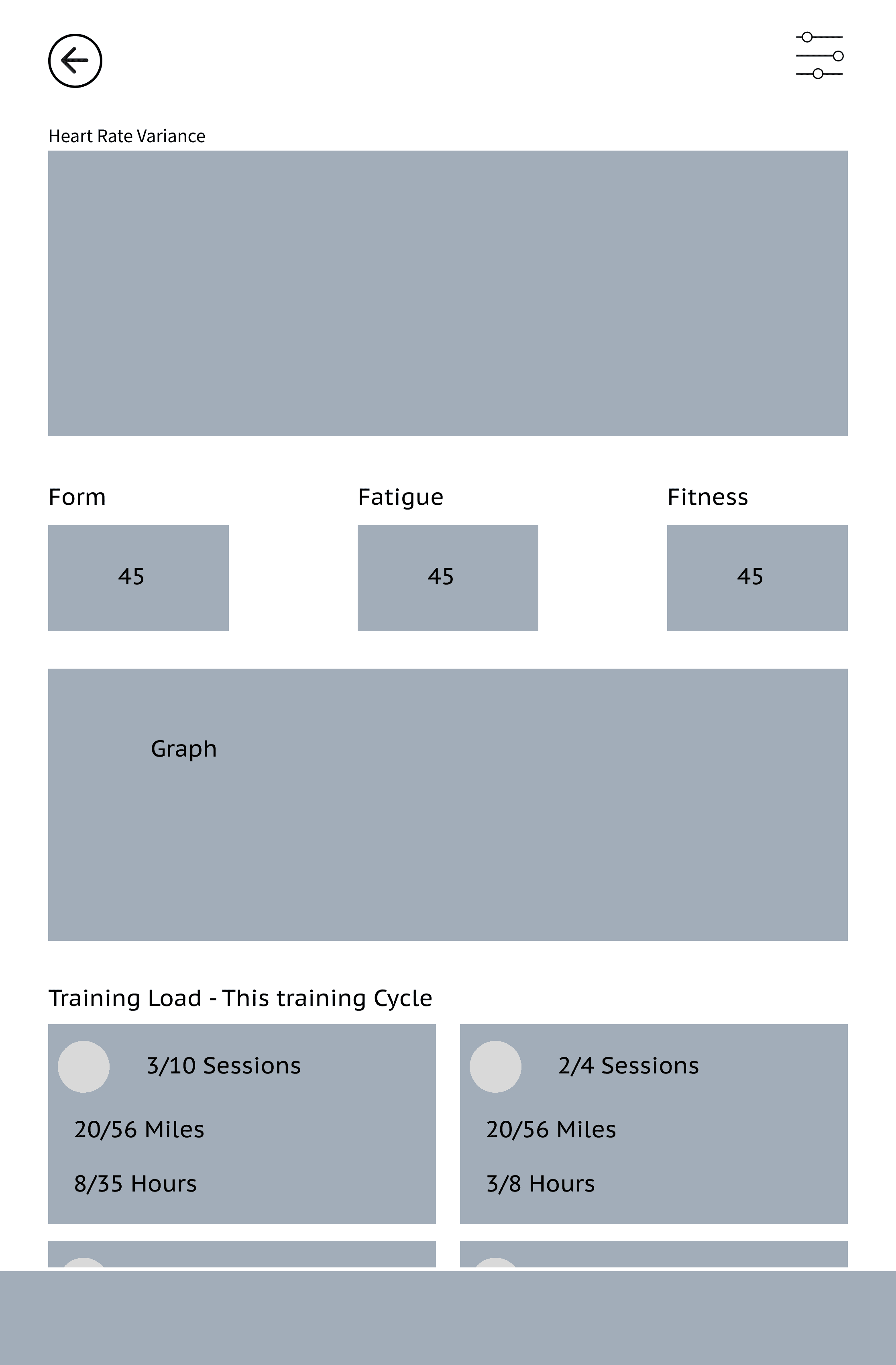
Data
Desktop
Community
Home
Data
New Workout
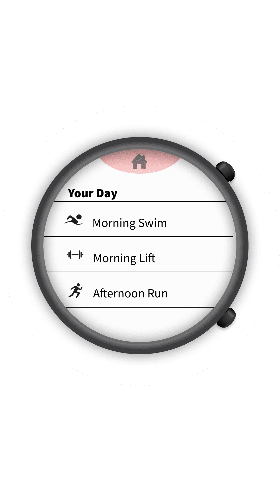
Workouts for the Day
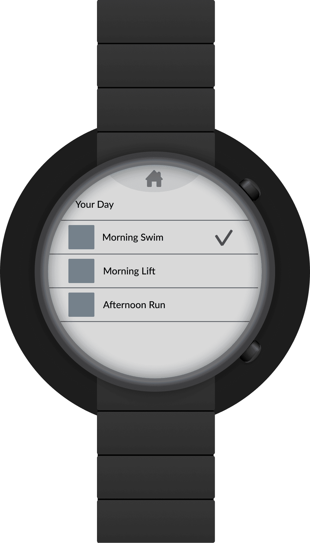
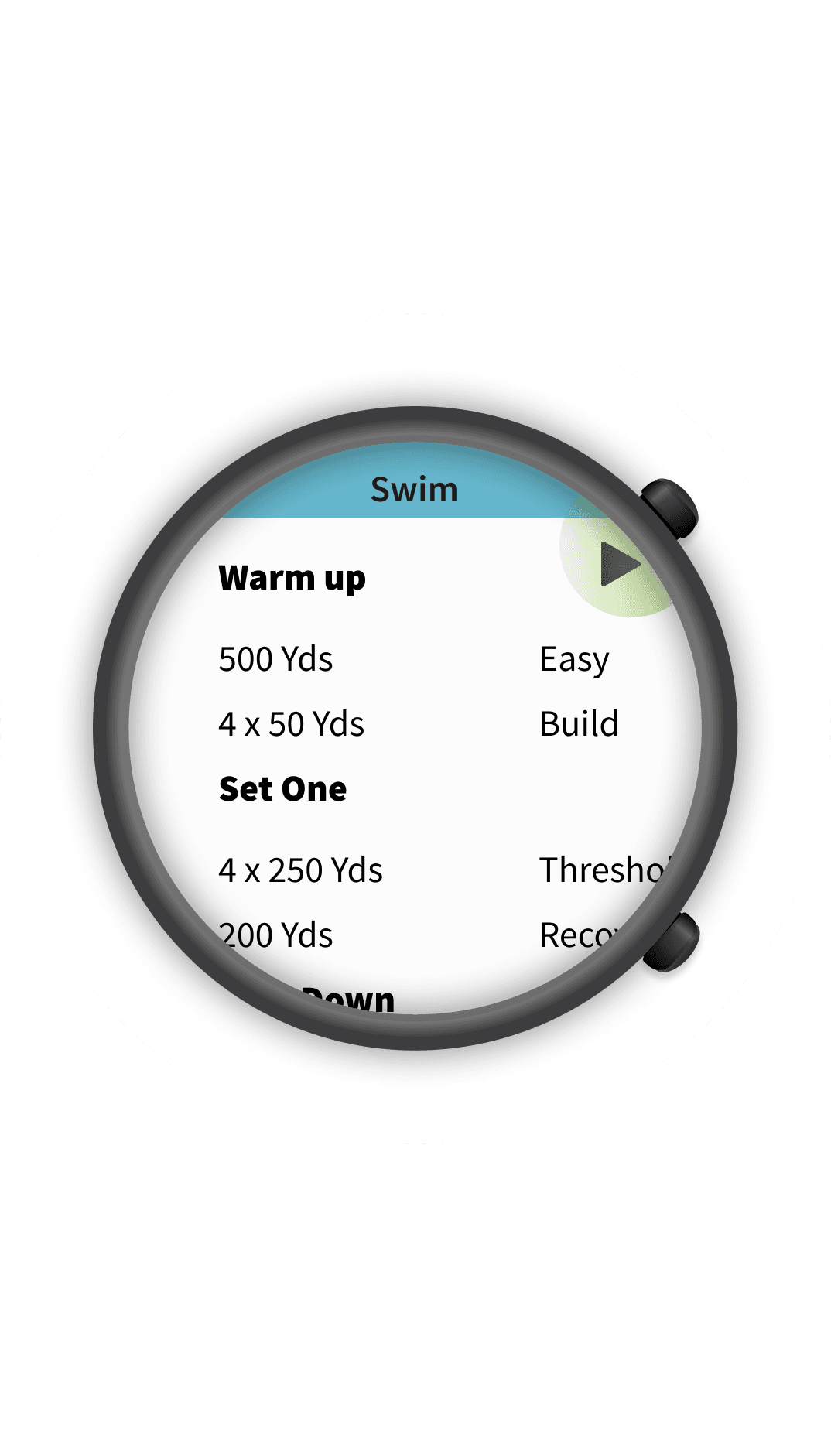
Workout Review
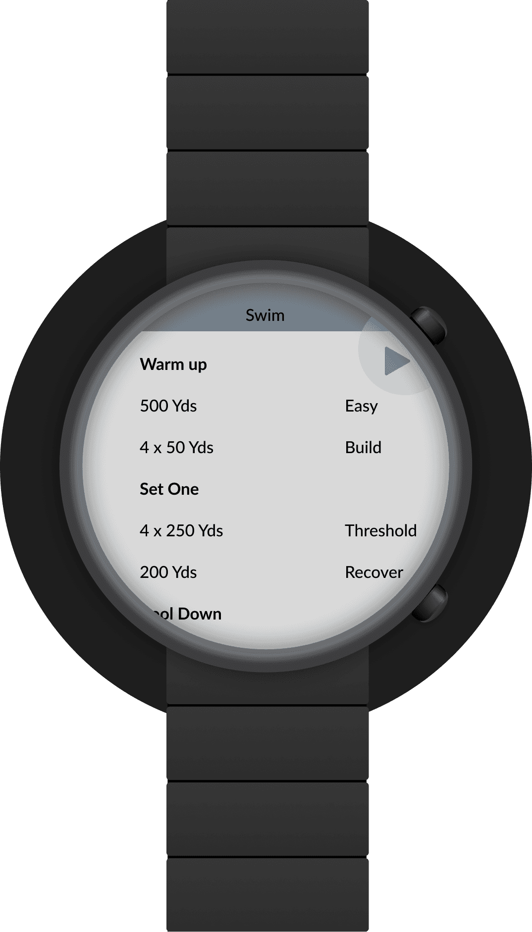
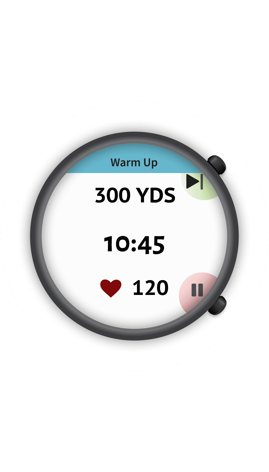
Warm Up
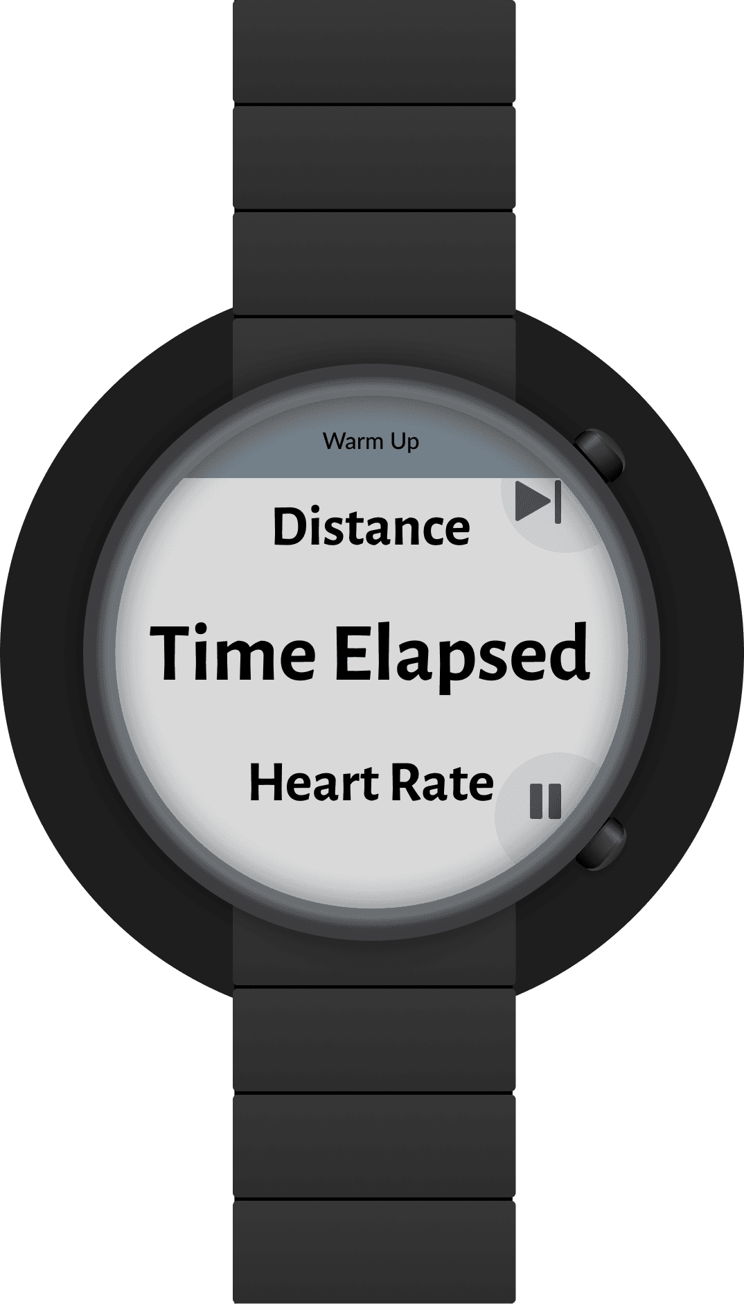
Running Screen
Home Traditional
Sport Settings
Bluetooth
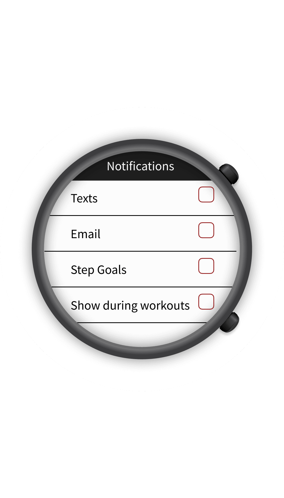
Notifications
Watch
Moodboards
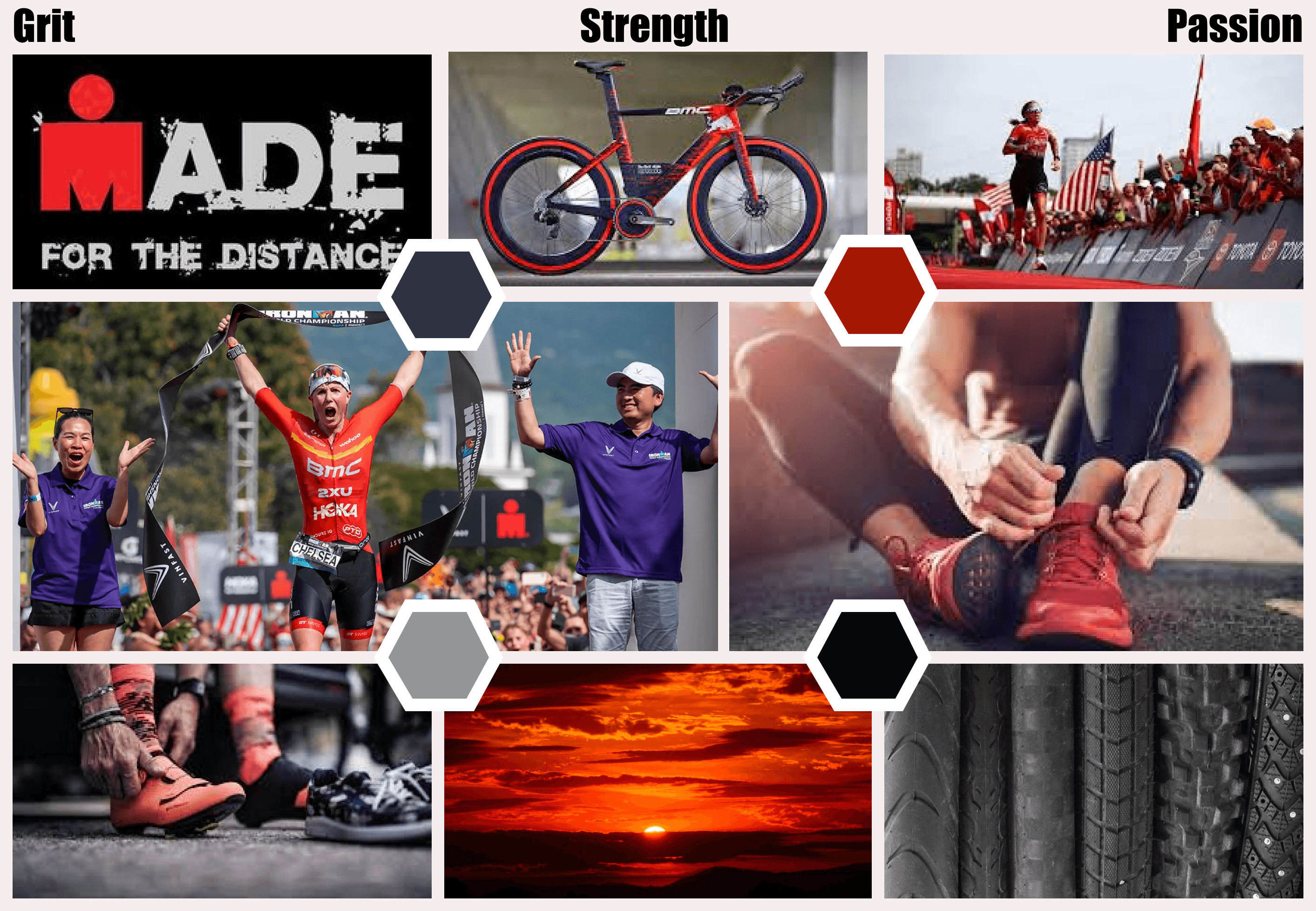
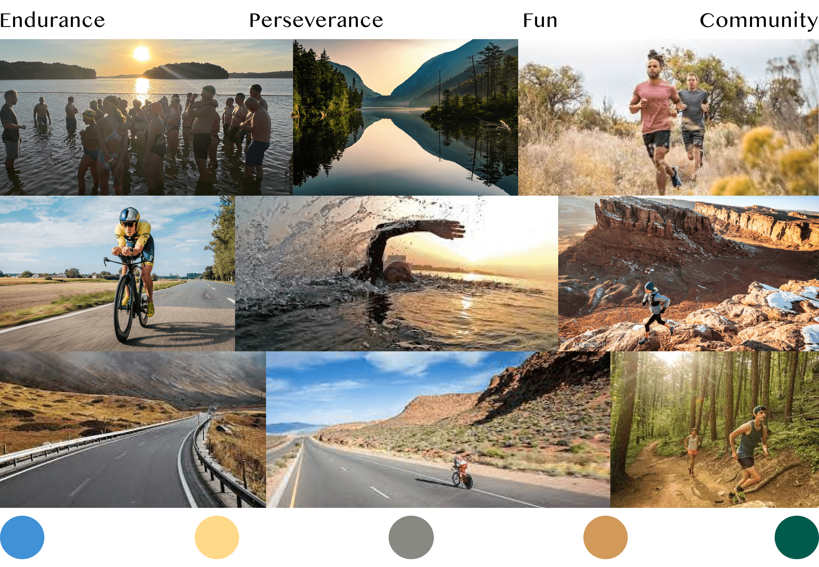
With the low fidelity wireframes complete, I then turned my attention to the visual ascetic. To help craft the colors and other UI elements I drafted two mood boards.
Both mood boards encompass different feelings about the sport. While the second mood board is more inviting, I decided to move forward with the first board because it more accurately reflects the user personas and goals. That said, I did reference the colors of second moldboard for the sport specific colors.
Visual style
Placement
Name
Size
Weight
BRAND
27.6
Regular
Sans Caption
27.6
Bold
Sans Caption
23.0
Regular
Sans Caption
23.0
Bold
Sub Heading
Sans Caption
19.0
Regular
SubHeading
Sans Caption
19.0
Bold
Paragraph 01
Source Sans Pro
16.0
Regular
Paragraph 01
Source Sans Pro
16.0
Bold
Paragraph 01
Source Sans Pro
16.0
Black
Paragraph 02
Source Sans Pro
13.3
Regular
Paragraph 02
Source Sans Pro
13.3
Bold
Paragraph 02
Source Sans Pro
13.3
Black
Captions
Source Sans Pro
10.58
Regular
Typography
01
Colors
02
Run
Dark
#CFEAAC
On
Background
#FCFCFC
Bike
Dark
#F3CEAA
Error
Dark
#CF6679
Swim
Dark
#B8E9F6
Primary
Dark
#FF8585
Surface #121212
Dark Theme
On
Background
#121212
Run
#9CCC5C
Error
#CE0927
Bike
#805226
Primary
#800A0A
Swim
#66B7CD
Surface #FCFCFC
Light Theme
Icons
03


Final Mockups
Analytics
Training Planning
Dark Mode
Takeaways & Next Steps
This project was a fantastic opportunity to explore using a variety of visual elements on different screen sizes. The main challenge of this project was to display information in a way that athletes could break down easily and customize, a task I wish to continue with user testing in the near future.
In addition to the information, color was another focal point. There is a lot of color throughout the app, and I spent a great deal of time finding the right colors for the three sports that worked in harmony with the primary red. I took this exploration further by creating a separate color pallet to experiment with how these colors would work in a dark mode. Overall, I’m satisfied with the result but will collect additional user feedback to verify if any adjustments would be valuable.
As mentioned briefly in the introduction of this case study, I would like to take a deeper dive into the watch design specifically. I aim to explore and test the ability to build custom screens for different sports and overall usage in practice. This process will begin by conducting additional user tests and proceeding from there.
As for Arrow, the next natural step is expanding its functionality. I would start by revisiting my interview notes and then conduct user tests with a low to mid-fidelity prototype to ensure features and functionality work as expected.
I have enjoyed this project immensely, as it has allowed me to work in the realm of sports, a space I wish to revisit soon.
